


Five Number Summary Calculator
Paste comma-separated numbers or upload a CSV and get the minimum, first quartile, median, third quartile and maximum, plus the interquartile range, outlier fences, a box-and-whisker plot and the full working, for one group or several at once.
⚡ 0. Quick Answer
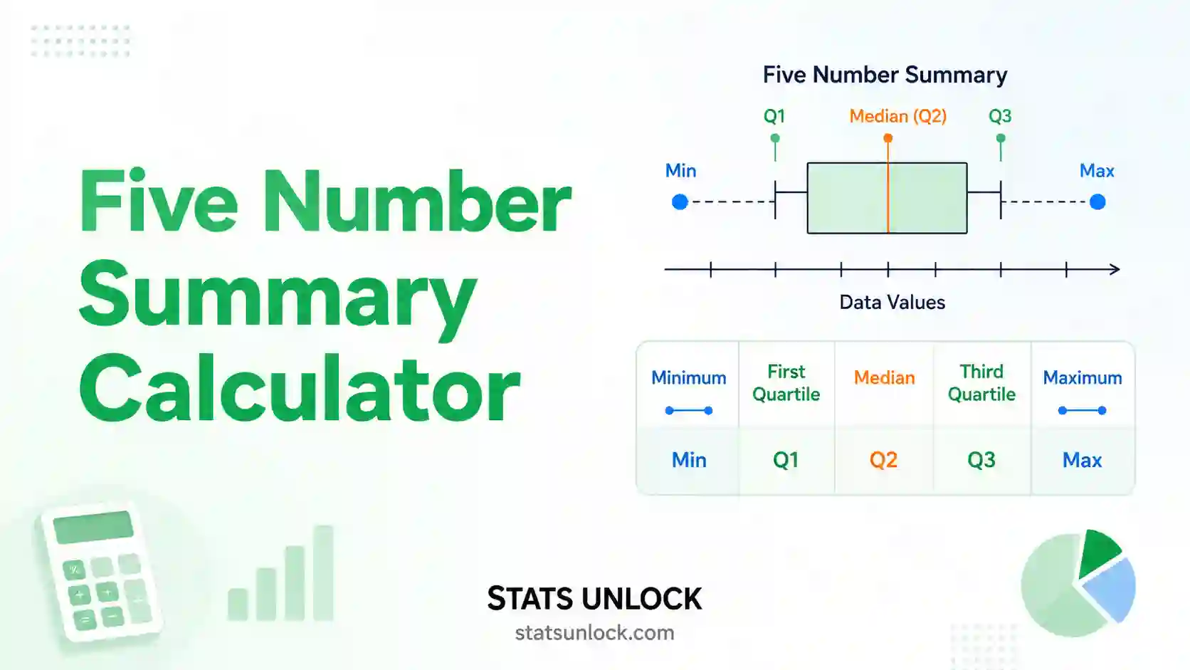
The five number summary describes any dataset with five values: the minimum, the first quartile (Q1), the median (Q2), the third quartile (Q3) and the maximum.
Sort your numbers from smallest to largest. The median splits them in half, Q1 is the middle of the lower half, and Q3 is the middle of the upper half. Together these five numbers tell you the centre, the spread and the shape of the data without assuming it is bell-shaped. They are exactly the five values a box-and-whisker plot draws.
Rule of thumb: any value below Q1 − 1.5 × IQR or above Q3 + 1.5 × IQR is a suspected outlier; beyond 3 × IQR it is an extreme outlier.
Key takeaways
- The five number summary is minimum, Q1, median, Q3 and maximum, in that order.
- IQR = Q3 − Q1 holds the middle 50% of the data and is the spread measure that outliers cannot inflate.
- The five numbers are exactly what a box plot draws: box edges at Q1 and Q3, line at the median, whiskers to the most extreme non-outlier values.
- The most common misreading is that the whiskers always reach the minimum and maximum. They only do so when there are no outliers.
- Different software gives slightly different quartiles. This calculator offers all three standard methods so you can match Excel, R, a TI-84 or your textbook exactly.
📚 1. What Is the Five Number Summary?
The five number summary is a compact description of a dataset built from five order statistics. It answers three questions at once: where is the middle, how spread out are the values, and is the distribution lopsided. Because every one of the five numbers is a position in the sorted data rather than an arithmetic average, the summary is robust: a single wild value can move the maximum but it cannot drag the median or the quartiles the way it drags the mean.
The five numbers, in order:
- Minimum, the smallest value in the dataset.
- First quartile (Q1), the 25th percentile. A quarter of the values fall below it.
- Median (Q2), the 50th percentile. Half the values fall below it.
- Third quartile (Q3), the 75th percentile. Three quarters of the values fall below it.
- Maximum, the largest value in the dataset.
What this calculator adds: the interquartile range (Q3 − Q1), the total range (max − min), the lower and upper Tukey fences, a list of any suspected and extreme outliers, the whisker ends actually used by a box plot, a skewness read from the quartile positions, and the sorted data with each quartile marked.
A worked one-liner: for the seven values 2, 4, 5, 7, 8, 9, 12 the median is 7, the lower half is 2, 4, 5 so Q1 = 4, the upper half is 8, 9, 12 so Q3 = 9, giving the summary 2, 4, 7, 9, 12 and an IQR of 5.
Who uses it: teachers introducing distributions before the normal curve, ecologists comparing body sizes across sites, clinicians summarising skewed measures such as length of stay, exam boards reporting score distributions, and analysts screening any new dataset for outliers before modelling.
| Summary | What it reports | Choose it when |
|---|---|---|
| Five number summary | Min, Q1, median, Q3, max | Data are skewed, ordinal, or contain outliers; you want a box plot |
| Mean and standard deviation | Centre and spread assuming symmetry | Data are roughly symmetric with no extreme values |
| Full percentile table | Every decile or percentile | You need reference ranges or growth-chart style cut-offs |
🧮 2. Set Up Your Data
Type one value per cell. Each column becomes a cluster. Empty cells are ignored.
📊 3. Results
🧠 4. Interpretation of Results, In Detail
4.1 Reading the five numbers in order
Read the summary from left to right and a picture of the distribution builds itself. The minimum and maximum tell you the total span of what was observed. Q1 and Q3 tell you where the bulk of the data sits: exactly half of every dataset falls between them, no matter how strange the shape. The median tells you the typical value in the only sense that is immune to extremes, since it is a position rather than an average.
The gap between the minimum and Q1 covers the lowest quarter of the data, and the gap between Q3 and the maximum covers the highest quarter. Each of those quarters contains exactly the same number of observations as the box does per half, so when one of them is much longer, the values in it are more thinly spread. That is the whole logic of reading a box plot.
4.2 What the interquartile range actually measures
The interquartile range is Q3 minus Q1, and it is the width of the middle 50% of your data. It is the natural partner to the median in the same way the standard deviation partners the mean. Its great virtue is resistance: you could take the largest value in your dataset and multiply it by a thousand, and the IQR would not move at all, because Q3 depends on position not magnitude. That is why skewed data, income, hospital stays, species counts, are almost always summarised with median and IQR rather than mean and standard deviation.
A small IQR relative to the total range means the data are concentrated with a few stragglers at the ends. An IQR that fills most of the range means the values are spread fairly evenly, with no dense core.
4.3 Judging skew from the quartiles alone
You do not need a skewness statistic to see asymmetry. Compare the two halves of the box. If the distance from the median to Q3 is clearly larger than the distance from Q1 to the median, the upper half of the middle data is more stretched, which indicates right skew, the direction typical of incomes, waiting times and counts. If the lower half is longer, the data are left skewed, which is common for scores near a ceiling such as easy exams or percentage completion.
Then check the whiskers, because they often disagree with the box. A short box with one very long whisker signals a tight core with a thin tail. When box and whiskers point in opposite directions, the skew is not consistent across the distribution and you should look at a histogram before summarising in words.
4.4 How the outlier fences are built and what they mean
The fences come from Tukey. The lower fence is Q1 minus 1.5 times the IQR and the upper fence is Q3 plus 1.5 times the IQR. Anything beyond a fence is flagged as a suspected outlier; anything beyond three times the IQR is called an extreme outlier. The 1.5 multiplier is a convention, not a law of nature. Tukey chose it because for roughly normal data it flags only about 0.7% of observations, which is rare enough to be interesting but common enough that a single flag is not alarming.
The critical point is what a flag means. It means look at this value. It does not mean delete it. An outlier can be a typing error, an instrument fault, a genuinely unusual case, or the single most scientifically interesting observation in the study. Deleting values simply because a fence flagged them is one of the most common forms of accidental data manipulation.
4.5 Why the whiskers may not reach the minimum and maximum
This trips up almost every student. In a standard box plot the whiskers do not extend to the extremes of the data. They extend to the furthest observation that still sits inside the fences, and anything beyond that is drawn as a separate dot. So when your data contain outliers, the whisker ends and the true minimum and maximum are different numbers. This calculator reports both, so you can label your figure correctly.
If your course or journal wants whiskers drawn all the way to the extremes, switch the whisker rule in section 2 to Always to the minimum and maximum. Just be sure the caption says which convention you used, because the two plots can look very different from the same data.
4.6 Why your quartiles may differ from another program
There is no single agreed definition of a quartile, and mainstream software genuinely disagrees. The Tukey or Moore and McCabe method finds the median, splits the data into two halves excluding that median when the count is odd, and takes the median of each half. This is what a TI-84 does and what most introductory textbooks teach. Excel's QUARTILE.INC, R's default type 7 and NumPy's percentile use linear interpolation across the whole sorted list, which usually gives a slightly narrower box. Excel's QUARTILE.EXC, R type 6 and Minitab use a different interpolation that usually gives a slightly wider box.
None is wrong. For large samples the three converge and the difference is irrelevant. For small samples the difference can be visible, which is why this calculator lets you pick the method and prints which one it used. If you are checking homework, choose Tukey. If you are reproducing a spreadsheet, choose the inclusive method.
4.7 What the four charts each show you
Chart 1 is the box plot itself, the direct picture of the five numbers, with any outliers as separate dots. This is the figure to put in your report.
Chart 2 shows the five values as bars so you can read the actual numbers off an axis, which is useful when the box plot is visually cramped because the data are tightly clustered.
Chart 3 plots every sorted observation with horizontal lines at Q1, the median and Q3. This makes gaps, ties and clumping visible in a way the box plot deliberately hides, and it is the fastest way to spot that your data are actually two groups mixed together.
Chart 4 is the cumulative distribution. Read across from 25%, 50% and 75% on the vertical axis and drop down to the horizontal axis to find each quartile. It shows why the quartiles sit where they do, and steep sections reveal where values pile up.
4.8 What the five number summary cannot tell you
The summary is deliberately coarse. It cannot reveal whether a distribution has two peaks, because two very different shapes can share the same five numbers. It says nothing about sample size, so a summary from six observations looks identical in form to one from six thousand and deserves far less trust. It ignores everything about the values inside each quarter, including ties and gaps. And, being purely descriptive, it offers no test, no p-value and no confidence interval, so two boxes that look different are not thereby significantly different.
4.9 Practical judgement
Use the five number summary as a first look, not a final answer. It is the right summary when the data are skewed, ordinal or outlier-prone, and it is the honest choice when you do not yet know the shape. Once you have seen the box plot, decide whether the mean is safe to report as well, whether the outliers are real, and whether the sample is large enough to say anything at all. Report the numbers alongside n, always, so the reader can calibrate how much weight the picture deserves.
✍ 5. How to Write Your Results in Research
▶ Run the analysis above to auto-fill all five examples with your results.
📌 Key conventions for this style
- APA abbreviates the median as Mdn, not M, which means the mean.
- Give the IQR either as a single width or as the Q1 to Q3 pair, and say which.
- Report n so the reader can judge how stable the quartiles are.
- Use the median and IQR, not the mean and SD, whenever you say the data are skewed.
📌 Key conventions for this style
- Name the quartile method. This is the single most common source of irreproducible descriptive statistics.
- State the fence multiplier used to flag outliers.
- Say whether flagged outliers were retained, and justify any exclusion.
- Name the software and version.
📌 Key conventions for this style
- Say "the middle half" instead of "the interquartile range".
- Say "a typical value" instead of "the median".
- Never use the words quartile, percentile or outlier without explaining them.
- Give units every time a number appears.
📌 Key conventions for this style
- Declare the format once in the methods line, then use it consistently in every row of the table.
- Median (Q1 to Q3) is the clearest convention; median (IQR width) is also accepted but must be labelled.
- Keep decimal places consistent with the measurement precision.
- Do not mix mean (SD) and median (IQR) rows in the same table without marking which is which.
📌 Key conventions for this style
- Always define what the whiskers represent. Readers cannot guess between the Tukey rule, min to max, and percentile whiskers.
- State n for each box.
- Say whether outlying points are shown individually.
- If boxes have different widths for different n, say so.
∑ 6. Formulas Used
📝 7. How to Use This Calculator
- Enter your data. The default tab takes comma-separated numbers, exactly as the placeholder shows:
52, 48, 55, 61, 47, .... Newlines, tabs, semicolons and spaces work too, so a column pasted straight from Excel is fine. The data do not need to be sorted; the calculator sorts them for you. - Name each cluster. The group name field above every textarea is editable. Type something meaningful such as Site A, north slope and that name flows into the results table, all four charts and the exported report.
- Add or remove clusters. Press Add cluster for a second, third or fourth group, so you can compare box plots side by side. Every column has its own Clear button to empty it and its own Remove button to delete it. Remove is disabled on the last remaining column.
- Or upload a file. On the Upload tab, choose a CSV or Excel file and click the column names you want. Every column you click becomes its own cluster with its own five number summary. Click a highlighted column again to deselect it.
- Try a sample dataset. Ten named datasets are built in, spanning ecology, clinical, education, business and two deliberately awkward sets, one with a strong outlier and one with heavy skew, so you can see what those look like in a box plot.
- Choose your quartile method. This matters more than anything else on the page. Pick Tukey to match a TI-84 or a textbook, inclusive to match Excel's
QUARTILE.INCor R's default, exclusive to matchQUARTILE.EXCor Minitab. - Set the outlier and whisker rules. The standard 1.5 × IQR fence suits nearly everyone. Switch the whisker rule if your course requires whiskers drawn all the way to the minimum and maximum.
- Press Calculate Five Number Summary. Nothing is computed until you do, and changing a dataset or a setting clears the results so you never read stale numbers.
- Read the five coloured cards, then the working. With step-by-step working switched on, the calculator shows the sorted data, the median position, how each half was split and how each fence was computed, so you can check it by hand or copy it into homework.
- Check the four charts and export. The box plot is the figure for your report. Section 5 auto-fills five reporting styles, and the two buttons under the charts export a plain-text report or a print-ready PDF.
📈 8. How to Find the Five Number Summary in Excel
Excel has no single "five number summary" command, so you build it from five functions: MIN, QUARTILE.INC, MEDIAN and MAX. This section shows the layout step by step with a picture of the spreadsheet each time, then covers the quartile method trap, box plots, and the equivalents in Google Sheets, R, Python, SPSS and the TI-84.
=QUARTILE.INC(A2:A17,{0;1;2;3;4}) and press Enter. Excel 365 spills all five numbers down the column in one step.8.1 The functions you need
| You want | Excel function | Note |
|---|---|---|
| Minimum | =MIN(A2:A17) | Same as QUARTILE.INC(range,0) |
| First quartile Q1 | =QUARTILE.INC(A2:A17,1) | Interpolated, matches R type 7 and NumPy |
| Median Q2 | =MEDIAN(A2:A17) | Same as QUARTILE.INC(range,2) |
| Third quartile Q3 | =QUARTILE.INC(A2:A17,3) | Interpolated |
| Maximum | =MAX(A2:A17) | Same as QUARTILE.INC(range,4) |
| Interquartile range | =QUARTILE.INC(A2:A17,3)-QUARTILE.INC(A2:A17,1) | The width of the box |
| Sample size | =COUNT(A2:A17) | Ignores blanks and the text header |
The second argument of QUARTILE.INC is the quart number: 0 = minimum, 1 = Q1, 2 = median, 3 = Q3, 4 = maximum. That is why one function can produce the whole summary.
8.2 Step by step, with the spreadsheet at every stage
1 Put your numbers in one column
Paste your values down a single column with a text label in row 1. You do not need to sort them; every function below sorts internally.
The 16 measurements live in A2:A17. Only the first eight rows are shown. The label in A1 is ignored by every statistical function.
2 Lay out the five labels
Type the five names down column C. Doing this first means you can drop the formulas straight into D and read the result like a table.
The empty column D is where the five numbers will go, one per row, in the standard order.
3 Enter the five formulas
Type these into D2 through D6. Notice that only the quart number changes.
=MIN(A2:A17)=QUARTILE.INC(A2:A17,1)=MEDIAN(A2:A17)=QUARTILE.INC(A2:A17,3)=MAX(A2:A17)The finished five number summary: 46, 49.75, 52, 55.25, 61. These are the inclusive-method values, which is what Excel gives by default.
4 Add the IQR, fences and outlier flags
The five numbers alone will not tell you whether anything is an outlier. Add three more rows.
=D5-D3=D3-1.5*D7=D5+1.5*D7Then flag each observation with a formula you can drag down beside your data:
=IF(OR(A2<$D$8,A2>$D$9),"OUTLIER","ok")IQR is 5.50 and the fences sit at 41.50 and 63.50. Every value in this dataset falls inside them, so there are no outliers and the whiskers run to the true minimum and maximum.
8.3 The quartile trap: QUARTILE.INC vs QUARTILE.EXC
This is the single biggest reason an Excel answer disagrees with a textbook, a TI-84 or a classmate. Excel has two quartile functions and they give different numbers on the same data.
| Function | Method | Matches | Q1 for our 16 leaves |
|---|---|---|---|
QUARTILE.INC | Inclusive, position = 0.25(n − 1) + 1 | R type 7, NumPy, Pandas, Google Sheets | 49.75 |
QUARTILE.EXC | Exclusive, position = 0.25(n + 1) | R type 6, Minitab, SPSS Tukey option | 49.25 |
| Not available in Excel | Tukey, median of the lower half | TI-83/84, most textbooks | 49.50 |
To reproduce the Tukey method in Excel you have to build it manually with MEDIAN on each half, using SMALL and LARGE to define the halves. It is fiddly and error-prone, which is exactly why this calculator offers all three methods with one click.
8.4 Making a box plot in Excel
- Select your data column, including the header.
- Go to Insert → Charts → Insert Statistic Chart → Box and Whisker. This exists in Excel 2016 and later.
- Right-click the box and choose Format Data Series.
- Tick Show inner points to plot every observation, and Show outlier points to draw values beyond the fences separately.
- Under Quartile Calculation, choose Inclusive median or Exclusive median. This changes where the box edges sit, so pick the one matching the method you reported.
8.5 The same thing in Google Sheets
Sheets uses the same names but drops the .INC suffix on the default function.
=MIN(A2:A17)
=QUARTILE(A2:A17,1)
=MEDIAN(A2:A17)
=QUARTILE(A2:A17,3)
=MAX(A2:A17)
Sheets' QUARTILE is the inclusive method, identical to Excel's QUARTILE.INC. Sheets also has QUARTILE.EXC. There is no native box plot, so people usually use a candlestick chart as a substitute.
8.6 R, Python, SPSS and the TI-84
| Tool | Command | Quartile method |
|---|---|---|
| R, base | summary(x) or quantile(x) | Type 7, inclusive interpolation |
| R, textbook match | quantile(x, type = 2) | Closest to the Tukey rule |
| R, box plot values | fivenum(x) | Tukey hinges, what boxplot() draws |
| Python, NumPy | np.percentile(x, [0,25,50,75,100]) | Linear, same as Excel INC |
| Python, Pandas | df['col'].describe() | Linear, same as Excel INC |
| SPSS | Analyze → Descriptive Statistics → Explore | Reports both Tukey hinges and weighted-average percentiles |
| TI-83 / TI-84 | STAT → CALC → 1-Var Stats, then scroll down | Tukey, the textbook rule |
| This calculator | Section 2 above | All three, your choice |
On a TI-84 specifically: press STAT, choose 1:Edit, type your values into L1, press STAT again, arrow across to CALC, choose 1:1-Var Stats, press Enter twice, then scroll down past the mean and standard deviation. The last five lines are minX, Q1, Med, Q3 and maxX, which is your five number summary. For the box plot press 2nd then Y=, turn Plot1 on, choose the box plot icon with outliers, and press ZOOM then 9:ZoomStat.
8.7 Excel errors you will probably hit
| Excel shows | Why | Fix |
|---|---|---|
#NUM! | The quart argument was not 0, 1, 2, 3 or 4, or the range is empty | Check the second argument and the range address |
#VALUE! | The range contains text, spaces, or numbers typed with units | Strip the units into a separate column |
#DIV/0! | QUARTILE.EXC was used on fewer than four values | The exclusive method needs n ≥ 4; use QUARTILE.INC instead |
| Q1 equals the minimum | Many tied values at the bottom of the data | Not an error. Check chart 3 on this page to see the ties |
| Box plot looks flat | Q1, median and Q3 are nearly equal | Not an error. The data are tightly clustered with long tails |
| Answer differs from a friend | One of you used INC and the other EXC | Agree on a method and state it in the write-up |
📋 9. Reference Tables
9.1 The three quartile methods compared on one dataset
Using the nine values 2, 4, 5, 7, 8, 9, 12, 15, 20. Notice the median never changes; only Q1 and Q3 move.
| Method | Q1 | Median | Q3 | IQR | Used by |
|---|---|---|---|---|---|
| Tukey / Moore and McCabe | 4.50 | 8 | 13.50 | 9.00 | TI-84, most textbooks |
| Inclusive (linear) | 5.00 | 8 | 12.00 | 7.00 | Excel INC, R type 7, NumPy |
| Exclusive | 4.50 | 8 | 13.50 | 9.00 | Excel EXC, R type 6, Minitab |
Conclusion: the inclusive method usually gives the narrowest box. For n above about 50 the three methods differ by less than the rounding you would report anyway.
9.2 Where each of the five numbers sits
| Statistic | Percentile | Proportion below it | Box plot feature |
|---|---|---|---|
| Minimum | 0th | 0% | Lower whisker end, if no outliers |
| Q1 | 25th | 25% | Bottom edge of the box |
| Median (Q2) | 50th | 50% | Line inside the box |
| Q3 | 75th | 75% | Top edge of the box |
| Maximum | 100th | 100% | Upper whisker end, if no outliers |
Conclusion: each of the four gaps between consecutive values contains exactly 25% of the observations, however wide or narrow it looks.
9.3 Outlier fences at a glance
| Multiplier | Lower fence | Upper fence | Label | Roughly what % of normal data it flags |
|---|---|---|---|---|
| 1.5 × IQR | Q1 − 1.5·IQR | Q3 + 1.5·IQR | Suspected outlier | About 0.7% |
| 2.0 × IQR | Q1 − 2.0·IQR | Q3 + 2.0·IQR | Custom, stricter | About 0.1% |
| 3.0 × IQR | Q1 − 3.0·IQR | Q3 + 3.0·IQR | Extreme outlier | Under 0.001% |
Conclusion: with 1.5 × IQR you should expect roughly one flagged point in every 150 observations even when nothing is wrong, so a single flag in a large sample is not evidence of an error.
9.4 Reading skew from the quartile gaps
| Pattern | What it means | Typical example |
|---|---|---|
| Median to Q3 clearly longer than Q1 to median | Right skew, a tail of large values | Income, hospital stay, species counts |
| Q1 to median clearly longer than median to Q3 | Left skew, a tail of small values | Exam scores near a ceiling, percentage completion |
| The two gaps are similar | Roughly symmetric middle | Heights, measurement replicates |
| Box narrow, one whisker very long | Tight core with a thin extreme tail | Response times with a few very slow trials |
| Box fills most of the range | Values spread evenly, no dense centre | Uniform or heavily mixed data |
Conclusion: box and whiskers can disagree. When they do, plot a histogram before describing the shape in words.
9.5 Converting between the five numbers and other statistics
| You want | From the five number summary | How good is it |
|---|---|---|
| Range | Max − Min | Exact |
| Interquartile range | Q3 − Q1 | Exact |
| Midhinge | (Q1 + Q3) ÷ 2 | Exact, a robust centre estimate |
| Midrange | (Min + Max) ÷ 2 | Exact but very sensitive to outliers |
| Standard deviation | IQR ÷ 1.349 | Approximate; only valid if the data are roughly normal |
| Quartile skewness | [(Q3 − Md) − (Md − Q1)] ÷ IQR | Exact, ranges from −1 to +1 |
| Mean | Not recoverable | Impossible; you need the raw data |
Conclusion: the IQR ÷ 1.349 shortcut is handy for meta-analysis when a paper reports only a box plot, but say clearly that it is an approximation.
📈 10. Example Results
Nine exam scores, worked by hand
The clean odd-sized case where the Tukey rule is easiest to follow.
A class of nine students scored 2, 4, 5, 7, 8, 9, 12, 15 and 20 on a short quiz. The teacher wants the five number summary using the method in the textbook.
| Quantity | Value | Note |
|---|---|---|
| n | 9 | Number of values |
| Minimum | 2 | Smallest value |
| Q1 | 4.5 | 25th percentile |
| Median | 8 | 50th percentile |
| Q3 | 13.5 | 75th percentile |
| Maximum | 20 | Largest value |
| IQR | 9 | Q3 minus Q1 |
| Lower fence | -9 | Q1 minus 1.5 x IQR |
| Upper fence | 27 | Q3 plus 1.5 x IQR |
| Outliers | none | Values beyond a fence |
| Whisker ends | 2 to 20 | Furthest values inside the fences |
What it means: The median is the fifth value, 8. The lower half is 2, 4, 5, 7 so Q1 is 4.5, and the upper half is 9, 12, 15, 20 so Q3 is 13.5. Half the class scored between 4.5 and 13.5.
How to write it: "Scores were summarised as Mdn = 8, IQR = 9 (Q1 = 4.5, Q3 = 13.5), range 2 to 20, n = 9."
Ten reaction times, no middle value
What changes when n is even and the median falls between two values.
Ten participants recorded reaction times in milliseconds: 289, 294, 298, 301, 305, 308, 312, 316, 320, 331. There is no single middle observation.
| Quantity | Value | Note |
|---|---|---|
| n | 10 | Number of values |
| Minimum | 289 | Smallest value |
| Q1 | 298 | 25th percentile |
| Median | 306.5 | 50th percentile |
| Q3 | 316 | 75th percentile |
| Maximum | 331 | Largest value |
| IQR | 18 | Q3 minus Q1 |
| Lower fence | 271 | Q1 minus 1.5 x IQR |
| Upper fence | 343 | Q3 plus 1.5 x IQR |
| Outliers | none | Values beyond a fence |
| Whisker ends | 289 to 331 | Furthest values inside the fences |
What it means: With ten values the median is the average of the fifth and sixth, (305 + 308) / 2 = 306.5, a number that does not appear in the data at all. Each half then contains five values, so Q1 and Q3 are genuine observations.
How to write it: "Reaction time was Mdn = 306.5 ms, IQR = 18 ms (Q1 = 298, Q3 = 316), range 289 to 331 ms, n = 10."
One extreme salary changes everything except the median
Why the five number summary survives a value the mean cannot.
Twelve staff salaries in thousands: 31, 33, 34, 36, 37, 38, 39, 41, 42, 44, 46 and 180. The last figure is a director on a very different contract.
| Quantity | Value | Note |
|---|---|---|
| n | 12 | Number of values |
| Minimum | 31 | Smallest value |
| Q1 | 35 | 25th percentile |
| Median | 38.5 | 50th percentile |
| Q3 | 43 | 75th percentile |
| Maximum | 180 | Largest value |
| IQR | 8 | Q3 minus Q1 |
| Lower fence | 23 | Q1 minus 1.5 x IQR |
| Upper fence | 55 | Q3 plus 1.5 x IQR |
| Outliers | 180 | Values beyond a fence |
| Whisker ends | 31 to 46 | Furthest values inside the fences |
What it means: The mean of this data is about 41.8 thousand, dragged upward by a single person. The median is 38.5 and the IQR is 8, both essentially unaffected. The value 180 sits far beyond the upper fence, so the box plot draws it as a separate dot and the upper whisker stops at 46.
How to write it: "Salary was Mdn = 38.5 (IQR 8, Q1 = 35, Q3 = 43), range 31 to 180 thousand, n = 12; one value was identified as an outlier by the 1.5 x IQR rule and retained in the analysis."
Hospital length of stay in days
Reading skew straight off the quartile gaps.
Fifteen patients stayed 1, 1, 2, 2, 3, 3, 4, 4, 5, 6, 8, 11, 14, 19 and 28 days. The distribution has a long upper tail, which is typical of duration data.
| Quantity | Value | Note |
|---|---|---|
| n | 15 | Number of values |
| Minimum | 1 | Smallest value |
| Q1 | 2 | 25th percentile |
| Median | 4 | 50th percentile |
| Q3 | 11 | 75th percentile |
| Maximum | 28 | Largest value |
| IQR | 9 | Q3 minus Q1 |
| Lower fence | -11.5 | Q1 minus 1.5 x IQR |
| Upper fence | 24.5 | Q3 plus 1.5 x IQR |
| Outliers | 28 | Values beyond a fence |
| Whisker ends | 1 to 19 | Furthest values inside the fences |
What it means: The gap from the median to Q3 is 7 days while the gap from Q1 to the median is only 2 days, so the upper half of the middle data is more than three times as stretched. This is clear right skew, and it is why length of stay should never be summarised with a mean and standard deviation.
How to write it: "Length of stay was Mdn = 4 days (IQR 9, Q1 = 2, Q3 = 11), range 1 to 28 days, n = 15; the distribution was strongly right skewed."
Survey ratings on a five-point scale
What happens when most values are identical and the box collapses.
Twenty respondents rated a service from 1 to 5. Sixteen gave a 4, two gave a 5, one gave a 3 and one gave a 2. This is exactly the shape a satisfied-customer survey produces.
| Quantity | Value | Note |
|---|---|---|
| n | 20 | Number of values |
| Minimum | 2 | Smallest value |
| Q1 | 4 | 25th percentile |
| Median | 4 | 50th percentile |
| Q3 | 4 | 75th percentile |
| Maximum | 5 | Largest value |
| IQR | 0 | Q3 minus Q1 |
| Lower fence | 4 | Q1 minus 1.5 x IQR |
| Upper fence | 4 | Q3 plus 1.5 x IQR |
| Outliers | 2, 3, 5, 5 | Values beyond a fence |
| Whisker ends | 4 to 4 | Furthest values inside the fences |
What it means: Q1, the median and Q3 are all 4, so the IQR is exactly zero and the box has no width. That is not a bug, it says that more than half the responses were identical. But notice the side effect: because the fences are built from the IQR, and the IQR is zero, the fences collapse onto the box and every single non-4 response gets flagged as an outlier. A mean of 3.95 would hide the concentration completely, while the fence rule over-reacts to it. With heavily tied data, report a frequency table instead of a box plot.
How to write it: "Ratings were Mdn = 4 (IQR 0, Q1 = 4, Q3 = 4), range 2 to 5, n = 20; 16 of 20 respondents selected the same rating, so a frequency distribution is reported in place of a box plot."
Four soil samples and unstable quartiles
Why quartiles from tiny samples should not be trusted.
A pilot study measured pH at four points: 5.6, 5.9, 6.4 and 7.1. The researcher wants quartiles.
| Quantity | Value | Note |
|---|---|---|
| n | 4 | Number of values |
| Minimum | 5.6 | Smallest value |
| Q1 | 5.75 | 25th percentile |
| Median | 6.15 | 50th percentile |
| Q3 | 6.75 | 75th percentile |
| Maximum | 7.1 | Largest value |
| IQR | 1 | Q3 minus Q1 |
| Lower fence | 4.25 | Q1 minus 1.5 x IQR |
| Upper fence | 8.25 | Q3 plus 1.5 x IQR |
| Outliers | none | Values beyond a fence |
| Whisker ends | 5.6 to 7.1 | Furthest values inside the fences |
What it means: With four observations each value carries a full quarter of the data, so moving any single measurement shifts a quartile substantially. The summary is computable but the quartiles are little more than the individual numbers relabelled. Report the raw values instead.
How to write it: "pH values were 5.6, 5.9, 6.4 and 7.1 (Mdn = 6.15); with n = 4 the quartiles are reported for completeness only."
The same data, two different Q1 values
The single most common reason two people disagree.
Eight measurements: 12, 15, 18, 22, 25, 29, 33 and 40. A student using a TI-84 and a colleague using Excel get different quartiles and both are convinced the other is wrong.
| Quantity | Value | Note |
|---|---|---|
| n | 8 | Number of values |
| Minimum | 12 | Smallest value |
| Q1 | 16.5 | 25th percentile |
| Median | 23.5 | 50th percentile |
| Q3 | 31 | 75th percentile |
| Maximum | 40 | Largest value |
| IQR | 14.5 | Q3 minus Q1 |
| Lower fence | -5.25 | Q1 minus 1.5 x IQR |
| Upper fence | 52.75 | Q3 plus 1.5 x IQR |
| Outliers | none | Values beyond a fence |
| Whisker ends | 12 to 40 | Furthest values inside the fences |
What it means: The Tukey rule splits the eight values into two halves of four and takes the median of each, giving Q1 = 16.5 and Q3 = 31. Excel interpolates across the whole list and returns Q1 = 17.25 and Q3 = 30. Neither is a mistake; they are different conventions. Say which one you used and the disagreement disappears.
How to write it: "Values were summarised as Mdn = 23.5 (Q1 = 16.5, Q3 = 31, IQR = 14.5) using the Tukey method; note that interpolation-based software returns Q1 = 17.25 and Q3 = 30."
Tree diameter at three forest plots
Comparing several box plots and reading them honestly.
Diameter at breast height in centimetres was recorded at plot A. Two further plots were measured with different effort, so the summaries are compared side by side in the calculator above.
| Quantity | Value | Note |
|---|---|---|
| n | 14 | Number of values |
| Minimum | 18 | Smallest value |
| Q1 | 26 | 25th percentile |
| Median | 34.5 | 50th percentile |
| Q3 | 45 | 75th percentile |
| Maximum | 67 | Largest value |
| IQR | 19 | Q3 minus Q1 |
| Lower fence | -2.5 | Q1 minus 1.5 x IQR |
| Upper fence | 73.5 | Q3 plus 1.5 x IQR |
| Outliers | none | Values beyond a fence |
| Whisker ends | 18 to 67 | Furthest values inside the fences |
What it means: The median diameter is 34.5 cm and the middle half of trees fall between 26 and 45. The upper whisker is noticeably longer than the lower one, indicating a scatter of larger, older trees above an otherwise even distribution. No value crosses a fence, so all trees are within the expected spread.
How to write it: "Diameter at breast height was Mdn = 34.5 cm (IQR 19, Q1 = 26, Q3 = 45), range 18 to 67 cm, n = 14."
🧪 11. Data Collection Protocol
Study design: the five number summary assumes a single set of observations measured on an ordered scale. Unlike the mean it does not require an interval scale, so ordinal data such as ratings and ranks are acceptable.
- Define the population precisely. Write down exactly what could have been measured, because the quartiles describe that population and nothing else.
- Build a sampling frame and randomise selection. Convenience sampling distorts the tails first, which is exactly where the minimum, maximum and outlier flags live.
- Fix the measurement scale and resolution before you start. Record the units and the number of decimal places, and never change them mid-study. Coarse rounding creates artificial ties that can collapse the box.
- Plan the sample size against what you want the summary to do. For a stable median aim for at least 15 to 20 observations; for stable quartiles aim for 30 or more; for a meaningful maximum and minimum you need considerably more, because extremes keep moving as the sample grows.
- Measure each unit once. If you take replicates, average them into one value per unit first, otherwise the sample size is inflated and the quartiles are falsely precise.
- Write your outlier policy before collection. Decide in advance what you will do with flagged values: investigate all of them, exclude only those with a documented cause, and report how many were excluded and why.
- Decide the quartile method in advance and record it in the protocol, so results are reproducible by anyone using different software.
- Record raw data in one column per group, exactly as the layout table below shows, ready to paste or upload here.
| Plot A (cm) | Plot B (cm) | Plot C (cm) |
|---|---|---|
| 18 | 24 | 31 |
| 21 | 27 | 29 |
| 24 | 22 | 35 |
One column per group, one row per unit, numbers only below the header row. Blank cells are ignored, so unequal group sizes are fine.
Pre-registration and ethics: record the analysis plan, including the quartile method, the fence multiplier and the outlier policy, before you look at the data. Deciding an outlier rule after seeing the box plot is one of the easiest ways to bias a descriptive result without intending to.
Common collection mistakes:
- Rounding aggressively at collection, which creates ties and can give a zero-width box.
- Mixing two genuinely different populations into one column, which produces a wide box that describes neither.
- Recording a censored value such as "over 100" as 100, which corrupts the maximum and the upper quartile.
- Deleting flagged outliers before the summary is computed, then reporting the summary as if it were complete.
- Changing observer or instrument part way through, which widens the IQR for reasons that have nothing to do with the subject.
🎯 12. When to Use This Calculator
Use the five number summary whenever you want an honest first description of a dataset, especially before you know its shape.
Use it when:
- ✓ Your data are skewed, so the mean would be misleading.
- ✓ Your data contain outliers you want to identify rather than let them distort the summary.
- ✓ Your data are ordinal, such as Likert ratings, ranks or grades.
- ✓ You need to draw a box-and-whisker plot, which is built from exactly these five numbers.
- ✓ You are comparing several groups and want a compact visual comparison.
- ✓ You are screening a new dataset before modelling.
Do not rely on it alone when:
- ✗ The distribution may have two peaks, because two very different shapes can share the same five numbers. Plot a histogram as well.
- ✗ Your sample is very small, under about ten, where quartiles are unstable. Show the raw values instead.
- ✗ You need a formal comparison between groups. Use a Mann-Whitney or Kruskal-Wallis test; overlapping boxes are not a significance test.
- ✗ You need a confidence interval for the median. Use a bootstrap or the order-statistic method.
- ✗ Your data are categorical with no natural order. Quartiles have no meaning there.
Real-world examples:
- Ecology, tree diameter or body mass per plot, compared as side-by-side box plots.
- Medicine, hospital length of stay, which is always right skewed and always reported as median with IQR.
- Education, exam score distributions per class, where the box plot shows spread and the outliers show who needs support.
- Business, order values or delivery times per region, where a handful of very large orders would wreck a mean.
- Quality control, machine output per shift, where the fences act as an automatic screening rule.
Decision tree: ordered numeric data → want centre and spread → skewed, ordinal or outlier-prone → use the five number summary. If the data are symmetric and clean, the mean and standard deviation carry more information. If you need to test a difference between groups, move to a rank-based test.
🔧 13. Troubleshooting and Common Errors
| Symptom | Likely cause | Fix |
|---|---|---|
| Result shows a dash or blank | Text, currency symbols or thousands separators inside the pasted values | Strip all non-numeric characters, use a full stop as the decimal separator, then press Calculate again |
| Q1, median and Q3 are all the same | More than half the values are identical | Not an error. Check chart 3 to see the ties, and report the zero IQR as a real finding |
| The box has zero width | Q1 equals Q3 | Same cause as above. A flat box is a legitimate result for heavily tied data |
| My Q1 does not match Excel | Excel uses interpolation, this page defaults to the Tukey rule | Switch the quartile method selector to Inclusive to match QUARTILE.INC |
| My Q1 does not match my TI-84 | You are using an interpolation method | Switch the quartile method selector to Tukey |
| The whisker does not reach my maximum | Your maximum is beyond the upper fence, so it is drawn as an outlier | Correct behaviour. Switch the whisker rule to Always to the minimum and maximum if your course requires it |
| Everything is flagged as an outlier | The IQR is near zero because of heavy ties, so the fences sit almost on the box | Use a histogram instead; the fence rule breaks down when IQR is close to zero |
| No outliers flagged but the data look wrong | The 1.5 rule is deliberately conservative and a single extreme value widens the IQR that defines the fence | Inspect chart 3 directly and use domain knowledge, not just the fence |
| "Need at least 2 values" message | Only one number was entered | Enter at least two observations per cluster; quartiles need at least four to be meaningful |
| Uploaded file shows no clickable columns | No numeric columns, or the numbers are stored as text | Format the column as a number in Excel and re-save, or remove units from the cells |
| Negative lower fence on positive data | Normal when the IQR is large relative to Q1 | Not an error. It simply means no low value can be flagged |
| Charts do not render | The CDN script was blocked, or the calculator has not been run yet | Allow the Chart.js CDN and press Calculate; the tables, working and examples still work without it |
⚖ 14. Assumptions and Limitations
Assumptions
- The data are at least ordinal. Values must be rankable from smallest to largest. Check the measurement scale. If the categories have no natural order, quartiles are meaningless.
- Observations are independent. Check the sampling design. Repeated measures on the same unit make the sample look larger and the quartiles look more stable than they are.
- The sample represents the population of interest. Check the sampling frame. Selection bias distorts the extremes first, so the minimum, maximum and outlier flags are the least trustworthy parts of a biased sample.
- Enough observations for quartiles to be stable. Check n. Below about ten the quartiles move substantially when a single value changes, and below four the exclusive method is undefined.
- The values are recorded at consistent precision. Check the raw data. Aggressive rounding manufactures ties, which can collapse the IQR to zero and make the fence rule unusable.
- The data come from one population. Check chart 3 for two separate clumps. A box plot of two mixed groups gives a wide box that describes neither.
Limitations
- The five number summary cannot detect multiple peaks. Two very different distributions can produce identical summaries. Always pair it with a histogram or the sorted-data chart.
- It does not report sample size on its own, so always state n alongside it.
- It gives no measure of uncertainty. For a confidence interval around the median, use a bootstrap or the order-statistic method.
- It is purely descriptive. Non-overlapping boxes are suggestive but are not a hypothesis test; use Mann-Whitney or Kruskal-Wallis for that.
- The 1.5 × IQR fence is a convention, not a statistical test. It flags roughly 0.7% of perfectly normal data, so expect occasional false alarms in large samples.
- The mean cannot be recovered from the five numbers, and the standard deviation can only be approximated as IQR divided by 1.349, and only when the data are roughly normal.
- This tool assumes a simple unweighted sample. Weighted, stratified or clustered survey data need a survey package that computes design-consistent quantiles.
🏁 15. Conclusion
A five number summary calculator exists to do something a single average never can: describe a dataset honestly without assuming what shape it has. Minimum, Q1, median, Q3 and maximum give you the centre, the spread and the asymmetry in one line, and because every one of them is a position in the sorted data rather than an arithmetic average, no single freak value can quietly distort the picture. That robustness is the whole point.
The most important habit to take away is to read the five numbers as four gaps rather than five points. Each gap holds exactly a quarter of your observations, so a long gap means those values are thinly spread and a short gap means they are packed together. Once you read a box plot that way, skew becomes obvious at a glance and you no longer need a skewness statistic to describe the shape in words.
The second habit is to state your method. There is no universal definition of a quartile, and Excel, R, Minitab and a TI-84 will genuinely give you different values for Q1 on the same small dataset. None of them is broken. Say which method you used, and say what your whiskers represent and what fence multiplier flagged your outliers, and your result becomes reproducible by anyone. Those three sentences prevent almost every argument that starts with "but I got a different answer".
Treat flagged outliers as questions rather than verdicts. A value beyond a fence is asking you to go back to the raw record and check what happened. Sometimes it is a typing slip, sometimes an instrument fault, and sometimes it is the most interesting observation you collected. Deleting it because a formula flagged it is the one thing you should never do silently.
Paste your numbers into the calculator above, pick the quartile method your course or journal uses, read the box plot and the working, and copy the reporting sentence that fits. Then reach for this five number summary calculator again the next time you meet an unfamiliar dataset, because it is the fastest honest look you can take at data you do not yet understand.
❓ 16. Frequently Asked Questions
Q1. What is the five number summary?
The five number summary is a set of five values that describe a dataset: the minimum, the first quartile (Q1), the median, the third quartile (Q3) and the maximum. Together they show the centre, the spread and the shape of the data without assuming it follows any particular distribution.
Q2. Which five measures are used in the five number summary?
Minimum, first quartile, median, third quartile and maximum, always given in that order. Some textbooks call them the minimum, lower hinge, median, upper hinge and maximum, which refers to the same five ideas computed with the Tukey rule.
Q3. How do you find the five number summary by hand?
Sort the values from smallest to largest. The first and last are the minimum and maximum. Find the median, then find the median of the values below it for Q1 and the median of the values above it for Q3. When n is odd, exclude the median itself from both halves.
Q4. What is the five number summary in statistics versus in math class?
They are the same five values. The difference is usually the quartile rule: school and introductory courses almost always teach the Tukey method of splitting the data at the median, while statistical software interpolates between neighbouring values. Use the method selector on this page to match whichever you were taught.
Q5. How is the five number summary related to a box plot?
A box-and-whisker plot is a drawing of the five number summary. The box runs from Q1 to Q3, a line inside marks the median, and the whiskers extend outward toward the minimum and maximum. Any value beyond the outlier fences is drawn as a separate point instead.
Q6. Do the whiskers always reach the minimum and maximum?
Only when there are no outliers. In the standard convention a whisker stops at the furthest observation still inside Q1 − 1.5 × IQR and Q3 + 1.5 × IQR, and anything past that is plotted as an individual dot. This calculator reports both the whisker ends and the true minimum and maximum so you can label your figure correctly.
Q7. Does the five number summary include outliers?
Yes. The minimum and maximum are the true extreme values of your dataset, including any outliers. What changes is the box plot: outliers are shown as separate points and the whiskers stop short of them. The five numbers themselves are always computed from the complete data.
Q8. How do I find the interquartile range from the five number summary?
Subtract Q1 from Q3. If the summary is 2, 4, 7, 9, 12 then the IQR is 9 − 4 = 5. The IQR is the width of the box in a box plot and holds the middle 50% of the data.
Q9. How do I find the five number summary in Excel?
Use =MIN(range), =QUARTILE.INC(range,1), =MEDIAN(range), =QUARTILE.INC(range,3) and =MAX(range). Section 8 of this page walks through the whole layout with spreadsheet screenshots, including the IQR and outlier fences.
Q10. How do I get the five number summary on a TI-84?
Press STAT, choose 1:Edit and enter your values into L1. Press STAT again, move to CALC, choose 1:1-Var Stats and press Enter twice. Scroll down past the mean and standard deviation and the last five lines are minX, Q1, Med, Q3 and maxX.
Q11. How do I get the five number summary in R?
Use summary(x) for the five numbers plus the mean, or fivenum(x) for the Tukey hinges that boxplot() actually draws. Note that quantile(x) defaults to type 7 interpolation, which can differ slightly from fivenum.
Q12. How do I get the five number summary in Python?
With NumPy use np.percentile(x, [0, 25, 50, 75, 100]), and with Pandas use df['col'].describe(), which prints the five numbers along with the count, mean and standard deviation. Both use linear interpolation, matching Excel's QUARTILE.INC.
Q13. How do I get the five number summary in SPSS?
Go to Analyze → Descriptive Statistics → Explore, move your variable into the Dependent List and run it. The Descriptives table gives the median and the percentiles table gives Q1 and Q3, with both Tukey hinges and weighted-average percentiles reported.
Q14. Why do different calculators give different quartiles?
Because there is no single agreed definition. At least nine quartile methods exist and three are in common use: the Tukey median-of-halves rule, inclusive interpolation and exclusive interpolation. For large samples they converge; for small ones they can differ visibly. Always state which method you used.
Q15. Can I find the standard deviation from a five number summary?
Only approximately. If the data are roughly normal, the standard deviation is about IQR divided by 1.349. This shortcut is used in meta-analysis when a paper reports only a box plot, but it is unreliable for skewed data and should always be labelled as an estimate.
Q16. What does the five number summary tell us that the mean does not?
It shows asymmetry and the extremes, which a mean hides completely. Two datasets can share the same mean while one is tightly symmetric and the other is heavily skewed with a long tail. The five numbers make that difference immediately visible, and unlike the mean they are not dragged around by a single extreme value.
Q17. What if my box plot has no box, or the median sits on an edge?
A zero-width box means Q1 equals Q3, which happens when more than half your values are identical, common with rating scales and rounded data. A median sitting on the edge of the box means the data are strongly skewed within the middle half. Both are real findings, not errors.
Q18. Should I delete values flagged as outliers?
No, not automatically. A fence flag is an instruction to investigate, not to delete. Go back to the raw record and look for a documented cause such as a transcription error or an instrument fault. If you exclude anything, report how many values you excluded and why, and show the summary both with and without them.
Q19. How many data points do I need for a reliable five number summary?
At least 15 to 20 for a stable median, and 30 or more for stable quartiles. Below about ten observations the quartiles shift noticeably when a single value changes, and the exclusive method is undefined below four values. With very small samples, show the raw numbers instead.
Q20. Can I use this calculator for my thesis or published research?
Yes for exploratory work, teaching and checking hand calculations. For formal submission, reproduce the numbers in R, Python, SPSS or SAS and cite that software. You can cite this tool as StatsUnlock. (2026). Five number summary calculator. https://statsunlock.com/five-number-summary-calculator/
📑 17. Cite This Tool
StatsUnlock. (2026). Five number summary calculator [Interactive statistical tool]. https://statsunlock.com/five-number-summary-calculator/@misc{statsunlock_fivenum_2026, title={Five Number Summary Calculator}, author={{StatsUnlock}}, year={2026}, note={Interactive statistical tool}, url={https://statsunlock.com/five-number-summary-calculator/}}Descriptive statistics were computed using the StatsUnlock Five Number Summary Calculator (2026). For each group we report the minimum, first quartile, median, third quartile and maximum, together with the interquartile range. Quartiles were computed using the Tukey median-of-halves method, and observations lying beyond Q1 minus 1.5 times the interquartile range or Q3 plus 1.5 times the interquartile range were flagged as outliers and retained in the analysis.🔗 18. Related Tools
Max minus min, the inclusive range, the midrange and the IQR, plus the d₂ table for estimating the standard deviation from the range.
Open the tool →Sample and population standard deviation side by side, with a confidence interval and the pooled versus combined distinction.
Open the tool →Turn any value into a z-score, get its percentile, and see why the z > 3 outlier rule quietly fails in small samples.
Open the tool →When your data turn out to be symmetric, switch to the mean and get its precision and confidence interval there.
Open the tool →When your data are symmetric with a true zero, the coefficient of variation compares relative spread across groups on different scales.
Open the tool →Working with fractions rather than a dataset? Add, subtract, multiply and divide mixed numbers with every step shown.
Open the tool →Take the median from this page further with the MAD, a distribution-free confidence interval and grouped-data support.
Open the tool →Cards marked Coming soon are not yet published, so they are shown without a link. Wire them up once each page goes live.
📖 19. Glossary of Terms
| Term | Plain-English meaning |
|---|---|
| Box plot | A drawing of the five number summary, with a box from Q1 to Q3 and whiskers reaching toward the extremes. |
| Extreme outlier | A value more than three interquartile ranges beyond the box. |
| Fence | The cut-off used to flag outliers, normally 1.5 interquartile ranges beyond Q1 or Q3. |
| Five number summary | The minimum, first quartile, median, third quartile and maximum of a dataset. |
| Hinge | Tukey's name for a quartile found by taking the median of each half of the data. |
| Interquartile range (IQR) | Q3 minus Q1, the width of the middle half of the data. |
| Maximum | The largest value in the dataset. |
| Median (Q2) | The middle value once the data are sorted; half the values lie below it. |
| Midhinge | The average of Q1 and Q3, a centre estimate that ignores the tails entirely. |
| Minimum | The smallest value in the dataset. |
| Order statistic | A value identified by its position in the sorted data, such as the third smallest. |
| Outlier | A value lying beyond a fence; a signal to investigate, not an instruction to delete. |
| Percentile | The value below which a given percentage of the data falls. |
| Q1 (first quartile) | The 25th percentile; a quarter of the values lie below it. |
| Q3 (third quartile) | The 75th percentile; three quarters of the values lie below it. |
| Quartile | One of the three values that split sorted data into four equal-sized parts. |
| Quartile method | The rule used to compute Q1 and Q3; different software uses different rules and gets slightly different answers. |
| Range | Maximum minus minimum, the total span of the data. |
| Robust statistic | A statistic that barely changes when a few extreme values change; the median and IQR are robust, the mean and standard deviation are not. |
| Skew | Asymmetry in a distribution; visible when one side of the box or one whisker is clearly longer. |
| Tie | Two or more observations with the same value; many ties can shrink the box to nothing. |
| Tukey method | The quartile rule that splits data at the median and takes the median of each half; used by TI calculators and most textbooks. |
| Whisker | The line from the box to the furthest value that is not an outlier. |
📚 20. References
The following peer-reviewed references support the methods used in this five number summary calculator, covering quartile estimation, box plot construction, outlier detection and best practice in reporting descriptive statistics.
- Tukey, J. W. (1977). Exploratory data analysis. Addison-Wesley. https://search.worldcat.org/title/3058187
- Hyndman, R. J., & Fan, Y. (1996). Sample quantiles in statistical packages. The American Statistician, 50(4), 361–365. https://doi.org/10.1080/00031305.1996.10473566
- McGill, R., Tukey, J. W., & Larsen, W. A. (1978). Variations of box plots. The American Statistician, 32(1), 12–16. https://doi.org/10.1080/00031305.1978.10479236
- Frigge, M., Hoaglin, D. C., & Iglewicz, B. (1989). Some implementations of the boxplot. The American Statistician, 43(1), 50–54. https://doi.org/10.1080/00031305.1989.10475612
- Hoaglin, D. C., Iglewicz, B., & Tukey, J. W. (1986). Performance of some resistant rules for outlier labeling. Journal of the American Statistical Association, 81(396), 991–999. https://doi.org/10.1080/01621459.1986.10478363
- Hoaglin, D. C., & Iglewicz, B. (1987). Fine-tuning some resistant rules for outlier labeling. Journal of the American Statistical Association, 82(400), 1147–1149. https://doi.org/10.1080/01621459.1987.10478551
- Moore, D. S., & McCabe, G. P. (2005). Introduction to the practice of statistics (5th ed.). W. H. Freeman. https://search.worldcat.org/title/56617973
- Wickham, H., & Stryjewski, L. (2011). 40 years of boxplots. Technical report, Rice University. https://vita.had.co.nz/papers/boxplots.pdf
- Krzywinski, M., & Altman, N. (2014). Visualizing samples with box plots. Nature Methods, 11, 119–120. https://doi.org/10.1038/nmeth.2813
- Streit, M., & Gehlenborg, N. (2014). Points of view: Bar charts and box plots. Nature Methods, 11, 117. https://doi.org/10.1038/nmeth.2807
- Weissgerber, T. L., Milic, N. M., Winham, S. J., & Garovic, V. D. (2015). Beyond bar and line graphs: Time for a new data presentation paradigm. PLOS Biology, 13(4), e1002128. https://doi.org/10.1371/journal.pbio.1002128
- Spitzer, M., Wildenhain, J., Rappsilber, J., & Tyers, M. (2014). BoxPlotR: A web tool for generation of box plots. Nature Methods, 11, 121–122. https://doi.org/10.1038/nmeth.2811
- Wan, X., Wang, W., Liu, J., & Tong, T. (2014). Estimating the sample mean and standard deviation from the sample size, median, range and/or interquartile range. BMC Medical Research Methodology, 14, 135. https://doi.org/10.1186/1471-2288-14-135
- Leys, C., Ley, C., Klein, O., Bernard, P., & Licata, L. (2013). Detecting outliers: Do not use standard deviation around the mean, use absolute deviation around the median. Journal of Experimental Social Psychology, 49(4), 764–766. https://doi.org/10.1016/j.jesp.2013.03.013
- Aguinis, H., Gottfredson, R. K., & Joo, H. (2013). Best-practice recommendations for defining, identifying, and handling outliers. Organizational Research Methods, 16(2), 270–301. https://doi.org/10.1177/1094428112470848
- Cox, N. J. (2009). Speaking Stata: Creating and varying box plots. The Stata Journal, 9(3), 478–496. https://doi.org/10.1177/1536867X0900900309
- Marmolejo-Ramos, F., & Tian, T. S. (2010). The shifting boxplot: A boxplot based on essential summary statistics around the mean. International Journal of Psychological Research, 3(1), 37–45. https://doi.org/10.21500/20112084.823
- American Psychological Association. (2020). Publication manual of the American Psychological Association (7th ed.). https://doi.org/10.1037/0000165-000
- NIST/SEMATECH. (2013). e-Handbook of statistical methods. National Institute of Standards and Technology. https://www.itl.nist.gov/div898/handbook/
- R Core Team. (2024). R: A language and environment for statistical computing. R Foundation for Statistical Computing. https://www.R-project.org/