


Area Chart Maker
Paste your numbers or upload a CSV and build a clean, publication-ready area chart with full editable styling and one-click image export.
Key Takeaways
- An area chart is a line chart with the space under the line filled with colour, so readers see both the trend and its overall volume.
- Enter a single series of comma-separated values (the default), or upload a CSV and pick the value column.
- The tool reports the count, mean, peak, and the area under the curve using the trapezoidal rule.
- Every colour, font, marker, axis line, and fill setting is editable, and the figure exports as PNG, JPEG, or WebP.
- All maths runs in your browser, so your data stays private on your own device.
1. Enter Your Data
Enter one series of values. Comma-separated is the default. Labels are optional.
Leave the labels box empty to number the points 1, 2, 3, and so on.
2. Publication-Ready Plot
One clean area chart with full editable styling.
3. Area Chart Results
Point-by-point breakdown
| # | Label (X) | Value (Y) | Cumulative | % of total | Change vs previous |
|---|
4. Formulas Used
5. How to Interpret Your Results
Reading the shape
What the filled area means
The shaded area stands for the total volume under your trend. A larger, taller area means more of whatever you are counting, be it visitors, sales, rainfall, or energy. Because the eye reads filled space as quantity, an area chart is best for one clear story about how much, not for comparing many overlapping lines at once.
Peaks, troughs and turning points
Trend direction
Scan the chart from left to right. A rising area shows growth, a falling area shows decline, and a flat area shows a steady level. Sharp single-point spikes are worth a second look, since they can be real events or data-entry slips. The mean line, when switched on, shows which points sit above or below the average.
6. How to Write Your Results in a Research Paper
Methods sentence
Results sentence
Core / effect sentence
Table caption
Figure caption
Discussion sentence
7. Example Results Section
Example 1 · Website traffic
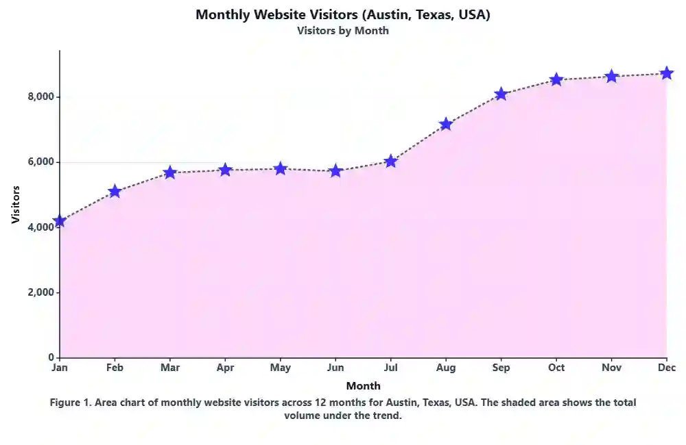
Monthly visitors to a US small-business blog rose from 4,120 in January to a peak of 9,540 in September, then eased to 8,200 by December. The area chart shows steady growth through the first three quarters, with the largest single jump between August and September (+2,010 visitors). Total visits for the year came to 78,300.
Example 2 · Rainfall
Weekly rainfall at a Pacific Northwest gauge peaked at 61 mm in week 7 and fell to a trough of 12 mm in week 20. The filled area highlights a wet early season followed by a dry mid-summer, with the area under the curve summarising a seasonal total of 742 mm across the 26-week window.
Example 3 · Daily active users
Daily active users of a mobile app climbed from 1,050 to 3,400 over 30 days. The step-style area chart makes each day-to-day change easy to read, and the mean line (2,180 users) shows the app crossed its average on day 14 and stayed above it for the rest of the month.
Example 4 · Sales revenue
Quarterly revenue for a Texas retailer grew across all four quarters, from $210k to $355k, giving an annual total (area under the curve) of $1.14M. Q4 contributed the largest share at 31% of the year, matching the holiday season.
Example 5 · Temperature
Average monthly temperature followed a clear seasonal arc, rising from 4 °C in January to a peak of 29 °C in July before cooling again. The symmetric area highlights the summer bulge, and the point-to-point change column flags the fastest warming between March and April (+6 °C).
Example 6 · Energy use
Household electricity use over 12 months formed a U-shaped area, high in winter and summer and low in spring and autumn. The two peaks (890 kWh in January, 810 kWh in July) reflect heating and cooling demand, while the annual total of 7,540 kWh matched the utility bill.
How to Use This Tool
- Type a series name and a source name at the top so your chart and download are labelled.
- Keep the Paste values tab active and enter your numbers separated by commas, for example 52, 48, 55, 61, 47.
- Optional: add matching labels (like months or weeks) in the labels box, one per value.
- Prefer a file? Switch to Upload CSV, pick your file, then choose the value column and an optional label column.
- Not sure what to enter? Choose one of the ten sample datasets and click Load sample data.
- Click Generate Plot and Results to draw the area chart and fill every section below.
- Open Plot Options under the chart to edit colours, fonts, markers, the curve style, the fill, and the axis frame.
- Turn on the mean line or peak and trough markers if you want to highlight key points.
- Type a figure caption; it is drawn right onto the chart so it stays with your exported image.
- Download the figure as PNG, JPEG, or WebP, and download the results table as a text file.
When to Use / When Not to Use an Area Chart
✅ When to Use
- You are showing one value that changes over an ordered sequence such as time.
- You want to stress the total volume or magnitude under the trend, not just its path.
- Your data has a natural zero baseline (counts, amounts, rainfall, revenue).
- You want a single, clean figure for a report, dashboard, or paper.
- The story is about how much accumulated, like total visits or total rainfall.
❌ When Not to Use
- Comparing many series at once: overlapping fills hide each other, so use a line chart.
- Categories with no order (product types, regions): use a bar chart instead.
- Showing precise values point by point: a line or dot chart is easier to read.
- Data that can go far below zero and back: the fill becomes confusing, so use a line chart.
- Showing parts of a whole at one moment: use a pie or stacked bar chart.
Assumptions & Limitations of an Area Chart
Ordered x-axis
An area chart assumes the points sit in a meaningful order, usually time. If the order is random, the filled shape has no real meaning and can mislead readers.
Single series works best
One filled series reads clearly. Stack or overlap several and the fills start hiding one another, which defeats the purpose of the chart.
Baseline matters
The area is measured from the baseline up. When values can be negative, the fill above and below zero can look odd, so a plain line chart is often safer.
Even spacing for the area
The area under the curve here uses equal spacing between points (Δx = 1). If your real x-values are unevenly spaced, treat the AUC as a relative guide, not an exact integral.
Smoothing can mislead
The smooth curve option makes the chart look polished, but it can invent gentle bumps between points that are not in the raw data. Use straight or step style when accuracy matters most.
8. Conclusion
An area chart is one of the simplest ways to turn a plain list of numbers into a clear story about change and volume. Keep it to a single, well-ordered series, label the axes plainly, and let the filled area carry the message of how much. With the editable options in this tool, you can match your journal or brand style and export a figure that is ready to drop straight into a paper, a report, or a slide.
9. Frequently Asked Questions
The questions people most often ask about area charts on Google, answered in full.
What is an area chart?
An area chart is a line chart with the space between the line and the x-axis filled with colour. It shows how a single value changes across an ordered sequence such as time, and the shaded area helps readers see both the trend and the overall volume at a glance.
What is an area chart used for?
Area charts are used to show change over time when the total volume matters, for example website traffic, rainfall, sales revenue, temperature, or energy use. The filled area draws the eye to how much has accumulated, not just the direction of the line.
What is the difference between a line chart and an area chart?
They plot the same data, but an area chart fills the space under the line. A line chart is best when you only care about the path or you are comparing several series. An area chart is best for a single series where you want to emphasise magnitude or cumulative volume.
How do I make an area chart from a list of numbers?
Paste your numbers separated by commas, such as 52, 48, 55, 61, 47, then click Generate Plot and Results. The tool plots the values in order, fills the area under the line, and builds a results table you can download.
Can I upload a CSV to build an area chart?
Yes. Open the Upload CSV tab, choose a .csv or .txt file, then pick the value column from the dropdown. You can also select a label column for the x-axis. The chart and table refresh from the columns you choose.
How is the area under the curve calculated?
The tool uses the trapezoidal rule. It treats each pair of neighbouring points as a trapezoid, averages their heights, multiplies by the spacing, and sums every piece. With equally spaced points the spacing is one unit, so the area is a clean running total of the trend.
Should the y-axis start at zero?
For area charts, yes, in most cases. Because the fill is measured from the baseline up, a non-zero baseline can exaggerate or shrink the area and mislead readers. You can set a custom Y minimum in the options, but a zero baseline is the honest default.
What is a stacked area chart?
A stacked area chart layers several series on top of each other so the total and each part are visible. It works for a few related series that add up to a whole. This tool focuses on a single, clean area series for clarity and publication use.
Can an area chart show negative values?
It can, but it is not ideal. When values dip below zero, the fill crosses the baseline and the shape gets hard to read. If your data swings well below zero, a plain line chart usually tells the story more clearly.
How many data points can I plot?
You can plot anything from a handful of points to a few hundred. With many points, turn off the markers and use a thin line so the filled trend stays clean. The tool keeps the axis labels readable by spacing out ticks automatically.
What is the best fill opacity for an area chart?
A fill opacity around 30 to 40 percent usually looks good. It is dark enough to read as volume but light enough to keep the line and grid visible. For print, a slightly lighter fill often reproduces better.
Should I smooth an area chart?
Smoothing looks polished but can invent bumps between points that are not in your data. Use straight lines when accuracy matters, step style for counts that change at set moments, and smooth only when the underlying trend is truly continuous.
How do I export my area chart as an image?
Click PNG, JPEG, or WebP below the chart. The tool saves the figure at the export width and height you set in the options, with your title, caption, colours, and axis frame baked in, ready for a report, paper, or slide.
Is this area chart maker free?
Yes, it is fully free with no sign-up. Everything runs in your browser, so your numbers stay on your own device and nothing is uploaded to a server.
Can I add labels like months to the x-axis?
Yes. In the Paste values tab, enter your labels in the second box, one per value, for example Jan, Feb, Mar. In the Upload CSV tab, pick a label column. Leave both empty to number the points 1, 2, 3, and so on.
What does the cumulative column mean?
The cumulative column is a running total. Each row adds its own value to the sum of all rows before it, so the last row equals the grand total of the series. It is handy for tracking totals like year-to-date visits or revenue.
How do I mark the highest and lowest points?
Tick the Mark peak and trough box in the plot options. The tool highlights the largest and smallest values with labelled markers so readers can spot the extremes without reading every number.
Can I use an area chart for percentages?
Yes, if the percentage is one series changing over time, such as a monthly conversion rate. If you are splitting a single total into parts, a pie or stacked bar chart is usually a better fit than an area chart.
Why does my area chart look jagged?
Jagged edges usually mean real, sharp changes between points, which is fine. If it looks noisy, you can widen the spacing, reduce markers, or apply light smoothing. Do not over-smooth, since that hides the true shape of your data.
What is the difference between an area chart and a histogram?
An area chart shows one value across an ordered sequence like time, with a continuous filled line. A histogram shows how often values fall into bins and uses separate bars. Use an area chart for trends and a histogram for the shape of a distribution.
10. References
- Tufte, E. R. (2001). The Visual Display of Quantitative Information. edwardtufte.com
- Cleveland, W. S., & McGill, R. (1984). Graphical Perception. Journal of the American Statistical Association. doi.org/10.1080/01621459.1984.10478080
- Few, S. (2012). Show Me the Numbers: Designing Tables and Graphs to Enlighten. perceptualedge.com
- Wilkinson, L. (2005). The Grammar of Graphics (2nd ed.). Springer. doi.org/10.1007/0-387-28695-0
- Wickham, H. (2016). ggplot2: Elegant Graphics for Data Analysis. Springer. doi.org/10.1007/978-3-319-24277-4
- Heer, J., Bostock, M., & Ogievetsky, V. (2010). A Tour Through the Visualization Zoo. ACM Queue. doi.org/10.1145/1794514.1805128
- Munzner, T. (2014). Visualization Analysis and Design. CRC Press. doi.org/10.1201/b17511
- Cairo, A. (2016). The Truthful Art: Data, Charts, and Maps for Communication. New Riders. thefunctionalart.com
- Kelleher, C., & Wagener, T. (2011). Ten guidelines for effective data visualization. Environmental Modelling & Software. doi.org/10.1016/j.envsoft.2010.12.006
- Healy, K. (2018). Data Visualization: A Practical Introduction. Princeton University Press. socviz.co
- Robbins, N. B. (2005). Creating More Effective Graphs. Wiley. doi.org/10.1002/9780470142391
- Wong, B. (2011). Points of view: Color blindness. Nature Methods. doi.org/10.1038/nmeth.1618
- Atkinson, K. E. (1989). An Introduction to Numerical Analysis (trapezoidal rule). Wiley. doi.org/10.1002/9781118626801
- Press, W. H., et al. (2007). Numerical Recipes (3rd ed.). Cambridge University Press. numerical.recipes
- Playfair, W. (1801). The Commercial and Political Atlas. doi.org/10.1017/CBO9780511709692
- Harris, R. L. (1999). Information Graphics: A Comprehensive Illustrated Reference. Oxford University Press. global.oup.com
- Ware, C. (2020). Information Visualization: Perception for Design (4th ed.). Morgan Kaufmann. doi.org/10.1016/C2016-0-02395-1
- Borland, D., & Taylor, R. M. (2007). Rainbow color map (still) considered harmful. IEEE CG&A. doi.org/10.1109/MCG.2007.323435
- Brewer, C. A. (1994). Color use guidelines for mapping and visualization. doi.org/10.1016/B978-0-08-042415-6.50014-4
- Matplotlib documentation: stackplot and fill_between for area charts. matplotlib.org