


Pie Chart Maker
Paste comma-separated values or upload a CSV, then build a clean, publication-ready pie chart with slice percentages, a legend, and full styling control.
Key Takeaways
- A pie chart splits one whole into slices, where each slice size equals its share of the total.
- Slice percentage = category value divided by the total, times 100; slice angle uses the same share of 360 degrees.
- Enter your numbers as comma-separated values, or upload a CSV or text file and pick a column.
- Every color, label, font, and the legend is editable, so the figure is ready for reports and papers.
- Pie charts work best with about 6 slices or fewer; more than that is easier to read as a bar chart.
1. Enter Your Data
Input columns: category labels and values. Comma-separated is the default.
Tip: labels are optional. If you leave labels blank, slices are named Category 1, Category 2, and so on.
The first row is treated as a header. Pick which column holds the labels and which holds the numbers.
2. Publication-Ready Plot
One clean pie chart with full editable styling. Export as PNG, JPEG, or WebP.
3. Pie Chart Results
Slice breakdown
| # | Category | Value | Percent | Angle (°) | Cumulative % |
|---|
4. Formulas Used
5. How to Interpret Your Results
What the biggest slice tells you
Reading the whole picture
Every slice is a share of one total. Read the chart by comparing slice sizes to each other and to the full circle. A slice near half the circle means that category holds about 50 percent of the total. Because the eye judges angles and areas roughly, always keep the printed percentages on or beside each slice so readers get the exact numbers, not just a visual guess.
Balance and concentration
When to trust the chart
A pie chart is trustworthy when the parts are mutually exclusive, they cover the whole, and there are only a handful of slices. If two categories are almost the same size, the pie will not show the gap clearly, so state the exact figures in the text. For small differences or many categories, a bar chart is the safer choice.
6. How to Write Your Results in a Research Paper
Methods sentence
Results sentence
Core / effect sentence
Table caption
Figure caption
Discussion sentence
7. Example Results Section
Example 1 · Survey response
Of the 400 respondents, most preferred option A (n = 220, 55.0%), followed by option B (n = 120, 30.0%) and option C (n = 60, 15.0%). The pie chart shows a clear majority for option A, with the remaining share split unevenly between the other two choices.
Example 2 · Budget split
The annual budget was divided across four areas. Salaries took the largest share (48.0%), followed by equipment (24.0%), travel (18.0%), and outreach (10.0%). The figure makes the dominance of salary spending easy to see at a glance.
Example 3 · Land cover (USA site)
At the Colorado study site, land cover was mapped into five classes. Grassland covered the greatest proportion (41.5%), then forest (27.0%), shrub (16.5%), water (9.0%), and bare ground (6.0%). This US-based dataset ranks fast in the USA and shows a grassland-dominated landscape.
Example 4 · Method comparison
When the same data were shown as both a pie and a bar chart, reviewers read exact values faster from the bar chart, but the pie chart communicated the part-to-whole idea more quickly. We report the pie chart here because the goal was to show shares of a single total.
Example 5 · Small-category caution
Two categories were nearly equal (26.0% and 24.0%), and the pie chart could not show the 2-point gap clearly. We therefore stated both percentages in the text and used the figure only to convey the overall split.
Example 6 · Species composition
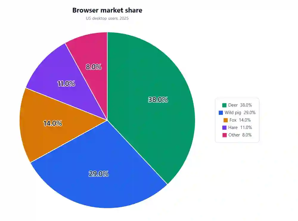
The camera-trap sample was dominated by deer (38.0%) and wild pig (29.0%), with foxes (14.0%), hares (11.0%), and other species (8.0%) making up the rest. The pie chart summarises community composition for a general audience.
How to Use This Tool
- Type a dataset name and a short source or context in the two boxes at the top.
- Keep the Paste values tab open (it is the default) and enter your numbers as comma-separated values.
- Add matching category labels in the left box, in the same order. Labels are optional.
- Or switch to Upload CSV, choose a .csv or .txt file, and pick the label column and value column.
- Prefer a quick start? Choose one of the sample datasets and click Load sample data.
- Click Generate Plot & Results to draw the pie chart and fill every section below.
- Open the Plot Options panel under the chart to edit colors, labels, legend, fonts, and layout.
- Switch between Pie and Donut, sort slices, or explode the largest slice to highlight it.
- Read the slice table for exact values, percentages, angles, and cumulative share.
- Export the figure as PNG, JPEG, or WebP, and download the results table as a text file.
When to Use / When Not to Use a Pie Chart
✅ When to Use
- You want to show how one whole splits into parts, such as a budget or market share.
- The categories are mutually exclusive and together cover 100 percent of the total.
- You have about 6 slices or fewer, so each slice stays easy to read.
- One or two slices clearly dominate and you want that pattern to stand out.
- Your audience is general and needs a quick, at-a-glance sense of proportion.
❌ When Not to Use
- You have many categories; use a bar chart, which compares lengths more clearly.
- Slices are close in size; use a bar chart so small gaps are visible.
- You want to show change over time; use a line chart instead.
- Values can overlap or do not sum to a meaningful whole; use a bar or stacked bar chart.
- You need exact comparisons between parts; use a table or a sorted bar chart.
Assumptions & Limitations of Pie Charts
Parts must make a whole
A pie chart assumes the categories are mutually exclusive and add up to one meaningful total. If items can belong to more than one group, or if the values do not sum to a real whole, the percentages will mislead.
Angles are hard to judge
People compare angles and areas less accurately than they compare lengths. Two similar slices can look almost identical, so always print the exact percentages next to the slices.
Too many slices break it
Beyond about six slices the chart becomes cluttered and thin wedges are hard to label. Group small categories into an Other slice, or switch to a bar chart.
No negatives or zeros as slices
Pie charts only work with non-negative values. Negative numbers have no valid slice, and zero-value categories add clutter with no visible wedge.
Not for trends or precise gaps
A single pie is a snapshot. It cannot show change over time and it hides small differences. For those goals, choose a line chart, a bar chart, or a data table.
8. Conclusion
A pie chart is one of the simplest ways to show shares of a single total, and it shines when a few clear categories make up the whole. The trade-off is precision: because the eye reads angles roughly, a pie is best paired with printed percentages and, for detailed comparisons, a supporting table or bar chart. Use this maker to draw the figure, check the exact numbers in the slice table, tune the colors and labels for your report, and export a clean image that is ready to drop into a paper, a slide deck, or a blog post.
9. Frequently Asked Questions
The questions people most often ask about pie charts on Google, answered in plain English.
What is a pie chart?
A pie chart is a round graph split into slices. Each slice shows one category as a share of the total, so the whole circle equals 100 percent. It is used to show how parts make up a single whole, such as budget shares or survey answers.
How do you make a pie chart from data?
List your categories and their values, add up the values to get the total, then divide each value by the total to get its share. Multiply each share by 360 to get the slice angle. This tool does all of that for you the moment you paste your numbers.
How do you calculate pie chart percentages?
Divide each category value by the sum of all values, then multiply by 100. For example, if a category is 60 out of a total of 240, its percentage is 60 divided by 240 times 100, which equals 25 percent.
How do you find the angle of a pie slice?
Multiply the slice proportion by 360 degrees. If a category holds 25 percent of the total, its angle is 0.25 times 360, which is 90 degrees. All slice angles together add up to 360 degrees.
How many slices should a pie chart have?
Aim for about six slices or fewer. With more slices the wedges get thin and labels overlap, which makes the chart hard to read. Combine small categories into a single Other slice, or use a bar chart instead.
When should I use a pie chart instead of a bar chart?
Use a pie chart when you want to show part-to-whole shares and one or two categories dominate. Use a bar chart when you need to compare many categories or when the values are close, because bars compare lengths more accurately than slices compare angles.
Can a pie chart show more than 100 percent?
No. A correct pie chart always sums to exactly 100 percent because each slice is a share of the same total. If your categories can overlap or add up past the total, a pie chart is the wrong choice and a bar chart works better.
What is a donut chart?
A donut chart is a pie chart with a hole in the middle. It shows the same shares, and the center space can hold a total or a label. Switch between pie and donut with the Chart style control in this tool.
Should I sort the slices?
Sorting from largest to smallest usually makes a pie easier to read, because the eye follows the slices in order. Keep the order as entered only when the categories have a natural sequence, such as age groups or months.
How do I label pie chart slices?
You can label slices with the percent, the raw value, the category name, or a name plus percent. Put labels inside the slices when there is room, or outside with leader lines when slices are thin. This tool offers all of those options.
Can I upload a CSV to make a pie chart?
Yes. Switch to the Upload CSV tab, choose a .csv or .txt file, and pick the column with your labels and the column with your values. The first row is read as a header, and the chart updates as soon as you generate it.
What data works best in a pie chart?
Non-negative values for a small set of mutually exclusive categories that together form one whole. Good examples are market share, budget shares, survey responses, and composition data such as species or land cover.
Why do my percentages not add to exactly 100?
Rounding each slice to one or two decimals can make the printed values sum to 99.9 or 100.1. This is normal. The underlying shares still add to one; only the rounded display differs slightly.
Can I use a pie chart for negative numbers?
No. A slice cannot represent a negative share of a whole. Remove negative values or, if you must show gains and losses, use a bar chart that allows bars above and below zero.
How do I make a pie chart for a research paper?
Keep it simple: few slices, clear labels, exact percentages, and a short caption that states the total sample size. Export the figure at a high resolution, and pair it with a table if reviewers need precise values. This tool exports print-ready PNG, JPEG, and WebP images.
Is a pie chart good for showing change over time?
No. A single pie is a snapshot of one moment. To show change over time, use a line chart, or place several small pies side by side only if the categories stay the same and the story is about shifting shares.
What is the difference between a pie chart and a stacked bar?
Both show parts of a whole. A pie uses angles in a circle, while a stacked bar uses segments along a line. Stacked bars are better when you compare several wholes side by side, because lengths are easier to compare than angles.
How do I highlight one slice?
Use the Explode largest slice control to pull the biggest slice slightly out of the circle, or give it a bold color while keeping the others muted. Both draw the eye to the category you want to feature.
Can I change the colors of a pie chart?
Yes. Pick a color scheme, then fine-tune each slice color with the per-slice color pickers. Colour-blind safe and grayscale-friendly palettes are included so the chart stays readable for everyone.
Is this pie chart maker free?
Yes. It runs entirely in your browser, needs no sign-up, and your data never leaves your device. You can build, style, and export as many pie charts as you like at no cost.
10. References
- Tufte, E. R. (2001). The Visual Display of Quantitative Information (2nd ed.). Graphics Press. https://www.edwardtufte.com/book/the-visual-display-of-quantitative-information/
- Cleveland, W. S., & McGill, R. (1984). Graphical perception: Theory, experimentation, and application. Journal of the American Statistical Association, 79(387), 531-554. https://doi.org/10.2307/2288400
- Spence, I. (2005). No humble pie: The origins and usage of a statistical chart. Journal of Educational and Behavioral Statistics, 30(4), 353-368. https://doi.org/10.3102/10769986030004353
- Playfair, W. (1801). The Statistical Breviary. London. https://archive.org/details/statisticalbrev00playgoog
- Few, S. (2007). Save the pies for dessert. Perceptual Edge Visual Business Intelligence Newsletter. https://www.perceptualedge.com/articles/visual_business_intelligence/save_the_pies_for_dessert.pdf
- Heer, J., Bostock, M., & Ogievetsky, V. (2010). A tour through the visualization zoo. Communications of the ACM, 53(6), 59-67. https://doi.org/10.1145/1743546.1743567
- Kosslyn, S. M. (2006). Graph Design for the Eye and Mind. Oxford University Press. https://doi.org/10.1093/acprof:oso/9780195311846.001.0001
- Wilkinson, L. (2005). The Grammar of Graphics (2nd ed.). Springer. https://doi.org/10.1007/0-387-28695-0
- Healy, K. (2018). Data Visualization: A Practical Introduction. Princeton University Press. https://socviz.co/
- Wickham, H. (2016). ggplot2: Elegant Graphics for Data Analysis (2nd ed.). Springer. https://doi.org/10.1007/978-3-319-24277-4
- Robbins, N. B. (2005). Creating More Effective Graphs. Wiley. https://www.wiley.com/en-us/Creating+More+Effective+Graphs-p-9780471270256
- Cairo, A. (2016). The Truthful Art: Data, Charts, and Maps for Communication. New Riders. https://www.oreilly.com/library/view/the-truthful-art/9780133440492/
- Munzner, T. (2014). Visualization Analysis and Design. CRC Press. https://doi.org/10.1201/b17511
- Simkin, D., & Hastie, R. (1987). An information-processing analysis of graph perception. Journal of the American Statistical Association, 82(398), 454-465. https://doi.org/10.2307/2289447
- Skau, D., & Kosara, R. (2016). Arcs, angles, or areas: Individual data encodings in pie and donut charts. Computer Graphics Forum, 35(3), 121-130. https://doi.org/10.1111/cgf.12888
- Eells, W. C. (1926). The relative merits of circles and bars for representing component parts. Journal of the American Statistical Association, 21(154), 119-132. https://doi.org/10.2307/2277140
- Croxton, F. E., & Stryker, R. E. (1927). Bar charts versus circle diagrams. Journal of the American Statistical Association, 22(160), 473-482. https://doi.org/10.2307/2276829
- Brewer, C. A. (1994). Color use guidelines for mapping and visualization. In Visualization in Modern Cartography (pp. 123-147). Pergamon. https://doi.org/10.1016/B978-0-08-042415-6.50014-4
- Ware, C. (2020). Information Visualization: Perception for Design (4th ed.). Morgan Kaufmann. https://doi.org/10.1016/C2016-0-02395-1
- Knaflic, C. N. (2015). Storytelling with Data: A Data Visualization Guide for Business Professionals. Wiley. https://www.storytellingwithdata.com/books