


Density Plot Maker
Turn a list of numbers into a smooth, publication-ready kernel density curve. Paste comma-separated values or upload a CSV, then style and download one clean plot.
Key Takeaways
- A density plot shows the shape of your data as one smooth curve, so peaks, spread, and skew are easy to read.
- The curve is built with kernel density estimation (KDE) using a Gaussian kernel and Silverman's bandwidth rule.
- Paste values like 52, 48, 55, 61, 47, ... or upload a CSV and pick a column. The group name is fully editable.
- Every color, font, line, and the bandwidth are adjustable, so the figure is ready for a research paper or report.
- Export the finished plot as PNG, JPEG, or WebP in one click. No sign-up, no install, works in your browser.
1. Enter Your Data
Enter one numeric variable. Comma-separated is the default. You can also upload a CSV and select the column.
2. Publication-Ready Plot
One clean density figure with full editable styling.
3. Density Results
Summary statistics
| Statistic | Value | Statistic | Value |
|---|
4. Formulas Used
5. How to Interpret Your Results
Where the data piles up
Shape and symmetry
Spread and tails
One peak or many
Reading the y-axis
The height of a density curve is not a count or a percent. It is a density, so the total area under the whole curve equals 1. To get a probability, read the area between two x-values, not the height at a single point. A taller peak simply means values cluster more tightly in that region.
6. How to Write Your Results in a Research Paper
Methods sentence
Results sentence
Shape / distribution sentence
Table caption
Figure caption
Discussion sentence
7. Example Results Section
Example 1 · Single sample
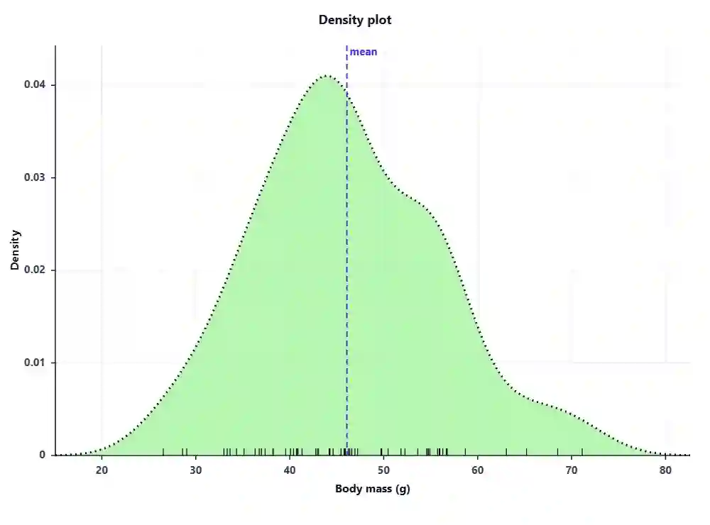
Body mass of 60 meadow voles from a Midwest USA grassland was summarised with a kernel density plot. The distribution was unimodal and slightly right-skewed (mean = 48.2 g, median = 47.1 g, SD = 9.4 g), with most animals between 40 and 56 g and a thin tail of heavier individuals above 65 g.
Example 2 · Group comparison
Density curves of leaf nitrogen were compared between shade and sun plots. The sun group peaked near 2.8% while the shade group peaked near 2.1%, and the two curves overlapped only slightly, suggesting a clear difference in central tendency worth testing formally.
Example 3 · Seasonal / temporal
Daily rainfall density shifted across seasons. The wet-season curve was broad with a long right tail (a few very heavy days), whereas the dry-season curve was narrow and tall near zero, showing that most dry-season days had little or no rain.
Example 4 · Method comparison
Two measuring methods gave nearly identical density shapes for the same fish lengths, with matching peaks near 18 cm and similar spread. The overlap indicated good agreement between calipers and image analysis.
Example 5 · Sample-size sensitivity
With only 15 observations the density curve looked bumpy and hard to read; after adding data to 120 observations the same variable produced a smooth single peak. This shows that density plots stabilise as sample size grows.
Example 6 · Bimodal signal
Adult and juvenile body sizes together produced a clearly bimodal density curve with two peaks near 22 g and 46 g. The two humps flagged a mixed population that a single mean would have hidden.
How to Use This Tool
- Type a clear group or variable name and a dataset name in the two boxes at the top.
- Keep the Paste values tab selected and type your numbers separated by commas, like 52, 48, 55, 61, 47.
- Prefer a file? Click Upload CSV, choose a .csv or .txt file, then pick the value column.
- Not ready with data? Pick one of the ten built-in samples and click Load sample data.
- Click Generate Plot & Results to draw the density curve and fill every section below.
- Open Plot Options under the figure to change colors, fonts, line style, and the bandwidth.
- Use the bandwidth slider to smooth or sharpen the curve until the shape reads clearly.
- Turn the mean line, median line, rug marks, fill, and grid on or off to suit your journal style.
- Type a figure caption; it prints under the plot and stays in the downloaded image.
- Export the finished figure as PNG, JPEG, or WebP, and download the summary statistics as a .txt file.
When to Use / When Not to Use a Density Plot
✅ When to Use
- You have one continuous numeric variable and want to see its shape.
- You want to compare the spread of two or more groups on the same scale.
- You need a smooth figure that does not depend on histogram bin choices.
- You want to spot skew, multiple peaks, or outlier tails quickly.
- You are preparing a clean distribution figure for a paper or report.
❌ When Not to Use
- Your variable is categorical, use a bar chart instead.
- You must show exact counts per bin, use a histogram.
- You have very few points (under about 10), report raw values or a dot plot.
- Data is strictly bounded (like 0 to 1 proportions), a KDE can leak past the limit; use a bounded method or histogram.
- You need to compare two paired measurements, use a scatter plot or Bland-Altman plot.
Assumptions & Limitations of the Density Plot
Bandwidth changes the story
The smoothness depends entirely on the bandwidth. Too small and the curve looks noisy, too large and it hides real peaks. Always report the bandwidth rule you used.
Continuous data only
KDE assumes the underlying variable is continuous. Counts, ranks, and categories can produce a misleading smooth shape.
Boundary bias
Near natural limits (zero, 100%, or a physical minimum) the curve can spread past the boundary, showing density where no data can exist.
Small samples are unstable
With few observations the curve wobbles and each point has a large effect. Density plots are most trustworthy with a few dozen values or more.
Not a probability at a point
The y-axis is density, not probability. Only areas under the curve give probabilities, so never read a single height as a chance.
8. Conclusion
A density plot is one of the fastest ways to understand a single variable before you run any formal test. It turns a messy list of numbers into a shape you can describe in plain words: where the data centres, how wide it spreads, whether it leans left or right, and whether one group is hiding inside another. Because the curve does not depend on bin edges, it is easy to lay two groups side by side and compare them honestly. Use it as a first look, pair it with summary statistics, and always state the bandwidth rule so a reader can reproduce your figure. When you are ready, export the plot and drop it straight into your manuscript, poster, or report.
9. Frequently Asked Questions
The questions people most often ask about density plots on Google, answered in full.
What is a density plot?
A density plot is a smooth curve that shows how the values of one numeric variable are spread out. Instead of grouping data into bars like a histogram, it uses kernel density estimation to draw a continuous shape. The peaks show where values cluster, and the width shows the spread. It is a clear, clean way to see the distribution of your data.
How do I make a density plot online for free?
Paste your comma-separated numbers or upload a CSV file and choose the value column. Then click Generate. This free density plot maker draws a smooth curve right in your browser, lets you edit colors, fonts, and bandwidth, and exports the figure as PNG, JPEG, or WebP. No sign-up or software install is needed.
What is kernel density estimation (KDE)?
Kernel density estimation is the method behind a density plot. It places a small smooth bump (a kernel) over every data point and adds them all up to form one continuous curve. The result estimates the probability density of the variable. This tool uses a Gaussian kernel, which is the most common choice.
What is bandwidth in a density plot?
Bandwidth is the setting that controls how smooth the curve is. A small bandwidth hugs the data and can look bumpy, while a large bandwidth is smoother but can hide real features. This tool starts with Silverman's rule as a sensible default and gives you a slider to fine-tune it.
Density plot vs histogram, which should I use?
A histogram shows raw counts in bins, while a density plot shows a smooth estimated shape. Density plots are great for comparing groups and do not depend on bin choice, but histograms are better when you need exact counts. Many researchers show a histogram with a density curve on top.
Why does the total area under a density curve equal 1?
A density curve represents a probability distribution, and all probabilities must add up to 1. So the whole area under the curve is scaled to exactly 1. This is why the y-axis is called density, not count. To get a probability you read the area between two x-values, not the height at one point.
What does a bimodal density plot mean?
A bimodal density plot has two clear peaks. It usually means your data is a mix of two groups, for example juveniles and adults, or two machines with different settings. Two humps are a signal to split the data and look at each group on its own, because a single average would hide the pattern.
How many data points do I need for a density plot?
There is no strict rule, but density plots become stable and trustworthy with a few dozen values or more. With fewer than about ten points the curve wobbles and can mislead. For very small samples, a dot plot or the raw numbers are safer.
What is a good bandwidth value?
A good bandwidth is one where the curve looks smooth but still shows real peaks. Silverman's rule gives a solid starting point. If the curve looks noisy, raise the bandwidth multiplier; if it looks too flat and hides detail, lower it. Always report which rule you used.
Can a density plot show skewness?
Yes. If the curve has a long tail to the right, the data is right-skewed (positive skew). A long tail to the left means left-skew. A curve that is roughly a mirror image around its peak is symmetric. This tool also prints a numeric skewness value to confirm what the shape shows.
What kernel does this tool use?
This tool uses a Gaussian (normal) kernel, which gives a smooth, well-behaved curve and is the standard choice in most statistics software. The Gaussian kernel weights nearby points more heavily than distant ones, so the density falls off gently on each side of every data point.
How do I read the y-axis of a density plot?
The y-axis shows density, which measures how tightly values cluster at each x-value. It is not a count or a percentage. A higher curve means more data is packed into that region. To turn density into a probability, measure the area under the curve between two x-values.
Can I compare two groups on a density plot?
Yes, comparing groups is one of the best uses of density plots. Because each curve is scaled to an area of 1, groups of different sizes can be compared fairly on the same axis. Overlapping curves suggest similar distributions, while separated peaks suggest a real difference worth testing.
Is a density plot the same as a probability density function?
They are closely related. A probability density function (PDF) is the true, theoretical curve for a variable. A density plot is an estimate of that PDF built from your sample data using KDE. With more data, the estimated density plot gets closer to the true PDF.
What is Silverman's rule of thumb?
Silverman's rule is a simple formula for choosing a good bandwidth automatically. It uses the standard deviation, the interquartile range, and the sample size to balance smoothness and detail. It works well for roughly bell-shaped data and is a trusted default in many statistics packages.
Can I export the density plot for my paper?
Yes. Once the figure looks right, click PNG, JPEG, or WebP to download it. You can set the export width and height for high resolution, and the figure caption you type is baked into the image, so it is ready to drop straight into a manuscript or slide.
Why does my density curve go below zero on the x-axis?
A Gaussian KDE can spread a little past the smallest and largest data values, because each kernel has tails. If your variable cannot be negative, this is a display effect called boundary bias, not real data. Lower the bandwidth or trim the axis range to reduce it.
Does the density plot handle decimals and negative numbers?
Yes. The tool accepts any real numbers, including decimals and negatives. It simply ignores blank cells and non-numeric text. So temperatures, z-scores, log values, and measurements with decimals all work fine.
How do I report a density plot in APA style?
Describe the shape in words, give the mean, median, and standard deviation, and reference the figure. For example: "Scores were unimodal and slightly right-skewed (M = 48.2, Mdn = 47.1, SD = 9.4); see Figure 1." State the kernel and bandwidth rule in your methods so the figure is reproducible.
Is this density plot maker really free?
Yes, it is completely free with no sign-up, no watermark, and no install. Your data stays in your browser and is never uploaded to a server. You can generate, restyle, and export as many density plots as you like.
10. References
- Silverman, B. W. (1986). Density Estimation for Statistics and Data Analysis. Chapman and Hall. https://doi.org/10.1201/9781315140919
- Scott, D. W. (2015). Multivariate Density Estimation: Theory, Practice, and Visualization (2nd ed.). Wiley. https://doi.org/10.1002/9781118575574
- Sheather, S. J., & Jones, M. C. (1991). A reliable data-based bandwidth selection method for kernel density estimation. JRSS-B, 53(3), 683-690. https://doi.org/10.1111/j.2517-6161.1991.tb01857.x
- Rosenblatt, M. (1956). Remarks on some nonparametric estimates of a density function. Annals of Math. Stat., 27(3), 832-837. https://doi.org/10.1214/aoms/1177728190
- Parzen, E. (1962). On estimation of a probability density function and mode. Annals of Math. Stat., 33(3), 1065-1076. https://doi.org/10.1214/aoms/1177704472
- Wand, M. P., & Jones, M. C. (1994). Kernel Smoothing. Chapman and Hall. https://doi.org/10.1201/b14876
- Wilkinson, L. (2005). The Grammar of Graphics (2nd ed.). Springer. https://doi.org/10.1007/0-387-28695-0
- Hyndman, R. J. (1996). Computing and graphing highest density regions. The American Statistician, 50(2), 120-126. https://doi.org/10.1080/00031305.1996.10474359
- Jones, M. C., Marron, J. S., & Sheather, S. J. (1996). A brief survey of bandwidth selection for density estimation. JASA, 91(433), 401-407. https://doi.org/10.1080/01621459.1996.10476701
- Botev, Z. I., Grotowski, J. F., & Kroese, D. P. (2010). Kernel density estimation via diffusion. Annals of Statistics, 38(5), 2916-2957. https://doi.org/10.1214/10-AOS799
- Tukey, J. W. (1977). Exploratory Data Analysis. Addison-Wesley. https://archive.org/details/exploratorydataa0000tuke
- Wickham, H. (2016). ggplot2: Elegant Graphics for Data Analysis. Springer. https://doi.org/10.1007/978-3-319-24277-4
- R Core Team (2024). density: Kernel Density Estimation. R stats documentation. https://stat.ethz.ch/R-manual/R-devel/library/stats/html/density.html
- Waskom, M. (2021). seaborn kdeplot documentation. https://seaborn.pydata.org/generated/seaborn.kdeplot.html
- SciPy community (2024). scipy.stats.gaussian_kde. https://docs.scipy.org/doc/scipy/reference/generated/scipy.stats.gaussian_kde.html
- Terrell, G. R., & Scott, D. W. (1992). Variable kernel density estimation. Annals of Statistics, 20(3), 1236-1265. https://doi.org/10.1214/aos/1176348768
- Chen, Y. C. (2017). A tutorial on kernel density estimation and recent advances. Biostatistics & Epidemiology, 1(1), 161-187. https://doi.org/10.1080/24709360.2017.1396742
- Deng, H., & Wickham, H. (2011). Density estimation in R. https://vita.had.co.nz/papers/density-estimation.pdf
- Hintze, J. L., & Nelson, R. D. (1998). Violin plots: a box plot-density trace synergism. The American Statistician, 52(2), 181-184. https://doi.org/10.1080/00031305.1998.10480559
- Freedman, D., & Diaconis, P. (1981). On the histogram as a density estimator. Z. Wahrscheinlichkeitstheorie, 57, 453-476. https://doi.org/10.1007/BF01025868