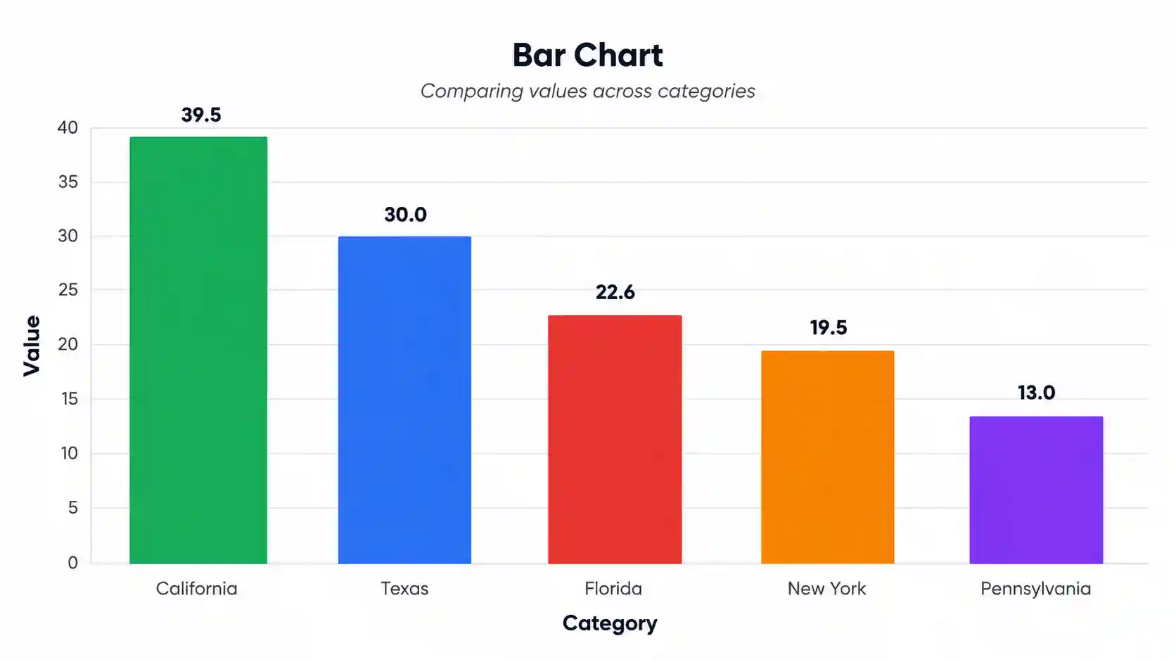
Bar Chart Generator
Create publication-ready bar graphs online — free, fast, and fully customizable. Perfect for research papers, theses, presentations, and reports.
📥 Data Input
Edit values directly in the table below — one row per bar.
⚙️ Plot Configuration
Chart Identity
Axis Labels
Bar Style
Color Palette
Data Labels & Errors
Fonts & Sizes
Sort Order
Export Settings
📈 Your Bar Chart
⬇️ Export Plot
Download your chart in any of these four formats — all publication-quality.
📊 Summary Statistics
📖 How to Read This Plot — Detailed Interpretation
What the Bar Chart Shows
Detailed Conclusion
📝 How to Write Your Results in Research
Five ready-to-paste write-ups in different academic styles — auto-filled from your live computed values.
🔬 Technical Details
Formula & Algorithm
A bar chart maps categorical values to rectangular bars whose height (or length) is directly proportional to the value represented. For a category i with value vi, the bar height hi is:
hi = (vi / vmax) × Hplot
Where:
- vi = value of category i
- vmax = maximum value (or the Y-axis maximum, whichever is greater)
- Hplot = plot area height in pixels
- hi = rendered bar height in pixels
Summary Statistics Computed
- Mean = Σ vi / n — average value across all categories
- Median = middle value when sorted (robust to outliers)
- SD = √[ Σ(vi − x̄)² / (n − 1) ] — sample standard deviation
- SE = SD / √n — standard error of the mean
- CV = (SD / mean) × 100% — coefficient of variation (relative dispersion)
- Range = max − min
- IQR = Q3 − Q1 — interquartile range
Libraries Used
Chart.js 4.4.0 · Chart.js DataLabels 2.2.0 · SheetJS 0.18.5 (xlsx). All rendering is client-side — no data leaves your browser.
📚 How to Use This Tool — Step-by-Step Guide
- Pick a sample dataset from the dropdown (e.g., "US States — Population") to see the tool in action immediately.
- Edit the group name in the first column — for example, change "California" to "Los Angeles" by clicking and typing.
- Paste your values into each bar's textarea using the format shown:
52, 48, 55, 61, 47. Multiple values are averaged automatically. - Add or remove bars with the "+ Add Bar" button or the red ✕ delete buttons.
- Switch separator to newline, space, or tab if your data uses a different delimiter.
- Upload your own file (CSV or Excel) and pick the column you want to visualize.
- Customize the chart — change colors, fonts, sort order, orientation, and titles in the configuration panel.
- Click "Generate Plot" to refresh all four visualizations with your new settings.
- Review the statistics table to see mean, median, SD, and CV for your data.
- Export as PNG, JPEG, WebP, or full TXT report ready for your paper or presentation.
✅ When to Use a Bar Chart (vs Alternatives)
✅ Use a Bar Chart when:
- You are comparing values across discrete categories (e.g., countries, species, treatments)
- Categories have no natural ordering or only ordinal ordering (e.g., low / medium / high)
- You want to show rankings from highest to lowest
- The data is summary values (means, totals, counts, percentages) — not raw observations
- You need a chart that non-technical readers can interpret instantly
❌ Don't use a bar chart when:
- Your X-axis is continuous (use a histogram or line chart instead)
- You want to show the full distribution of raw values (use box plot or violin plot)
- You have more than ~15 categories (use a horizontal bar chart, dot plot, or heatmap)
- You want to show change over time (use a line chart)
- You want to show part-to-whole at one point with very few categories (donut or pie can be cleaner)
Decision Tree
Is the X-axis categorical?
├── Yes → Are you comparing summary values?
│ ├── Yes → Bar chart ✓
│ └── No (raw data) → Box plot / violin plot
└── No (continuous) → Histogram / line chart
Real-World Use Cases (USA)
- Public health: Comparing flu vaccination rates across US states for the 2025–26 season.
- Wildlife ecology: Reporting white-tailed deer density across five US national forests.
- Business analytics: Quarterly revenue across the four major US e-commerce platforms.
❓ Frequently Asked Questions
What is a bar chart?
When should I use a bar chart?
How do I interpret a bar chart?
What sample size do I need for a bar chart?
How do I export my bar chart for publication?
What's the difference between a bar chart and a histogram?
How do I cite a bar chart in my paper?
Can I use this tool with my own data?
What file formats does the upload accept?
How do I make my bar chart colorblind-friendly?
📚 References
Selected references on bar chart design, data visualization, and statistical reporting.
- Tufte, E. R. (2001). The Visual Display of Quantitative Information (2nd ed.). Graphics Press. https://www.edwardtufte.com/book/the-visual-display-of-quantitative-information/
- Cleveland, W. S., & McGill, R. (1984). Graphical perception: Theory, experimentation, and application to the development of graphical methods. Journal of the American Statistical Association, 79(387), 531–554. https://doi.org/10.1080/01621459.1984.10478080
- Wilkinson, L. (2005). The Grammar of Graphics (2nd ed.). Springer. https://doi.org/10.1007/0-387-28695-0
- Wong, B. (2011). Color blindness. Nature Methods, 8(6), 441. https://doi.org/10.1038/nmeth.1618
- Few, S. (2012). Show Me the Numbers: Designing Tables and Graphs to Enlighten (2nd ed.). Analytics Press. https://www.perceptualedge.com/library.php
- Cairo, A. (2016). The Truthful Art: Data, Charts, and Maps for Communication. New Riders. https://www.peachpit.com/store/truthful-art-data-charts-and-maps-for-communication-9780321934079
- Healy, K. (2018). Data Visualization: A Practical Introduction. Princeton University Press. https://kieranhealy.org/publications/dataviz/
- Crameri, F., Shephard, G. E., & Heron, P. J. (2020). The misuse of colour in science communication. Nature Communications, 11, 5444. https://doi.org/10.1038/s41467-020-19160-7
- Cleveland, W. S. (1993). Visualizing Data. Hobart Press. https://www.stat.purdue.edu/~wsc/visualizing.html
- Heer, J., Bostock, M., & Ogievetsky, V. (2010). A tour through the visualization zoo. Communications of the ACM, 53(6), 59–67. https://doi.org/10.1145/1743546.1743567
- Chart.js Contributors. (2013–present). Chart.js [Computer software]. https://www.chartjs.org
- SheetJS LLC. (2012–present). SheetJS Community Edition [Computer software]. https://sheetjs.com
- American Psychological Association. (2020). Publication Manual of the American Psychological Association (7th ed.). https://apastyle.apa.org/products/publication-manual-7th-edition
- U.S. Census Bureau. (2024). State Population Totals: 2020–2024. https://www.census.gov/data/tables/time-series/demo/popest/2020s-state-total.html
- National Park Service. (2024). Wildlife Population Estimates. https://www.nps.gov/subjects/wildlife/index.htm