


Violin Plot Maker
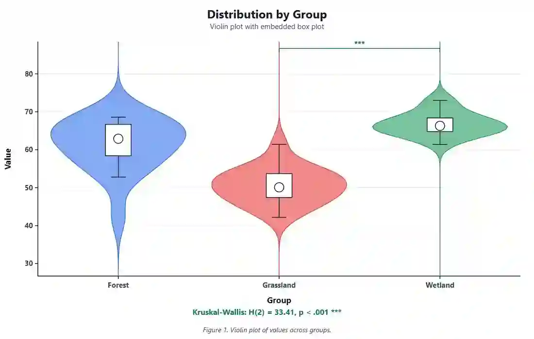
Turn your group data into a clean, publication-ready violin plot with an embedded box plot and an automatic significance test. Paste values or upload a CSV, edit every style option, and export a high-resolution image in one click.
Key Takeaways
- A violin plot shows the full distribution shape of each group, not just the average.
- The white box inside each violin is a standard box plot (median, quartiles, whiskers).
- Wider sections mean more data points sit at that value, so you can spot skew and extra peaks.
- This tool runs a built-in ANOVA or Kruskal-Wallis test and prints the p-value for you.
- Every colour, font, axis, and label is editable, so the figure is ready for a research paper.
1. Enter Your Data
Type a group name and paste its values as comma-separated numbers. Add as many groups as you need, or upload a CSV file.
Tip: pick one column of numbers and one column that names the group for each row.
2. Publication-Ready Plot
One violin plot, fully editable. Change any option below and the figure updates live.
3. Results
4. Formulas Used
5. How to Interpret Your Results
6. How to Write Your Results in a Research Paper
Copy any card and swap in your own wording. The numbers below fill from your data.
7. Example Results Section
How to Use This Tool
- Rename the first group and paste its values as comma-separated numbers.
- Click + Add group to add more groups, or remove any you do not need.
- Prefer a file? Open the Upload CSV tab and choose a .csv file.
- Pick your value column and group column, then click Use these columns.
- Press Generate Plot & Results to draw the violin plot.
- Open Plot Options and edit the title, colours, fonts, and axes.
- Turn the box plot, data points, or mean marker on or off as needed.
- Choose a significance test, or leave it on Auto.
- Type a figure caption; it prints on the image itself.
- Download a PNG, JPEG, or WebP and drop it straight into your paper.
When to Use and When Not to Use
✅ When to use a violin plot
- You compare a numeric measure across two or more groups.
- You want to show the full distribution shape, not just the mean.
- Your data may be skewed or have more than one peak.
- Each group has enough points (about 10 or more) to estimate a curve.
- You need one clean figure for a paper, poster, or report.
❌ When not to use it
- Very small samples (under about 8) - use a strip or dot plot instead.
- You only have counts or proportions - use a bar chart.
- You track a value over time - use a line chart.
- You compare two numeric variables - use a scatter plot.
- Your audience is unfamiliar with density curves - a box plot may be clearer.
Assumptions and Limitations
8. Conclusion
A violin plot is one of the most honest ways to show group data, because it reveals the shape hiding behind every average. When two groups share the same mean but one is skewed or split into two clusters, a bar chart hides that story while a violin plot puts it in plain sight. That extra detail helps reviewers trust your figure and helps readers understand your result at a glance. Use this violin plot maker to draft the figure, adjust the style to match your journal, run a quick significance test, and export a crisp image that is ready to publish. Everything runs in your browser, so your data stays private on your own device.
9. Frequently Asked Questions
What is a violin plot?
A violin plot is a chart that shows the distribution of a numeric variable for one or more groups. It looks like a box plot wrapped in a mirrored density curve. The curve shows where data points are dense, and the box inside shows the median and quartiles.
What is a violin plot used for?
It is used to compare the shape, spread, and centre of data across groups. Researchers use it when the mean alone is not enough, for example when data is skewed, has outliers, or has more than one peak that a bar chart would hide.
How do I read a violin plot?
Wider parts of the violin mean more data points fall at that value. The white box shows the interquartile range, the dot or line marks the median, and the whiskers show the typical range. Long tails signal skew, and two bulges signal two clusters.
What is the difference between a violin plot and a box plot?
A box plot only shows five summary numbers: the minimum, Q1, median, Q3, and maximum. A violin plot adds the full density curve on top, so you can see the actual shape of the distribution, including skew and extra peaks that a box plot misses.
How much data do I need for a violin plot?
Aim for at least 10 points per group, and ideally 20 or more. With fewer points the density curve is unstable and can suggest patterns that are not real. For tiny samples a dot plot or strip plot is safer.
What does the width of a violin mean?
Width shows density. A wide section means many data points share that value, and a narrow section means few. The widest point is usually near the median for symmetric data, or shifted up or down for skewed data.
Can a violin plot show more than one peak?
Yes. If a group has two clusters of values, the violin shows two bulges. This is called a bimodal shape and is one of the biggest reasons to choose a violin plot over a bar chart or a simple box plot.
What is bandwidth in a violin plot?
Bandwidth controls how smooth the density curve is. A large bandwidth gives a smooth, simple shape; a small one shows more bumps and detail. This tool starts from the Silverman rule and lets you fine-tune it with a slider.
Should I report the mean or the median with a violin plot?
If the violins are skewed, report the median because it is not pulled by extreme values. If they are roughly symmetric, the mean and median will be close and either is fine. Many journals prefer the median with the interquartile range.
What significance test goes with a violin plot?
For two groups use a t-test or Mann-Whitney U. For three or more groups use one-way ANOVA or Kruskal-Wallis. Use the non-parametric options (Mann-Whitney, Kruskal-Wallis) when the data is skewed. This tool picks a sensible test on Auto.
Is a violin plot the same as a bean plot?
They are close cousins. A bean plot also mirrors a density curve, but it usually shows individual data lines and a mean line instead of a box. A violin plot shows a smooth curve with a box inside. Both display distribution shape.
How do I make a violin plot without R or Python?
Use this online violin plot maker. Paste your numbers or upload a CSV, and the tool draws the chart, adds a box plot, runs a test, and exports an image. You do not need to install software or write any code.
Can I make a horizontal violin plot?
Yes. Open the Plot Options and set orientation to horizontal. The value axis moves to the bottom and the group names move to the side, which is handy when group names are long.
How do I export a violin plot for publication?
Set a large export width and height in the Plot Options for a high-resolution image, then click Download PNG. PNG keeps sharp lines and text, which is what most journals want. JPEG and WebP are also available.
Why does my violin extend beyond my data?
The density curve is an estimate, so it can spill a little past the real minimum and maximum. This tool forces each violin to taper to a crisp point, but a small overshoot near the tails is normal and expected.
Can I show the individual data points too?
Yes. Turn on Show data points in the Plot Options to add a light jitter of raw points over each violin. This is useful for small samples so readers can see the actual observations.
What colour scheme should I use?
Pick the colour-blind safe scheme for accessibility, or match your journal style. You can also set a custom colour for each group. Keep fills semi-transparent so the box plot stays visible inside.
Does this violin plot tool store my data?
No. All calculations run in your browser on your own device. Nothing is uploaded to a server, so your data stays private. You can even save the page and use it offline.
Can I compare only two groups with a violin plot?
Yes. Two groups work perfectly. The tool will offer a t-test or Mann-Whitney U instead of ANOVA and draw a bracket with a star when the difference is significant.
How do I cite a figure made with this tool?
Describe the plot in your methods, name the test you used, and note the software. You can write, for example, "Violin plots were produced with the StatsUnlock Violin Plot Maker (statsunlock.com)."
10. References
- Hintze, J. L., & Nelson, R. D. (1998). Violin plots: A box plot-density trace synergism. The American Statistician, 52(2), 181-184. https://doi.org/10.1080/00031305.1998.10480559
- Tukey, J. W. (1977). Exploratory Data Analysis. Addison-Wesley. archive.org/details/exploratorydataa00tuke_0
- Silverman, B. W. (1986). Density Estimation for Statistics and Data Analysis. Chapman & Hall. https://doi.org/10.1201/9781315140919
- Wickham, H., & Stryjewski, L. (2011). 40 years of boxplots. vita.had.co.nz/papers/boxplots.pdf
- Scott, D. W. (2015). Multivariate Density Estimation (2nd ed.). Wiley. https://doi.org/10.1002/9781118575574
- Kruskal, W. H., & Wallis, W. A. (1952). Use of ranks in one-criterion variance analysis. JASA, 47(260), 583-621. https://doi.org/10.1080/01621459.1952.10483441
- Welch, B. L. (1947). The generalization of Student's problem when several different population variances are involved. Biometrika, 34(1-2), 28-35. https://doi.org/10.1093/biomet/34.1-2.28
- Mann, H. B., & Whitney, D. R. (1947). On a test of whether one of two random variables is stochastically larger. Annals of Mathematical Statistics, 18(1), 50-60. https://doi.org/10.1214/aoms/1177730491
- Fisher, R. A. (1925). Statistical Methods for Research Workers. Oliver & Boyd. psychclassics.yorku.ca/Fisher/Methods
- McGill, R., Tukey, J. W., & Larsen, W. A. (1978). Variations of box plots. The American Statistician, 32(1), 12-16. https://doi.org/10.1080/00031305.1978.10479236
- Wilke, C. O. (2019). Fundamentals of Data Visualization. O'Reilly. clauswilke.com/dataviz
- Weissgerber, T. L., et al. (2015). Beyond bar and line graphs. PLoS Biology, 13(4), e1002128. https://doi.org/10.1371/journal.pbio.1002128
- Rosenthal, R., & Rosnow, R. L. (2008). Essentials of Behavioral Research. McGraw-Hill. mheducation.com
- Field, A. (2018). Discovering Statistics Using IBM SPSS (5th ed.). Sage. sagepub.com
- Wickham, H. (2016). ggplot2: Elegant Graphics for Data Analysis. Springer. https://doi.org/10.1007/978-3-319-24277-4
- Cleveland, W. S. (1993). Visualizing Data. Hobart Press. stat.purdue.edu/~wsc/visualizing
- Waskom, M. L. (2021). seaborn: statistical data visualization. JOSS, 6(60), 3021. https://doi.org/10.21105/joss.03021
- Krzywinski, M., & Altman, N. (2014). Visualizing samples with box plots. Nature Methods, 11, 119-120. https://doi.org/10.1038/nmeth.2813
- Student. (1908). The probable error of a mean. Biometrika, 6(1), 1-25. https://doi.org/10.1093/biomet/6.1.1
- R Core Team (2024). R: A Language and Environment for Statistical Computing. R-project.org