
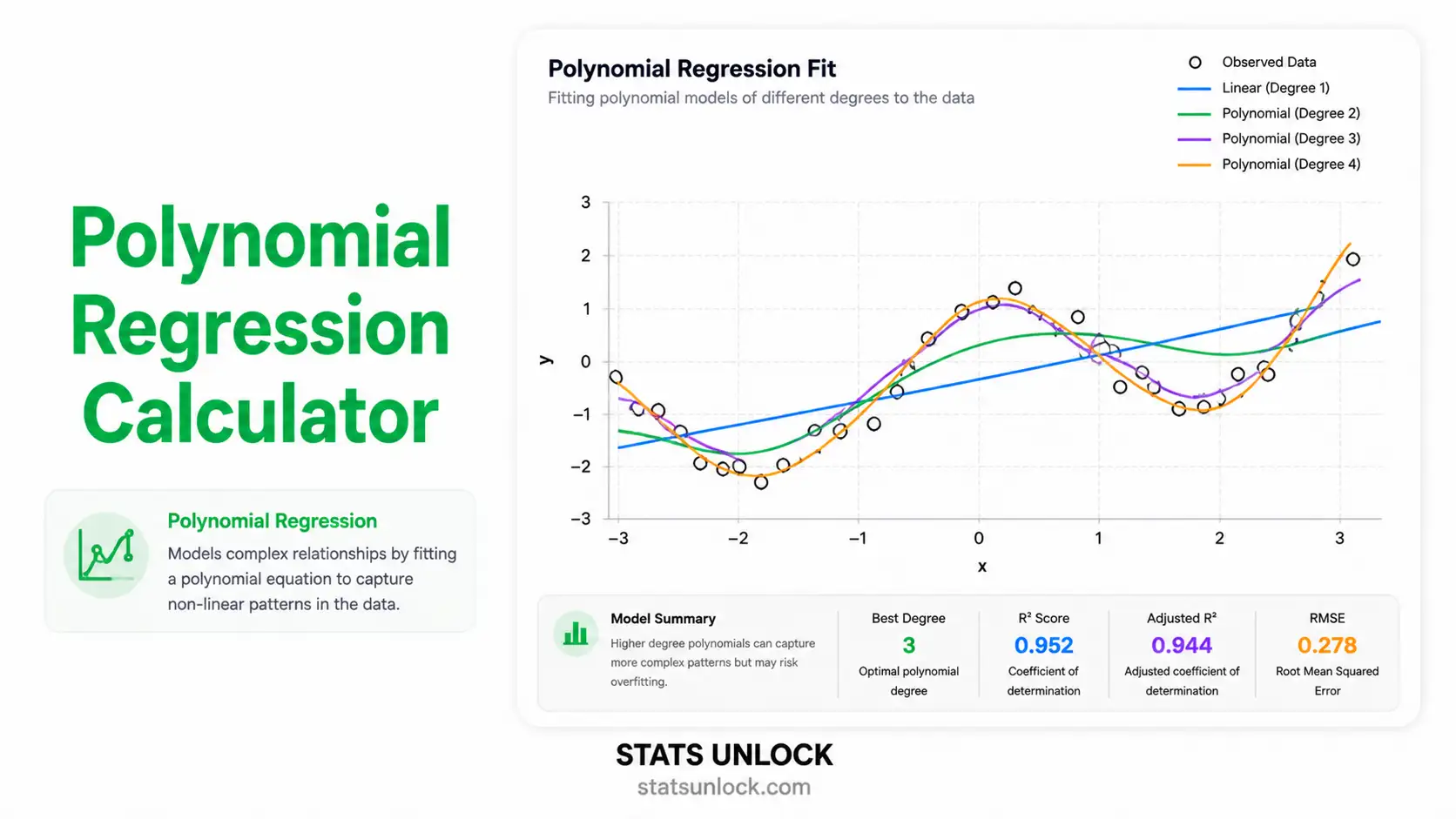
Polynomial Regression Calculator
Paste comma-separated X and Y values or upload a CSV, choose a degree from 1 to 6, and get the fitted polynomial equation with R squared, adjusted R squared, coefficient p values, confidence intervals, AIC, BIC, full residual diagnostics, four colour plots and result sentences you can paste straight into a paper.
⚡ 0. Quick Answer
A polynomial regression calculator fits a curved line through your data by adding squared, cubed and higher powers of X to an ordinary least squares model.
Degree 2 gives one bend, degree 3 gives two bends, and so on. The model is still linear in its coefficients, so it is solved with the same least squares maths as straight-line regression. In the worked example on this page, 12 fertiliser plots give the fitted curve below, an R squared of 0.9910, and an optimum dose of 163.35 kg N per hectare.
Rule of thumb: start at degree 2 and only go higher if adjusted R squared rises, BIC falls, and the highest order term has p below 0.05. Above degree 3 you are usually fitting noise, not signal.
Key takeaways
- This free polynomial regression calculator fits degrees 1 to 6 by least squares and prints the full equation with every coefficient.
- It reports R squared, adjusted R squared, RMSE, AIC, BIC and an overall F test, so you can defend the degree you picked.
- The degree table runs an incremental F test for each extra power, which is the correct way to decide whether the curve is real.
- Assumption checks cover normality, constant variance, independence and the condition number that warns you about unstable high-degree fits.
- Four plots render under the results: fitted curve, residuals versus fitted, normal Q-Q, and adjusted R squared by degree.
- Every result comes with a copy-ready APA 7th sentence, so writing up takes seconds rather than an afternoon.
📚 1. What Is Polynomial Regression?
Polynomial regression is a regression model in which the relationship between the predictor X and the outcome Y is modelled as a polynomial of degree n. Instead of forcing a straight line through data that clearly bends, you add extra columns to the design matrix, X squared for one bend, X cubed for two bends, and let least squares find the coefficients.
The single most misunderstood point: polynomial regression is a linear model. The word linear in "linear regression" refers to the coefficients, not to the shape of the curve. The model Y = b₀ + b₁X + b₂X² is linear in b₀, b₁ and b₂, so it is fitted with exactly the same normal equations, and the same t tests and F tests apply. Only a model such as Y = a ebX, where a coefficient sits inside a nonlinear function, needs true nonlinear least squares.
What each degree can do:
- Degree 1, a straight line. No bends. This is simple linear regression.
- Degree 2, quadratic. One bend, a single peak or a single trough. This covers most real research questions: an optimum dose, a saturation point, a performance peak.
- Degree 3, cubic. Two bends. Growth curves that accelerate then flatten, and S shapes.
- Degree 4 and above. Three or more bends. Almost always overfitting outside physics and engineering calibration work.
A worked one-liner: for the 12 fertiliser plots used throughout this page, the degree 2 fit is Y = 2.1544 + 0.042440X − 0.00012991X². Because b₂ is negative the curve opens downward, and the peak sits at X = −b₁ ÷ (2b₂) = 163.35 kg N per hectare, giving a predicted yield of 5.62 t per hectare.
Who uses it: agronomists find optimum fertiliser and irrigation rates, pharmacologists model dose response saturation, engineers calibrate sensors, economists model diminishing returns, sports scientists describe performance across the lifespan, and ecologists fit growth curves. Any time theory says "it rises then it falls", polynomial regression is the first model to try.
| Method | What it fits | Use it when | Main risk |
|---|---|---|---|
| Simple linear regression | A straight line | The scatter plot shows no bend | Missing real curvature |
| Polynomial regression | A smooth curve with n − 1 bends | There is one clear bend, and you want an interpretable equation | Wild behaviour outside the data range |
| Nonlinear regression | A named curve such as exponential or logistic | Theory gives you the exact functional form | Needs starting values and can fail to converge |
| Spline or GAM | Local curves joined at knots | The shape is complex or wiggly in places | No single equation to quote in a paper |
| LOESS | A smoothed local average | You want to look at the shape before modelling | Not a model, so no coefficients or p values |
If you can write the answer as one equation and a reviewer can check it by hand, polynomial regression is doing its job. If you find yourself at degree 5 trying to chase every wiggle, the honest move is a spline instead.
Is polynomial regression linear or nonlinear?
Polynomial regression is a linear model. Linear describes the coefficients, not the curve on the page. Because Y = b₀ + b₁X + b₂X² is a straight-line combination of its coefficients, it is fitted with ordinary least squares and uses the same t tests and F tests as simple regression. Only a coefficient trapped inside a function, as in Y = a ebX, makes a model genuinely nonlinear.
What degree should I use in polynomial regression?
Start at degree 2, then check four things before going higher: the p value of the highest order term, the incremental F test against the next lower degree, whether adjusted R squared rises and BIC falls, and whether the residual plot still shows an arc. If all four agree, the extra power has earned its place. Above degree 3 you are almost always fitting noise.
What is a good R squared for polynomial regression?
It depends on the field, not on a universal threshold. Calibration and laboratory work routinely exceeds 0.99, agronomy and ecology sit around 0.80 to 0.95, and 0.30 can be a genuine result in survey research. Always read adjusted R squared beside it, because plain R squared can never fall when you add a term and will reward a model that has simply memorised your data.
Can polynomial regression predict outside the range of my data?
No. Polynomials diverge sharply beyond the fitted range, and the higher the degree the faster it happens. A cubic that fits beautifully from 0 to 200 can predict a negative value at 260. Restrict every prediction to the span of X you actually measured, and if a reviewer asks about higher values, the honest answer is that you would need to collect them.
How many data points does polynomial regression need?
A degree n model needs at least n + 1 distinct X values before it can be fitted at all, but that is the arithmetic minimum, not a usable sample. Aim for roughly 10 observations per estimated coefficient, so about 30 points for a quadratic and 40 for a cubic, spread over at least six distinct X levels so the curve is identifiable.
🧮 2. Set Up Your Data
Type one number per cell. Column X is the predictor, and every Y column becomes its own group. Empty cells are ignored, and a row is used only when both X and that Y are present.
📊 3. Results
🧠 4. How Do You Interpret Polynomial Regression Results?
4.1 Read the equation before you read anything else
The fitted equation is the result. Everything else on the page is evidence about how much you should trust it. Read it left to right. The intercept b₀ is the predicted value of Y when X is zero, which is meaningful only if zero is inside the range you actually measured. The linear coefficient b₁ is the slope at X = 0, not the slope everywhere, because in a curved model the slope changes as X changes. The quadratic coefficient b₂ controls the bend: negative means the curve opens downward and has a maximum, positive means it opens upward and has a minimum.
This is the single most common misreading in applied work. In a straight line model, one coefficient is the whole story. In a polynomial model, no coefficient means anything on its own. The slope at any point X is the derivative, b₁ + 2b₂X + 3b₃X² and so on, so you must state the X value you are talking about. Saying "the effect of fertiliser was 0.045 t per kg" is wrong in a quadratic model. Saying "at 50 kg N per hectare the marginal effect was 0.0294 t per kg, falling to 0.0060 t per kg at 140 kg" is right.
If you centred X, which this calculator does by default, the intercept becomes the predicted Y at the mean of X, which is nearly always more useful than the predicted Y at zero. The curve itself is identical either way. Centring changes the labels on the coefficients, not the fit.
4.2 What R squared tells you, and the trap inside it
R squared is the proportion of the variation in Y that the fitted curve explains. It runs from 0 to 1. An R squared of 0.9910 means the curve accounts for 99.10 per cent of the up and down movement in Y, leaving 0.90 per cent unexplained.
The trap is that R squared can never fall when you add a term. Add X cubed and R squared goes up, even if the cubic term is pure noise, because the extra column gives least squares one more knob to turn. Push the degree to n minus 1 and R squared reaches exactly 1.000, with a curve that passes through every point and predicts nothing. That is why R squared alone must never decide the degree.
Adjusted R squared fixes this by charging a penalty for every coefficient you spend. It can fall. When adjusted R squared stops rising as you add a power, you have found the honest stopping point. In the worked example, adjusted R squared goes 0.7208 at degree 1, 0.9890 at degree 2, 0.9879 at degree 3, then 0.9864 at degree 4. The huge jump is from 1 to 2. Everything after that is noise dressed up as improvement.
4.3 The overall F test: does the curve beat a flat line?
The F test in the ANOVA table compares your fitted polynomial against a model with nothing in it but the mean of Y. A significant F says the model explains more than chance would. In the worked example, F(2, 9) = 493.58 with p < 0.001, so the model is doing real work.
Be clear about what this test does not tell you. It does not say the degree is right. A degree 5 model fitted to quadratic data will also produce a wildly significant F, because two of its terms are real and three are junk riding along. The overall F is a screening test. Degree selection is done in section 4.4.
4.4 Choosing the degree, the part that actually matters
Four pieces of evidence point at the right degree, and you should look at all four before deciding.
- The p value of the highest order term. If the X cubed term has p = 0.22, that cubic bend is not distinguishable from noise. Drop back to degree 2. This is the fastest check and it is what reviewers look at first.
- The incremental F test. This asks whether the extra sum of squares bought by one more power is large relative to the residual variance. It is algebraically the square of the t test on that coefficient when only one term is added, so the two agree, but the F framing extends naturally to adding several terms at once.
- Adjusted R squared and BIC. Adjusted R squared should rise. BIC should fall. BIC penalises extra terms harder than AIC does, so when they disagree, BIC is the conservative choice and the one to quote in a paper.
- The residual plot. If residuals versus fitted values still show a clear arc or wave, curvature remains and the degree is too low. If they look like a random cloud, stop.
Never choose the degree by eyeballing which curve looks prettiest on the scatter plot. A higher degree always looks like a tighter fit, which is exactly the illusion overfitting creates.
4.5 The coefficient table: standard errors, t values and p values
Each row of the coefficient table gives an estimate, its standard error, a t value and a p value. The t value is simply the estimate divided by its standard error, and it asks whether that coefficient could plausibly be zero. Degrees of freedom are n minus the number of coefficients, so a degree 2 model on 12 points has 12 minus 3 = 9 degrees of freedom.
Two warnings. First, do not delete a lower order term because its p value is large while a higher order term is significant. If X squared stays, X stays with it. Removing the linear term forces the vertex of the parabola to sit at X = 0, which is a strong and almost always false assumption. This rule is called hierarchy or marginality, and violating it is a common referee complaint.
Second, in an uncentred fit the coefficients are correlated with each other by construction, because X and X squared move together. That inflates standard errors and can make individually significant terms look non-significant. Centring X, which is the default here, largely removes the problem.
4.6 Confidence intervals and what they are really saying
Each coefficient comes with a confidence interval, by default 95 per cent. Read it as the range of coefficient values that are compatible with your data at that confidence level. If the interval excludes zero, the coefficient is significant at the matching alpha, so the interval and the p value always agree.
Intervals are more informative than p values because they carry units and magnitude. An interval of [−0.000149, −0.000111] for b₂ says the downward curvature is small but very precisely estimated. An interval of [−0.004, 0.002] would say you cannot even agree on the direction of the bend.
4.7 The turning point, and why it is often the real answer
For a quadratic, the vertex sits at X = −b₁ ÷ (2b₂). This is usually the number the research question was really asking for: the optimum dose, the most efficient speed, the age of peak performance. The calculator reports it whenever the fit is quadratic and the vertex falls inside a sensible range.
Two cautions. If the vertex lies outside the range of X you actually measured, do not report it as an optimum. All you have shown is that the curve is still bending at the edge of your data. And the vertex is a ratio of two estimated coefficients, so its own uncertainty is wider than either coefficient's interval suggests. For a formal confidence interval on a turning point, use the delta method or a bootstrap rather than quoting the point estimate alone.
4.8 Residual diagnostics, four questions in plain words
Is the shape right? Residuals versus fitted values should look like a shapeless cloud. An arc means the degree is too low. This is the most important plot on the page.
Is the spread constant? A funnel that widens to the right means heteroscedasticity: the model is more wrong for large values. The Breusch-Pagan test puts a p value on it. Coefficients stay unbiased but standard errors, and therefore p values, become untrustworthy. Fix it with a log transform of Y or with robust standard errors.
Are the residuals normal? The Q-Q plot should show points close to the diagonal. The Jarque-Bera test checks skewness and kurtosis together. Mild departures do not matter much at moderate sample sizes, because the central limit theorem is doing quiet work in the background. Severe skew or a few huge outliers do matter.
Are the observations independent? The Durbin-Watson statistic runs from 0 to 4, and 2 means no autocorrelation. Below about 1.5 suggests positive autocorrelation, which is common in time ordered data and makes p values far too small. Above about 2.5 suggests negative autocorrelation. If your X is time, take this seriously and consider a time series model instead.
4.9 The condition number: your overfitting alarm
Powers of X are highly correlated with each other, and the higher the degree, the worse it gets. The condition number of the design matrix measures how close the columns are to being redundant. Below 30 is comfortable. Between 30 and 100 is worth noting. Above 1000 means the coefficients are numerically unstable, and a tiny change in one data value can swing them wildly.
Centring X, which this calculator does by default, usually drops the condition number by orders of magnitude at no cost to the fit. If it is still enormous after centring, the honest reading is that your degree is too high for the amount of data you have.
4.10 Prediction, interpolation and the extrapolation cliff
Inside the range of X you measured, a well fitted polynomial predicts well. Outside it, polynomials do something no other model does quite so violently: they take off. A cubic that fits your data beautifully from 0 to 200 can predict a negative yield at 260 or a physically impossible one at 400. The higher the degree, the sooner and the harder this happens.
The rule is simple and there are no exceptions worth learning. Never predict outside the range of X in your data. If a reviewer asks what happens at higher X, the correct answer is that you would need to measure it.
4.11 Effect size, and how much the curve really matters
R squared is itself the effect size for a regression model. Cohen's benchmarks, adapted for f squared = R squared ÷ (1 − R squared), put 0.02 as small, 0.15 as medium and 0.35 as large, which correspond to R squared values of about 0.02, 0.13 and 0.26. Field data routinely beat these, and calibration data in engineering can sit above 0.999.
More useful than any benchmark is the practical question: how much does Y actually change across the range of X you studied? Multiply that difference by whatever unit matters to the reader, money, kilograms, minutes, and say it out loud. A statistically significant curvature that moves yield by 0.02 t per hectare is not a finding worth a paragraph, however small the p value.
4.12 Common mistakes this calculator prevents
- Choosing degree by R squared alone. The degree table shows adjusted R squared, AIC and BIC beside it, so the penalty is always visible.
- Dropping the linear term. The model always keeps the full hierarchy, so the parabola is free to sit where the data put it.
- Unstable high-degree arithmetic. X is centred and scaled internally, then the coefficients are converted back to the original scale, so degree 5 and 6 fits do not collapse into rounding error.
- Silent missing values. Rows where either X or Y is missing or non-numeric are dropped and counted, and the count is shown, so n is never a surprise.
- Unreported diagnostics. Normality, constant variance, independence and conditioning are all tested and shown, whether or not you go looking for them.
- Extrapolation by accident. The prediction card tells you plainly when the X you asked about is outside the range of the data.
✍ 5. How to Write Your Results in Research
▶ Run the analysis above to auto-fill all five examples with your own results.
When reporting polynomial regression results, four things must appear somewhere in the sentence: the degree of the polynomial, the overall model test with its degrees of freedom, R squared or adjusted R squared, and the test of the highest order term. Everything else is optional detail. A reader who has those four numbers can reconstruct your conclusion; a reader who has only R squared cannot.
📌 Key conventions for this style
- APA italicises F, p, t, R and b. Report exact p values to three decimals, and write p < .001 below that.
- Give both degrees of freedom for F, model first and residual second.
- Report unstandardised b with its standard error for regression coefficients, not beta alone.
- Name the degree explicitly. "A polynomial regression" without a degree is not reportable.
- APA drops the leading zero for values that cannot exceed 1, so write p = .003 and R² = .994.
📌 Key conventions for this style
- Justify the degree with evidence: the incremental F test, adjusted R squared, and BIC, not with a visual impression.
- State that X was centred before fitting, and that centring does not change the fitted values.
- Report the residual diagnostics you ran and what they showed, even when they passed.
- Give the turning point with its interpretation if the model is quadratic and the vertex lies inside the data range.
- Name the software and version. This calculator can be cited using section 19.
📌 Key conventions for this style
- Say "curved" and "levels off", never "quadratic term" or "second order".
- Give the turning point in real units, because that is the number a practitioner will act on.
- Say how much of the variation the curve explains as a percentage.
- Never write R², F, t, p or b in a plain-language paragraph.
- State the range you studied, so nobody applies the number outside it.
📌 Key conventions for this style
- Declare the model once in Methods and keep every Results line consistent with it.
- Word limits are tight, so lead with adjusted R squared and the highest order term's p value.
- Keep decimal places consistent down a column in any table.
- Footnote whether the standard errors are classical or robust.
📌 Key conventions for this style
- Say plainly whether the degree was pre-specified or chosen after seeing the data. Selecting it afterwards makes the p values optimistic.
- Publish the raw X and Y values, or a link to them, so the fit can be reproduced exactly.
- State the software, its version, and whether X was centred.
- Report every degree you tried, not only the winner.
- If the degree was selected from the data, describe it as exploratory and say so in the abstract.
∑ 6. Formulas Used
🔢 7. How to Use This Polynomial Regression Calculator
Ten steps, start to finish, using the fertiliser dataset that is loaded by default.
- Load or paste your data. Pick a sample dataset from the dropdown, or paste your own numbers into the X and Y boxes as comma-separated values. Spaces, tabs and new lines work too.
- Name the group. The group name box is editable. Type something meaningful such as Field trial, north block. That name appears on the chart legend, in the results table and in the exported report.
- Add more groups if you want to compare curves. Press Add group and paste a second dataset. Each group is fitted separately and drawn on the same chart.
- Or upload a file instead. Open the Upload tab, choose a CSV or Excel file, pick the X column, then click each Y column you want. Every selected column is loaded as its own group.
- Choose the degree. Start at 2. If you are not sure, choose Auto select and the calculator will compare degrees 1 to 6 and show you the whole table anyway.
- Set alpha, the confidence level and decimal places. Alpha 0.05 and 95 per cent intervals are the defaults, and four decimal places suits most data. Small coefficients need five or six.
- Leave centring on. Centring X makes the arithmetic stable at higher degrees and gives the intercept a useful meaning. The fitted curve is identical either way.
- Press Run Polynomial Regression. Nothing is calculated before you press it, so you can set everything up in peace.
- Read the results in order: the fitted equation, then R squared and adjusted R squared, then the p value of the highest order term, then the degree table, then the residual plots.
- Copy your sentence or export the report. Section 5 fills in with your numbers. Use Download Doc for a plain text report or Download PDF for a printable version.
📈 8. How to Run Polynomial Regression in Excel
Excel can fit a polynomial three different ways, and they do not all give you the same information. A chart trendline gives you the equation and R squared in about ten seconds but no p values. LINEST gives you the full statistical output in one array formula. The Analysis ToolPak gives you a familiar regression table but only after you build the X squared column yourself. This section shows all three, with the spreadsheet on screen at every step, using the same 12 fertiliser plots used everywhere else on this page.
=LINEST(B2:B13,A2:A13^{1,2},TRUE,TRUE) and press Ctrl+Shift+Enter in older Excel, or just Enter in Microsoft 365. That is the complete quadratic regression.8.1 The functions you need
| You want | Excel formula | Note |
|---|---|---|
| Full quadratic fit with statistics | =LINEST(B2:B13,A2:A13^{1,2},TRUE,TRUE) | Returns a 3 column by 5 row block. Coefficients come out in reverse order |
| Cubic fit | =LINEST(B2:B13,A2:A13^{1,2,3},TRUE,TRUE) | Now a 4 column by 5 row block |
| Just the coefficients | =LINEST(B2:B13,A2:A13^{1,2}) | One row of three numbers, b2 then b1 then b0 |
| One coefficient on its own | =INDEX(LINEST(B2:B13,A2:A13^{1,2}),1,1) | Index 1 is the highest power, not the intercept |
| Build the X squared column | =A2^2 | Needed for the Analysis ToolPak route |
| Fitted values | =TREND(B2:B13,A2:A13^{1,2},A2:A13^{1,2}) | Or type the equation out with your own coefficients |
| Predict at a new X | =TREND(B2:B13,A2:A13^{1,2},{150,22500}) | Both powers must be supplied for the new point |
| R squared from a chart | Trendline options, Display R-squared | Fast, but no p values and no standard errors |
| Turning point of a quadratic | =-F2/(2*E2) | With b1 in F2 and b2 in E2 |
| p value for a coefficient | =T.DIST.2T(ABS(E2/E3),9) | Excel gives you t but never the p value. You must compute it |
LINEST returns coefficients from the highest power down to the intercept, left to right. For a quadratic the first cell is b2, not b0. Read the block right to left and label the cells before you trust them.8.2 Step by step
1 Put X in column A and Y in column B
One pair per row, with a text label in row 1. Sort by X if you like, though least squares does not care about the order.
The 12 fertiliser plots sit in A2:A13 and B2:B13. Only the first eight rows are shown here.
2 Add the X squared column if you plan to use the ToolPak
The Analysis ToolPak has no idea what a polynomial is. It only knows about columns, so you have to hand it the squared column yourself. LINEST does not need this step because the ^{1,2} part builds the powers on the fly.
=A2^2=A2^3
Column C now holds X squared. Fill it down to row 13 by double clicking the small square at the bottom right of C2.
3 Run LINEST and read the block correctly
Select an empty block three cells wide and five cells tall, type the formula, and confirm it. Then label every cell, because the block arrives with no headings at all.
=LINEST(B2:B13,A2:A13^{1,2},TRUE,TRUE)Ctrl+Shift+Enter
Row 1 is the coefficients, reading right to left: intercept 2.154400, linear 0.0424398, quadratic −0.00012991. Row 2 is their standard errors. Row 3 left is R² = 0.990966 and row 3 right is the standard error of the estimate, 0.121581. Row 4 is F = 493.58 and residual df = 9. Row 5 is SS regression 14.5921 and SS residual 0.13304.
4 Turn the raw block into the numbers you will actually report
Excel stops short of the two things a journal wants: adjusted R squared and p values. Both are one formula away.
=1-(1-G4)*(12-1)/(12-3)=F.DIST.RT(E5,2,9)=T.DIST.2T(ABS(E2/E3),9)=-F2/(2*E2)
Adjusted R squared is 0.9890, the overall model p value is 6.33E-10, and the turning point sits at 163.35 kg N per hectare with a predicted yield of 5.6206 t per hectare.
5 Build fitted values and residuals, then look at them
Never stop at R squared. Two extra columns and one scatter plot of residuals against fitted values will tell you more about whether the degree is right than any single statistic.
=$H$2+$H$3*A2+$H$4*A2^2=B2-C2
Fitted values in column C and residuals in column D. The residuals bounce either side of zero with no visible pattern, which is exactly what a correctly specified degree looks like.
6 The fast route: a chart trendline
Select A2:B13, insert a Scatter chart, right click a point, choose Add Trendline, pick Polynomial, set Order 2, and tick Display Equation on chart and Display R-squared value on chart. You now have the equation in ten seconds.
Chart Tools → Add Trendline → Polynomial → Order 2
8.3 The awkward cases
| Situation | What to do |
|---|---|
| Blank cells inside the range | LINEST returns #VALUE! if the X and Y ranges do not match row for row. Delete the incomplete rows first, or filter them out into a clean block. |
| Text such as "n/a" mixed into the numbers | Same error. Use =ISNUMBER(A2) down a helper column to find the offenders quickly. |
| Very large X values, for example a year like 2024 | Powers of 2024 overflow into rounding error fast. Subtract the mean or the first year first, so X becomes 0, 1, 2, and refit. The curve is identical and the arithmetic is stable. |
| You want a cubic, not a quadratic | Change ^{1,2} to ^{1,2,3} and select a block four wide instead of three. |
| Forcing the curve through the origin | Set the third argument of LINEST to FALSE. Do this only when theory demands it, because R squared is then computed differently and cannot be compared to the usual one. |
| Older Excel not accepting the formula | Array formulas need Ctrl+Shift+Enter before Microsoft 365. If you see one number instead of a block, that is what happened. |
| Two groups to compare | Run LINEST twice on the two blocks. Excel has no built-in test for whether two curves differ, so use the R or Python route for that. |
8.4 Why Excel, R and Python can disagree
All three fit the same least squares model, so with clean data they agree to many decimal places. Where they part company is in defaults and in numerical conditioning.
- Raw versus orthogonal powers. R's
poly(x, 2)uses orthogonal polynomials by default, which give different looking coefficients and different individual p values, though identical fitted values, R squared and overall F. To match Excel exactly you must writepoly(x, 2, raw = TRUE)orI(x^2). This is the single most common source of "my numbers do not match" emails. - Conditioning at high degrees. Excel's
LINESTis known to lose precision on high order fits with large X values, where NumPy and R stay accurate because they solve by QR decomposition rather than by inverting X transpose X. At degree 2 or 3 on centred data you will not see a difference. At degree 6 on raw years you certainly will. - Trendline display precision. Excel's chart trendline rounds the equation for display. The underlying fit is fine; the label lies to you. Always take coefficients from
LINEST, not from a chart label. - Missing values. R and pandas drop incomplete rows for you if you ask them to. Excel refuses to run at all. This is arguably the safer behaviour.
- p values. R and statsmodels print them. Excel makes you compute them from the t or F statistic yourself, which is why so many spreadsheet regressions get reported without any.
For this page's dataset, all three routes give b₂ = −0.00012991, R² = 0.9910 and F(2, 9) = 493.58.
8.5 Charting the curve properly
- Select A2:B13 and insert a Scatter with only markers chart. Never use a line chart, because it joins points in row order and will draw a zigzag if your X values are unsorted.
- Add the polynomial trendline at the order you fitted, and extend the forecast zero units forward and backward. Extrapolating a polynomial on a chart is how misleading figures are born.
- Label both axes with units. A yield axis with no units is not publishable.
- Add a second chart, a scatter of residuals against fitted values, with a horizontal line at zero. Put it in the supplementary material if not in the paper.
- For 300 dpi output, right click the chart, choose Save as Picture, and pick PNG. Excel's copy-paste route drops resolution.
8.6 Error messages and what they mean
| Message | Cause | Fix |
|---|---|---|
#VALUE! | Text or blanks in the range, or X and Y of different lengths | Clean the block so both ranges have the same number of numeric rows |
#REF! | The selected output block is smaller than the array LINEST wants to return | Select 3 columns by 5 rows for a quadratic, 4 by 5 for a cubic |
#N/A in the block | Normal. LINEST pads the unused corners of the statistics block | Nothing to fix. Ignore those cells |
#NUM! | Too few distinct X values for the degree requested | You need at least degree + 1 distinct X values. Lower the degree or collect more |
| All coefficients show as 0 | Display rounding, or X values so large the powers overflowed | Widen the column, increase decimals, and centre X by subtracting its mean |
| Only one number appears instead of a block | Array formula not entered with Ctrl+Shift+Enter in older Excel | Re-enter with Ctrl+Shift+Enter, or use Microsoft 365 where it spills automatically |
| Trendline equation says y = 0x² + 0.04x + 2 | Trendline label rounding | Format Trendline Label, set Scientific or 10 decimal places |
📈 9. How to Run Polynomial Regression in R
R fits a polynomial regression in one line, lm(y ~ poly(x, 2, raw = TRUE)), but a bare summary() is not enough to defend a degree choice. The script below is complete and runnable. It fits the model, prints the coefficient table with confidence intervals, compares degrees 1 to 6 with proper incremental F tests, runs four assumption checks, prints a plain-English verdict, and saves one publication-ready figure at 300 dpi. It uses base R only, so there is nothing to install.
Rscript. Change only the x <- c(...) and y <- c(...) lines to use your own data.poly(x, 2) without raw = TRUE fits orthogonal polynomials. The fitted curve, R squared and overall F are identical, but the coefficients and their individual p values are completely different numbers, and they will not match Excel, Python or the formula in any textbook. Always write raw = TRUE when you intend to report coefficients.9.1 The complete script
R, base only, saves polynomial_regression_plot.png
# ============================================================
# Polynomial regression with full statistics and one figure
# StatsUnlock - https://statsunlock.com/polynomial-regression-calculator/
# Base R only. Nothing to install.
# ============================================================

set.seed(42)

# ---- 1. Your data ------------------------------------------
# Replace with your own values, or read a CSV:
#   d <- read.csv("data.csv")
#   d <- d[complete.cases(d$x, d$y), ]
#   x <- d$x ; y <- d$y
x <- c(0, 20, 40, 60, 80, 100, 120, 140, 160, 180, 200, 220)
y <- c(2.18, 2.90, 3.60, 4.23, 4.78, 5.34, 5.23, 5.36, 5.70, 5.61, 5.42, 5.23)

xlab <- "Fertiliser N (kg/ha)"
ylab <- "Yield (t/ha)"
degree <- 2
alpha  <- 0.05

keep <- is.finite(x) & is.finite(y)
x <- x[keep]; y <- y[keep]
n <- length(y)
cat(sprintf("n = %d usable pairs\n\n", n))

# ---- 2. Fit the polynomial ---------------------------------
# raw = TRUE gives the ordinary powers of x, which is what Excel,
# NumPy and every textbook formula use. Leave it out and R fits
# ORTHOGONAL polynomials instead: same curve, different coefficients.
fit <- lm(y ~ poly(x, degree, raw = TRUE))
s   <- summary(fit)
b   <- unname(coef(fit))

print(s)

# ---- 3. The fitted equation --------------------------------
eq <- sprintf("%.6g", b[1])
for (k in 1:degree) {
  eq <- paste0(eq, sprintf(" %+.6g*x^%d", b[k + 1], k))
}
cat("\nEquation:  y =", eq, "\n")

# ---- 4. Confidence intervals -------------------------------
cat("\nConfidence intervals for the coefficients:\n")
print(round(confint(fit, level = 1 - alpha), 8))

# ---- 5. Fit statistics -------------------------------------
e    <- resid(fit)
sse  <- sum(e^2)
sst  <- sum((y - mean(y))^2)
p    <- degree + 1
dfe  <- n - p
fs   <- s$fstatistic
cat(sprintf("\nR squared          = %.4f\n", s$r.squared))
cat(sprintf("Adjusted R squared = %.4f\n", s$adj.r.squared))
cat(sprintf("Residual SE (s)    = %.4f on %d df\n", s$sigma, dfe))
cat(sprintf("RMSE               = %.4f\n", sqrt(sse / n)))
cat(sprintf("F(%d, %d)           = %.2f,  p = %.4g\n",
            fs[2], fs[3], fs[1], pf(fs[1], fs[2], fs[3], lower.tail = FALSE)))
cat(sprintf("AIC = %.2f   BIC = %.2f\n",
            n * log(sse / n) + 2 * p, n * log(sse / n) + p * log(n)))

# ---- 6. Degree comparison and incremental F ----------------
cat("\nDeg     R2   AdjR2      AIC      BIC    F_inc    p_inc\n")
prev <- NULL
maxd <- min(6, n - 2)
for (d in 1:maxd) {
  md  <- lm(y ~ poly(x, d, raw = TRUE))
  sm  <- summary(md)
  ss  <- sum(resid(md)^2)
  pd  <- d + 1
  fin <- NA; pin <- NA
  if (!is.null(prev)) {
    a   <- anova(prev, md)
    fin <- a$F[2]; pin <- a$`Pr(>F)`[2]
  }
  cat(sprintf("%3d %7.4f %7.4f %8.2f %8.2f %8.3f %8.4g\n",
              d, sm$r.squared, sm$adj.r.squared,
              n * log(ss / n) + 2 * pd, n * log(ss / n) + pd * log(n), fin, pin))
  prev <- md
}

# ---- 7. Assumption checks ----------------------------------
z  <- (e - mean(e)) / sqrt(mean((e - mean(e))^2))
sk <- mean(z^3); ku <- mean(z^4) - 3
jb <- n / 6 * (sk^2 + ku^2 / 4)
dw <- sum(diff(e)^2) / sum(e^2)
g  <- e^2 / (sse / n)
bp <- 0.5 * sum((fitted(lm(g ~ poly(x, degree, raw = TRUE))) - mean(g))^2)
cn <- kappa(cbind(1, poly(scale(x), degree, raw = TRUE)), exact = TRUE)
cat(sprintf("\nJarque-Bera normality : JB = %.3f, p = %.4f\n", jb, pchisq(jb, 2, lower.tail = FALSE)))
cat(sprintf("Breusch-Pagan variance: BP = %.3f, p = %.4f\n", bp, pchisq(bp, degree, lower.tail = FALSE)))
cat(sprintf("Durbin-Watson         : DW = %.3f\n", dw))
cat(sprintf("Condition number      : %.1f (on centred and scaled x)\n", cn))

# ---- 8. Plain-English verdict ------------------------------
cat("\nVERDICT\n")
pmodel <- pf(fs[1], fs[2], fs[3], lower.tail = FALSE)
if (pmodel < alpha) {
  cat(sprintf("  The degree %d model is significant, F(%d, %d) = %.2f, p = %.4g.\n",
              degree, fs[2], fs[3], fs[1], pmodel))
  cat(sprintf("  It explains %.2f%% of the variance in %s.\n", 100 * s$r.squared, ylab))
} else {
  cat("  The model is not significant. A flat line describes these data just as well.\n")
}
phigh <- coef(s)[degree + 1, 4]
if (phigh < alpha) {
  cat(sprintf("  The highest order term is significant (p = %.4g), so degree %d is justified.\n",
              phigh, degree))
} else {
  cat(sprintf("  The highest order term is not significant (p = %.4g). Try degree %d.\n",
              phigh, degree - 1))
}
if (degree == 2) {
  vx   <- -b[2] / (2 * b[3])
  vy   <- b[1] + b[2] * vx + b[3] * vx^2
  kind <- if (b[3] < 0) "maximum" else "minimum"
  cat(sprintf("  Turning point (%s) at x = %.2f, predicted y = %.4f%s\n", kind, vx, vy,
              if (vx >= min(x) && vx <= max(x)) ""
              else "  [OUTSIDE the data range, do not report as an optimum]"))
}

# ---- 9. One publication-ready figure -----------------------
png("polynomial_regression_plot.png", width = 3300, height = 1320, res = 300)
par(mfrow = c(1, 2), mar = c(4.4, 4.4, 3, 1))
grid_x <- seq(min(x), max(x), length.out = 300)
plot(x, y, pch = 19, col = "#0f766e", cex = 1.2, xlab = xlab, ylab = ylab,
     main = sprintf("Polynomial fit, R2 = %.4f", s$r.squared))
lines(grid_x, predict(fit, data.frame(x = grid_x)), col = "#c2410c", lwd = 2.6)
abline(lm(y ~ x), col = "#94a3b8", lwd = 1.8, lty = 2)
legend("bottomright", bty = "n", cex = .85,
       legend = c("Observed", sprintf("Degree %d fit", degree), "Straight line"),
       col = c("#0f766e", "#c2410c", "#94a3b8"), pch = c(19, NA, NA), lty = c(NA, 1, 2))
plot(fitted(fit), e, pch = 19, col = "#7c3aed", cex = 1.2,
     xlab = "Fitted values", ylab = "Residual", main = "Residuals vs fitted")
abline(h = 0, col = "#64748b", lwd = 1.4)
dev.off()

cat("\nFigure saved as polynomial_regression_plot.png (300 dpi)\n")
cat("Generated by STATS UNLOCK - statsunlock.com\n")
9.2 What each part does
| Line or function | What it does, and why it is there |
|---|---|
| x <- c(...) | Builds the numeric vectors. c() means combine. Swap in read.csv("data.csv")$col for a real file, and drop incomplete rows with complete.cases(), because lm() silently deletes them and your reported n will be wrong if you do not check. |
| lm(y ~ poly(x, degree, raw = TRUE)) | The whole model. lm is ordinary least squares, and poly(..., raw = TRUE) supplies the plain powers x, x², x³. The intercept is included automatically. |
| summary(fit) | Prints the coefficient table with estimates, standard errors, t values and p values, plus residual standard error, R squared, adjusted R squared and the overall F test. |
| confint(fit) | Confidence intervals for every coefficient. A journal will want these, and R does not print them by default. |
| anova(prev, md) | The incremental F test. It compares the smaller model with the larger one and asks whether the extra power earned its place. This is the correct formal test for degree selection. |
| resid(fit), fitted(fit) | The residuals and the fitted values. Everything in the diagnostics section is built from these two vectors. |
| sum(diff(e)^2) / sum(e^2) | The Durbin-Watson statistic computed by hand, so the script needs no extra package. About 2 means no autocorrelation. |
| pchisq(jb, 2, lower.tail = FALSE) | The Jarque-Bera p value. lower.tail = FALSE gives the upper tail, which is what a test statistic needs. |
| kappa(cbind(1, ...), exact = TRUE) | The condition number of the design matrix. Below 30 is comfortable. Above 1000 means the coefficients are numerically unstable. |
| predict(fit, data.frame(x = grid_x)) | Draws the smooth curve. Never join the raw points with lines(x, y), because that gives a jagged path, not a fitted curve. |
| png(..., res = 300) | Opens a 300 dpi device before plotting. Anything drawn after this goes into the file until dev.off() closes it. |
9.3 What the figure shows
Two panels side by side. On the left, your data as points with the fitted polynomial curve in orange and the ordinary straight line as a dashed grey reference, so the reader can see exactly what the extra term bought. On the right, residuals against fitted values with a horizontal line at zero. That right panel is the one a reviewer looks at first: a shapeless cloud means the degree is right, and any visible arc means a term is missing.
9.4 Problems and fixes
| Problem | Cause | Fix |
|---|---|---|
| Coefficients do not match Excel or Python | raw = TRUE was left out, so R fitted orthogonal polynomials | Add raw = TRUE, or use lm(y ~ x + I(x^2)) which is always raw |
Error in lm.fit: 0 (non-NA) cases | Every row has a missing value in x or y | Check the column names and the file you actually loaded |
Coefficients show as NA | Fewer distinct x values than the degree needs, so the model is singular | Lower the degree. You need at least degree + 1 distinct x values |
| n in the output is smaller than expected | lm() quietly dropped rows with missing values | Filter with complete.cases() yourself and report the n you filtered to |
| Huge coefficients at degree 5 or 6 | Raw powers of large x values are nearly collinear | Centre x first: x <- x - mean(x). The fitted curve is unchanged |
| The plotted curve is a zigzag | Plotted against unsorted x, or plotted the data instead of the prediction | Use a fine seq() grid with predict(), as the script does |
| The PNG is blank | dev.off() was not called, or was called too early | Every png() needs exactly one dev.off() after the last plot command |
anova() refuses to compare | The two models were fitted on different numbers of rows | Remove missing values once, up front, before fitting anything |
9.5 One-liners worth remembering
| You want | R |
|---|---|
| Quadratic fit | lm(y ~ x + I(x^2)) |
| Cubic fit | lm(y ~ poly(x, 3, raw = TRUE)) |
| Just R squared | summary(fit)$r.squared |
| Just adjusted R squared | summary(fit)$adj.r.squared |
| Coefficients as a plain vector | unname(coef(fit)) |
| Compare two degrees formally | anova(fit1, fit2) |
| AIC and BIC | AIC(fit); BIC(fit) |
| Predict at a new x | predict(fit, data.frame(x = 150)) |
| Prediction interval | predict(fit, data.frame(x = 150), interval = "prediction") |
| All four standard diagnostic plots | par(mfrow = c(2, 2)); plot(fit) |
| Turning point of a quadratic | -coef(fit)[2] / (2 * coef(fit)[3]) |
📈 10. How to Run Polynomial Regression in Python
Python gives you two routes. numpy.polyfit is one line and returns the coefficients, but no standard errors and no p values. statsmodels gives you the full regression table in a form a journal will accept. The script below deliberately builds the statistics from NumPy and SciPy directly, so you can see exactly where every number comes from, and so it runs anywhere without statsmodels installed. It prints the same numbers as the R script on the same data.
x = np.array([...]) and y = np.array([...]) lines.Install with pip install numpy scipy matplotlib if you do not already have them. For the shorter route, pip install statsmodels and use the one-liner in section 10.5.
10.1 The complete script
Python 3, saves polynomial_regression_plot.png
# ============================================================
# Polynomial regression with full statistics and one figure
# StatsUnlock - https://statsunlock.com/polynomial-regression-calculator/
# Needs numpy, scipy and matplotlib only.
# ============================================================
import numpy as np
import matplotlib
matplotlib.use("Agg")
import matplotlib.pyplot as plt
from scipy import stats

np.random.seed(42)

# ---- 1. Your data ------------------------------------------
# Replace with your own values, or read a CSV:
#   import pandas as pd
#   df = pd.read_csv("data.csv").dropna(subset=["x", "y"])
#   x, y = df["x"].to_numpy(float), df["y"].to_numpy(float)
x = np.array([0, 20, 40, 60, 80, 100, 120, 140, 160, 180, 200, 220], dtype=float)
y = np.array([2.18, 2.90, 3.60, 4.23, 4.78, 5.34, 5.23, 5.36, 5.70, 5.61, 5.42, 5.23])

xlab, ylab = "Fertiliser N (kg/ha)", "Yield (t/ha)"
degree = 2
alpha = 0.05

ok = np.isfinite(x) & np.isfinite(y)
x, y = x[ok], y[ok]
n = len(y)

def fit_poly(x, y, d):
    X = np.vander(x, d + 1, increasing=True)
    beta, *_ = np.linalg.lstsq(X, y, rcond=None)
    fitted = X @ beta
    resid = y - fitted
    p = d + 1
    dfe = n - p
    sse = float(resid @ resid)
    sst = float(((y - y.mean()) ** 2).sum())
    ssr = sst - sse
    mse = sse / dfe
    XtXinv = np.linalg.inv(X.T @ X)
    se = np.sqrt(np.diag(mse * XtXinv))
    tval = beta / se
    pval = 2 * stats.t.sf(np.abs(tval), dfe)
    r2 = 1 - sse / sst
    adj = 1 - (1 - r2) * (n - 1) / dfe
    fstat = (ssr / (p - 1)) / mse
    fp = stats.f.sf(fstat, p - 1, dfe)
    return dict(beta=beta, se=se, t=tval, p=pval, fitted=fitted, resid=resid,
                sse=sse, ssr=ssr, sst=sst, dfe=dfe, mse=mse, s=np.sqrt(mse),
                r2=r2, adj=adj, f=fstat, fp=fp, p_n=p,
                aic=n * np.log(sse / n) + 2 * p,
                bic=n * np.log(sse / n) + p * np.log(n))

m = fit_poly(x, y, degree)

# ---- 2. The fitted equation --------------------------------
terms = [f"{m['beta'][0]:.6g}"] + [
    f"{m['beta'][k]:+.6g}*x^{k}" if k > 1 else f"{m['beta'][k]:+.6g}*x"
    for k in range(1, degree + 1)]
print("=" * 62)
print(f"POLYNOMIAL REGRESSION, degree {degree}, n = {n}")
print("=" * 62)
print("Equation:  y =", " ".join(terms))

# ---- 3. Coefficient table ----------------------------------
tcrit = stats.t.ppf(1 - alpha / 2, m["dfe"])
print(f"\n{'Term':<10}{'Estimate':>14}{'SE':>13}{'t':>9}{'p':>11}"
      f"{'CI low':>14}{'CI high':>14}")
for k in range(degree + 1):
    name = "Intercept" if k == 0 else ("x" if k == 1 else f"x^{k}")
    b, s = m["beta"][k], m["se"][k]
    print(f"{name:<10}{b:>14.6g}{s:>13.6g}{m['t'][k]:>9.3f}"
          f"{m['p'][k]:>11.4g}{b - tcrit * s:>14.6g}{b + tcrit * s:>14.6g}")

# ---- 4. Fit statistics -------------------------------------
print(f"\nR squared          = {m['r2']:.4f}")
print(f"Adjusted R squared = {m['adj']:.4f}")
print(f"Residual SE (s)    = {m['s']:.4f} on {m['dfe']} df")
print(f"RMSE               = {np.sqrt(m['sse'] / n):.4f}")
print(f"F({degree}, {m['dfe']})           = {m['f']:.2f},  p = {m['fp']:.4g}")
print(f"AIC = {m['aic']:.2f}   BIC = {m['bic']:.2f}")

# ---- 5. Degree comparison and incremental F ----------------
print(f"\n{'Deg':>4}{'R2':>10}{'AdjR2':>10}{'AIC':>10}{'BIC':>10}"
      f"{'F_inc':>10}{'p_inc':>11}")
prev = None
maxd = min(6, n - 2)
for d in range(1, maxd + 1):
    md = fit_poly(x, y, d)
    if prev is None:
        finc = pinc = float("nan")
    else:
        finc = ((prev["sse"] - md["sse"]) / 1) / md["mse"]
        pinc = stats.f.sf(finc, 1, md["dfe"])
    print(f"{d:>4}{md['r2']:>10.4f}{md['adj']:>10.4f}{md['aic']:>10.2f}"
          f"{md['bic']:>10.2f}{finc:>10.3f}{pinc:>11.4g}")
    prev = md

# ---- 6. Assumption checks ----------------------------------
r = m["resid"]
skew, exkurt = stats.skew(r), stats.kurtosis(r)
jb = n / 6 * (skew ** 2 + exkurt ** 2 / 4)
jb_p = stats.chi2.sf(jb, 2)
dw = float(((np.diff(r)) ** 2).sum() / (r @ r))
g = r ** 2 / (m["sse"] / n)
Xb = np.vander(x, degree + 1, increasing=True)
gh = Xb @ np.linalg.lstsq(Xb, g, rcond=None)[0]
bp = 0.5 * float(((gh - g.mean()) ** 2).sum())
bp_p = stats.chi2.sf(bp, degree)
cond = np.linalg.cond(np.vander((x - x.mean()) / x.std(ddof=1), degree + 1, increasing=True))
print(f"\nJarque-Bera normality : JB = {jb:.3f}, p = {jb_p:.4f}")
print(f"Breusch-Pagan variance: BP = {bp:.3f}, p = {bp_p:.4f}")
print(f"Durbin-Watson         : DW = {dw:.3f}")
print(f"Condition number      : {cond:.1f} (on centred and scaled x)")

# ---- 7. Plain-English verdict ------------------------------
print("\nVERDICT")
if m["fp"] < alpha:
    print(f"  The degree {degree} model is significant, F({degree}, {m['dfe']}) = "
          f"{m['f']:.2f}, p = {m['fp']:.4g}. It explains {100 * m['r2']:.2f}% of the variance.")
else:
    print("  The model is not significant. A flat line describes these data just as well.")
if m["p"][degree] < alpha:
    print(f"  The highest order term is significant (p = {m['p'][degree]:.4g}), "
          f"so degree {degree} is justified.")
else:
    print(f"  The highest order term is not significant (p = {m['p'][degree]:.4g}). "
          f"Try degree {degree - 1}.")
if degree == 2:
    vertex = -m["beta"][1] / (2 * m["beta"][2])
    peak = np.polyval(m["beta"][::-1], vertex)
    inside = x.min() <= vertex <= x.max()
    kind = "maximum" if m["beta"][2] < 0 else "minimum"
    print(f"  Turning point ({kind}) at x = {vertex:.2f}, predicted y = {peak:.4f}"
          f"{'' if inside else '  [OUTSIDE the data range, do not report as an optimum]'}")
print("  Normality OK." if jb_p > .05 else "  Residuals depart from normality.")
print("  Constant variance OK." if bp_p > .05 else "  Variance is not constant.")
print("  Independence OK." if 1.5 < dw < 2.5 else "  Autocorrelation is present.")

# ---- 8. One publication-ready figure -----------------------
grid = np.linspace(x.min(), x.max(), 300)
fig, ax = plt.subplots(1, 2, figsize=(11, 4.4))
ax[0].scatter(x, y, s=52, color="#0f766e", zorder=3, label="Observed")
ax[0].plot(grid, np.polyval(m["beta"][::-1], grid), color="#c2410c", lw=2.4,
           label=f"Degree {degree} fit")
b1 = fit_poly(x, y, 1)["beta"]
ax[0].plot(grid, np.polyval(b1[::-1], grid), color="#94a3b8", lw=1.6, ls="--",
           label="Straight line")
ax[0].set_xlabel(xlab); ax[0].set_ylabel(ylab)
ax[0].set_title(f"Polynomial fit, R$^2$ = {m['r2']:.4f}")
ax[0].legend(frameon=False, fontsize=9); ax[0].grid(alpha=.25)
ax[1].axhline(0, color="#64748b", lw=1.2)
ax[1].scatter(m["fitted"], r, s=52, color="#7c3aed", zorder=3)
ax[1].set_xlabel("Fitted values"); ax[1].set_ylabel("Residual")
ax[1].set_title("Residuals vs fitted"); ax[1].grid(alpha=.25)
fig.suptitle("Polynomial Regression - StatsUnlock", fontsize=11)
fig.tight_layout()
fig.savefig("polynomial_regression_plot.png", dpi=300)
print("\nFigure saved as polynomial_regression_plot.png (300 dpi)")
print("Generated by STATS UNLOCK - statsunlock.com")
10.2 What each part does
| Line or function | What it does, and why it is there |
|---|---|
| np.vander(x, d + 1, increasing=True) | Builds the design matrix, one column per power: 1, x, x², x³. increasing=True puts the intercept first, which keeps the coefficient order the same as R's. |
| np.linalg.lstsq(X, y) | Solves the least squares problem by QR decomposition rather than by inverting X transpose X, which is far more stable at high degrees. This is why NumPy beats a hand-rolled matrix inverse. |
| np.linalg.inv(X.T @ X) | Used only to get the standard errors from the covariance matrix. The coefficients themselves never go through this route. |
| stats.t.sf(abs(t), dfe) | The upper tail of the t distribution. Doubling it gives the two tailed p value. |
| stats.f.sf(fstat, p - 1, dfe) | The p value for the overall F test, upper tail of the F distribution. |
| fit_poly() called in a loop | Refits every degree from 1 to 6 so the comparison table and the incremental F tests are computed from the same function, with no chance of the two disagreeing. |
| stats.skew / stats.kurtosis | Feed the Jarque-Bera statistic. SciPy's kurtosis returns excess kurtosis by default, which is what the Jarque-Bera formula expects. |
| np.linalg.cond(...) | The condition number on centred and scaled x, the numerical stability warning light. |
| np.polyval(beta[::-1], grid) | Evaluates the polynomial on a fine grid to draw a smooth curve. polyval wants highest power first, which is why the coefficients are reversed. |
| matplotlib.use("Agg") | Selects a non-interactive backend, so the script also runs on a server or in a scheduled job with no display attached. |
| fig.savefig(..., dpi=300) | Writes the publication-ready PNG. Call tight_layout() first or the axis labels get clipped. |
10.3 What the figure shows
The same two panels as the R figure, drawn to the same 300 dpi standard: the fitted curve over your data with the straight line for comparison on the left, and residuals against fitted values on the right. Both scripts save the file under the same name, so you can run them one after the other and compare the images pixel by pixel if you want reassurance that the two languages agree.
10.4 Problems and fixes
| Problem | Cause | Fix |
|---|---|---|
RankWarning: Polyfit may be poorly conditioned | Raw powers of large x values are nearly collinear | Centre and scale x before fitting. The warning is real, not cosmetic |
LinAlgError: Singular matrix | Fewer distinct x values than degree + 1 | Lower the degree, or collect data at more distinct x values |
| Coefficients in the wrong order | np.polyfit returns highest power first, np.vander(increasing=True) returns intercept first | Pick one convention and stick to it. This script uses intercept first throughout |
nan everywhere in the output | Missing values in x or y | The script filters with np.isfinite. If you edit it, keep that line |
| p values do not match R | Using the normal distribution instead of t, or the wrong degrees of freedom | Residual df is n minus (degree + 1), not n minus 1 |
| The saved figure is empty | savefig called after plt.show(), which clears the figure | Save first, then show, or use the Agg backend as this script does |
| Axis labels cut off | tight_layout() not called | Call fig.tight_layout() immediately before savefig |
| sklearn gives different numbers | PolynomialFeatures adds an intercept column and LinearRegression adds another by default | Set include_bias=False in PolynomialFeatures, or fit_intercept=False in the regressor. Not both |
10.5 One-liners worth remembering
| You want | Python |
|---|---|
| Quadratic coefficients only | np.polyfit(x, y, 2) (highest power first) |
| Modern NumPy equivalent | np.polynomial.Polynomial.fit(x, y, 2).convert().coef |
| Full regression table | import statsmodels.formula.api as smf; smf.ols("y ~ x + I(x**2)", df).fit().summary() |
| Incremental F test | from statsmodels.stats.anova import anova_lm; anova_lm(m1, m2) |
| Predict at a new x | np.polyval(np.polyfit(x, y, 2), 150) |
| R squared quickly | 1 - np.sum(r**2) / np.sum((y - y.mean())**2) |
| Scikit-learn pipeline | make_pipeline(PolynomialFeatures(2), LinearRegression()) |
| Cross-validated degree choice | cross_val_score(pipe, x.reshape(-1, 1), y, cv=5, scoring="neg_mean_squared_error") |
| Turning point of a quadratic | -b[1] / (2 * b[2]) |
| Pandas straight from a file | df = pd.read_csv("data.csv").dropna(subset=["x", "y"]) |
📋 11. Reference Tables
Seven lookup tables you will actually reach for while reading a polynomial regression output. All critical values are two tailed unless stated.
Table 1. Critical t values for coefficient tests
Residual degrees of freedom are n minus (degree + 1). A degree 2 fit on 12 points has 9 df.
| Residual df | alpha .10 | alpha .05 | alpha .01 | alpha .001 |
|---|---|---|---|---|
| 5 | 2.015 | 2.571 | 4.032 | 6.869 |
| 6 | 1.943 | 2.447 | 3.707 | 5.959 |
| 7 | 1.895 | 2.365 | 3.499 | 5.408 |
| 8 | 1.860 | 2.306 | 3.355 | 5.041 |
| 9 | 1.833 | 2.262 | 3.250 | 4.781 |
| 10 | 1.812 | 2.228 | 3.169 | 4.587 |
| 12 | 1.782 | 2.179 | 3.055 | 4.318 |
| 15 | 1.753 | 2.131 | 2.947 | 4.073 |
| 20 | 1.725 | 2.086 | 2.845 | 3.850 |
| 30 | 1.697 | 2.042 | 2.750 | 3.646 |
| 60 | 1.671 | 2.000 | 2.660 | 3.460 |
| 120 | 1.658 | 1.980 | 2.617 | 3.373 |
| Infinity (z) | 1.645 | 1.960 | 2.576 | 3.291 |
What to conclude: if the absolute t value for a coefficient exceeds the critical value in your alpha column, that coefficient differs from zero. The worked example has t = −15.61 on 9 df against a critical 2.262, so the quadratic term is very clearly real.
Table 2. Critical F values at alpha = .05
Numerator df is the number of terms in the model excluding the intercept, which equals the degree. Denominator df is n minus (degree + 1).
| Denominator df | df1 = 1 | df1 = 2 | df1 = 3 | df1 = 4 | df1 = 5 | df1 = 6 |
|---|---|---|---|---|---|---|
| 5 | 6.61 | 5.79 | 5.41 | 5.19 | 5.05 | 4.95 |
| 6 | 5.99 | 5.14 | 4.76 | 4.53 | 4.39 | 4.28 |
| 7 | 5.59 | 4.74 | 4.35 | 4.12 | 3.97 | 3.87 |
| 8 | 5.32 | 4.46 | 4.07 | 3.84 | 3.69 | 3.58 |
| 9 | 5.12 | 4.26 | 3.86 | 3.63 | 3.48 | 3.37 |
| 10 | 4.96 | 4.10 | 3.71 | 3.48 | 3.33 | 3.22 |
| 12 | 4.75 | 3.89 | 3.49 | 3.26 | 3.11 | 3.00 |
| 15 | 4.54 | 3.68 | 3.29 | 3.06 | 2.90 | 2.79 |
| 20 | 4.35 | 3.49 | 3.10 | 2.87 | 2.71 | 2.60 |
| 25 | 4.24 | 3.39 | 2.99 | 2.76 | 2.60 | 2.49 |
| 30 | 4.17 | 3.32 | 2.92 | 2.69 | 2.53 | 2.42 |
| 60 | 4.00 | 3.15 | 2.76 | 2.53 | 2.37 | 2.25 |
| 120 | 3.92 | 3.07 | 2.68 | 2.45 | 2.29 | 2.18 |
What to conclude: the worked example gives F(2, 9) = 493.58 against a critical 4.26, so the curve explains far more than chance. Use the df1 = 1 column for an incremental F test, because stepping up one degree adds exactly one term.
Table 3. Choosing the degree
| Degree | Name | Bends | Minimum n | Sensible n | Typical use |
|---|---|---|---|---|---|
| 1 | Linear | 0 | 3 | 15+ | No visible curvature in the scatter plot |
| 2 | Quadratic | 1 | 4 | 15+ | An optimum, a saturation point, a peak. Covers most research questions |
| 3 | Cubic | 2 | 5 | 20+ | Growth curves, S shapes, accelerate then flatten |
| 4 | Quartic | 3 | 6 | 30+ | Engineering calibration only. Rare in life or social sciences |
| 5 | Quintic | 4 | 7 | 40+ | Almost always overfitting. Consider a spline instead |
| 6 | Sextic | 5 | 8 | 50+ | Numerically fragile. Only with centred x and a very good reason |
What to conclude: minimum n is the point at which the model can be fitted at all, not the point at which it can be trusted. A rule that serves well in practice is at least 10 observations per estimated coefficient, so a quadratic wants about 30 points before you would call it well estimated.
Table 4. Interpreting R squared and adjusted R squared
| R squared | f squared | Cohen's label | What it means in practice |
|---|---|---|---|
| 0.00 to 0.02 | < 0.02 | Negligible | The curve is not describing anything useful |
| 0.02 to 0.13 | 0.02 to 0.15 | Small | A real but weak relationship. Common in social science field data |
| 0.13 to 0.26 | 0.15 to 0.35 | Medium | A clear pattern that survives noise |
| 0.26 to 0.50 | > 0.35 | Large | A strong relationship by any behavioural science standard |
| 0.50 to 0.90 | > 1.0 | Very large | Typical of controlled experiments and dose response work |
| 0.90 to 0.999 | > 9.0 | Near deterministic | Physics, chemistry, engineering calibration. Check for overfitting first |
| 1.000 exactly | Infinite | Perfect fit | Almost always degree = n − 1. The model has memorised the data |
What to conclude: f squared = R² ÷ (1 − R²). Judge R squared against the norms of your field, not against these labels alone. A 0.30 in survey research is impressive; a 0.30 in a calibration curve means something is broken.
Table 5. Durbin-Watson bands
| DW value | Reading | Consequence | What to do |
|---|---|---|---|
| 0.0 to 1.0 | Strong positive autocorrelation | Standard errors badly understated, p values far too small | Use a time series model, or Newey-West standard errors |
| 1.0 to 1.5 | Moderate positive autocorrelation | p values optimistic | Check whether x is time or spatial order. Add a lag term |
| 1.5 to 2.5 | Acceptable | No practical problem | Report it and move on |
| 2.5 to 3.0 | Moderate negative autocorrelation | p values conservative | Usually harmless. Check for an over-fitted degree |
| 3.0 to 4.0 | Strong negative autocorrelation | Alternating residuals, a sign of misspecification | Look for a systematic measurement or ordering artefact |
What to conclude: the worked example gives DW = 2.085, comfortably inside the acceptable band. Durbin-Watson only means something when the rows have a natural order such as time or distance. On unordered data it is noise.
Table 6. Condition number bands
| Condition number | Reading | What it means for your coefficients |
|---|---|---|
| 1 to 10 | Excellent | Fully stable. Typical of a centred quadratic |
| 10 to 30 | Good | No practical concern |
| 30 to 100 | Moderate collinearity | Standard errors are inflated. Coefficients still usable, interpret with care |
| 100 to 1000 | Serious collinearity | Individual coefficients are unreliable even though predictions are fine |
| Above 1000 | Severe | Numerically unstable. Centre x, or lower the degree, or switch to orthogonal polynomials |
What to conclude: centring x before fitting typically drops the condition number by two or three orders of magnitude at no cost to the fitted curve. The worked example sits at 2.7 after centring.
Table 7. Turning it into words
| p value of the highest term | APA wording | Decision |
|---|---|---|
| p < .001 | p < .001 | Keep the term. The curvature is very clearly real |
| .001 to .01 | p = .004 | Keep the term |
| .01 to .05 | p = .032 | Keep the term, but say the evidence is moderate |
| .05 to .10 | p = .073 | Borderline. Report it as suggestive, not established, and drop back a degree for the headline model |
| > .10 | p = .68 | Drop the term. There is no evidence for that bend |
What to conclude: never write p = .000. Write p < .001. And never write "approaching significance" for p = .07. Say the estimate and its confidence interval, and let the reader judge.
📈 12. Example Results
Eight worked examples, each with the real data, the real output, and the sentence you would write. Between them they cover the textbook case, a clear result, a borderline one, a null one, a small sample, a significant but trivial effect, an assumption failure, and a genuine cubic.
Fertiliser dose and crop yield
The clean case where a quadratic is exactly the right model.
Twelve field plots received nitrogen from 0 to 220 kg per hectare. The agronomist wants the dose that maximises yield, not just the direction of the effect.
| Statistic | Value | Note |
|---|---|---|
| n | 12 | Usable data pairs |
| Degree fitted | 2 | Highest power of X in the model |
| Fitted equation | Y = 2.1544 + 0.0424398X − 0.000129908X2 | The model, in the original units of X and Y |
| R squared | 0.9910 | Proportion of variance the curve explains |
| Adjusted R squared | 0.9890 | R squared after charging for each coefficient |
| Residual SE (s) | 0.1216 | Typical prediction error, in units of Y |
| F(2, 9) | 493.58 | Overall model test, p < .001 |
| Highest term p | < .001 | Is the top power of X pulling its weight |
| AIC / BIC | -48.02 / -46.57 | Lower is better when comparing degrees |
| Durbin-Watson | 2.085 | About 2 means no autocorrelation |
| Jarque-Bera p | 0.842 | Above .05 means residuals look normal |
| Breusch-Pagan p | 0.076 | Above .05 means the variance is constant |
| Turning point | 163.35 kg N/ha | Maximum, inside the measured range |
| Predicted peak yield | 5.6206 t/ha | Value of the curve at the vertex |
What it means: The curve explains 99.10 per cent of the variation in yield. The negative quadratic coefficient means yield rises, peaks and then falls, and the vertex sits at 163.35 kg N per hectare with a predicted 5.62 t per hectare. Every diagnostic passes, and no higher degree improves adjusted R squared.
How to write it: A quadratic polynomial regression predicted yield from nitrogen dose, F(2, 9) = 493.58, p < .001, R² = .991, adjusted R² = .989. The quadratic term was significant, b = −0.00013, SE = 0.00001, t(9) = −15.61, p < .001, and yield was maximised at 163.35 kg N ha⁻¹.
Drug dose and response score
A large, unambiguous curvature that no reviewer will question.
Eleven dose levels from 0 to 100 mg were tested and a response score recorded. The pharmacologist expects saturation at higher doses.
| Statistic | Value | Note |
|---|---|---|
| n | 11 | Usable data pairs |
| Degree fitted | 2 | Highest power of X in the model |
| Fitted equation | Y = 11.2263 + 1.34157X − 0.00860035X2 | The model, in the original units of X and Y |
| R squared | 0.9976 | Proportion of variance the curve explains |
| Adjusted R squared | 0.9971 | R squared after charging for each coefficient |
| Residual SE (s) | 0.9701 | Typical prediction error, in units of Y |
| F(2, 8) | 1692.39 | Overall model test, p < .001 |
| Highest term p | < .001 | Is the top power of X pulling its weight |
| AIC / BIC | 1.83 / 3.02 | Lower is better when comparing degrees |
| Durbin-Watson | 1.704 | About 2 means no autocorrelation |
| Jarque-Bera p | 0.173 | Above .05 means residuals look normal |
| Breusch-Pagan p | 0.848 | Above .05 means the variance is constant |
What it means: Response climbs steeply, flattens and then falls slightly at the top dose. The quadratic term is overwhelmingly significant, p < .001, so the plateau is a real feature of the data and not a chance wobble. Adding a cubic term does not improve adjusted R squared.
How to write it: Response was modelled as a quadratic function of dose, F(2, 8) = 1692.39, p < .001, R² = .998. The negative quadratic term, b = −0.0069, p < .001, indicates diminishing returns above approximately 70 mg.
Training weeks and performance score
The awkward case where the bend is suggestive rather than established.
Fifteen athletes were measured after 0 to 14 weeks of a training programme. The question is whether gains are levelling off.
| Statistic | Value | Note |
|---|---|---|
| n | 15 | Usable data pairs |
| Degree fitted | 2 | Highest power of X in the model |
| Fitted equation | Y = 23.0983 + 2.70119X − 0.0638704X2 | The model, in the original units of X and Y |
| R squared | 0.9640 | Proportion of variance the curve explains |
| Adjusted R squared | 0.9579 | R squared after charging for each coefficient |
| Residual SE (s) | 1.7033 | Typical prediction error, in units of Y |
| F(2, 12) | 160.46 | Overall model test, p < .001 |
| Highest term p | .033 | Is the top power of X pulling its weight |
| AIC / BIC | 18.63 / 20.75 | Lower is better when comparing degrees |
| Durbin-Watson | 2.263 | About 2 means no autocorrelation |
| Jarque-Bera p | 0.962 | Above .05 means residuals look normal |
| Breusch-Pagan p | 0.346 | Above .05 means the variance is constant |
What it means: The straight line already explains most of the variation. The quadratic term is significant at .05 but not at .01, so the flattening is suggestive rather than established. With 15 points that is exactly the sort of result that fails to replicate. Report the quadratic model, but describe the curvature as tentative and give its confidence interval.
How to write it: A quadratic term improved fit over a linear model, F(1, 12) = 5.80, p = .033, R² = .964. Because the evidence for curvature was moderate, the linear model is also reported.
Advertising weeks and enquiries
No curve at all, and the calculator says so plainly.
Twenty weekly observations of enquiries against week number. The manager suspects growth is accelerating.
| Statistic | Value | Note |
|---|---|---|
| n | 20 | Usable data pairs |
| Degree fitted | 2 | Highest power of X in the model |
| Fitted equation | Y = 11.0256 + 1.55706X + 0.00827296X2 | The model, in the original units of X and Y |
| R squared | 0.8913 | Proportion of variance the curve explains |
| Adjusted R squared | 0.8785 | R squared after charging for each coefficient |
| Residual SE (s) | 3.7815 | Typical prediction error, in units of Y |
| F(2, 17) | 69.70 | Overall model test, p < .001 |
| Highest term p | .775 | Is the top power of X pulling its weight |
| AIC / BIC | 55.95 / 58.94 | Lower is better when comparing degrees |
| Durbin-Watson | 2.136 | About 2 means no autocorrelation |
| Jarque-Bera p | 0.924 | Above .05 means residuals look normal |
| Breusch-Pagan p | 0.745 | Above .05 means the variance is constant |
What it means: The quadratic coefficient is nowhere near significant, adjusted R squared is lower than for the straight line, and BIC is higher. There is no acceleration here, only a steady linear trend with ordinary week to week noise. The correct model is degree 1.
How to write it: The quadratic term did not improve fit, b = 0.0083, t(17) = 0.29, p = .775, and adjusted R² fell from .885 to .879. A linear model was therefore retained.
Six calibration points on a sensor
What happens when there is barely enough data to fit the model.
An engineer has six calibration readings and wants a quadratic correction curve. A degree 2 fit leaves only three residual degrees of freedom.
| Statistic | Value | Note |
|---|---|---|
| n | 6 | Usable data pairs |
| Degree fitted | 2 | Highest power of X in the model |
| Fitted equation | Y = 1.11357 + 1.39746X − 0.0611607X2 | The model, in the original units of X and Y |
| R squared | 0.9985 | Proportion of variance the curve explains |
| Adjusted R squared | 0.9976 | R squared after charging for each coefficient |
| Residual SE (s) | 0.1486 | Typical prediction error, in units of Y |
| F(2, 3) | 1028.96 | Overall model test, p < .001 |
| Highest term p | .002 | Is the top power of X pulling its weight |
| AIC / BIC | -21.03 / -21.66 | Lower is better when comparing degrees |
| Durbin-Watson | 2.013 | About 2 means no autocorrelation |
| Jarque-Bera p | 0.643 | Above .05 means residuals look normal |
| Breusch-Pagan p | 0.994 | Above .05 means the variance is constant |
What it means: The fit looks excellent, but with only three residual degrees of freedom the critical t value is 3.182 rather than about 2, so confidence intervals are wide and the estimates move a lot if any single point changes. R squared of 0.9985 is far less impressive than it looks, because the model spends three coefficients on six points. Collect more points before trusting the curve outside the calibration range.
How to write it: With only six calibration points, a quadratic was fitted for descriptive purposes, R² = .999, F(2, 3) = 1028.96, p < .001. Given three residual degrees of freedom, coefficient estimates should be treated as provisional.
A large sample with a tiny bend
A p value below .001 that changes nothing in practice.
Sixty observations from an automated logger. The quadratic term is highly significant, but look at what it actually does to the predicted values.
| Statistic | Value | Note |
|---|---|---|
| n | 60 | Usable data pairs |
| Degree fitted | 2 | Highest power of X in the model |
| Fitted equation | Y = 50.0607 + 0.296013X − 0.000544952X2 | The model, in the original units of X and Y |
| R squared | 0.9982 | Proportion of variance the curve explains |
| Adjusted R squared | 0.9981 | R squared after charging for each coefficient |
| Residual SE (s) | 0.3105 | Typical prediction error, in units of Y |
| F(2, 57) | 15690.01 | Overall model test, p < .001 |
| Highest term p | < .001 | Is the top power of X pulling its weight |
| AIC / BIC | -137.41 / -131.13 | Lower is better when comparing degrees |
| Durbin-Watson | 2.101 | About 2 means no autocorrelation |
| Jarque-Bera p | 0.351 | Above .05 means residuals look normal |
| Breusch-Pagan p | 0.239 | Above .05 means the variance is constant |
What it means: With 60 points, even a very small curvature becomes statistically significant. Across the whole measured range the quadratic term bends the line by only about six units, which for this instrument is inside its own tolerance. Statistical significance and practical importance are different questions, and only the second one belongs in an abstract.
How to write it: Although the quadratic term reached significance, p < .001, it altered predicted values by less than 6 units across the measured range and is therefore not practically meaningful.
Spending against income, funnel shaped residuals
The fit is fine, but the p values are not trustworthy.
Twenty six households. The scatter spreads out as income rises, which is the classic funnel shape of non-constant variance.
| Statistic | Value | Note |
|---|---|---|
| n | 26 | Usable data pairs |
| Degree fitted | 2 | Highest power of X in the model |
| Fitted equation | Y = 3.41597 + 1.83227X − 0.00818855X2 | The model, in the original units of X and Y |
| R squared | 0.8401 | Proportion of variance the curve explains |
| Adjusted R squared | 0.8262 | R squared after charging for each coefficient |
| Residual SE (s) | 8.1359 | Typical prediction error, in units of Y |
| F(2, 23) | 60.41 | Overall model test, p < .001 |
| Highest term p | .537 | Is the top power of X pulling its weight |
| AIC / BIC | 111.82 / 115.59 | Lower is better when comparing degrees |
| Durbin-Watson | 1.793 | About 2 means no autocorrelation |
| Jarque-Bera p | 0.156 | Above .05 means residuals look normal |
| Breusch-Pagan p | 0.016 | Above .05 means the variance is constant |
What it means: The curve itself is unbiased, but the residual spread grows with X, so the standard errors are wrong and every p value on the page is unreliable. The Breusch-Pagan test flags it at p = .016, and note that the quadratic term itself is not significant here, p = .537, so a straight line with corrected standard errors is the honest model. The fixes, in order of preference, are a log transform of Y, weighted least squares, or heteroscedasticity-robust standard errors. Do not simply report the table as it stands.
How to write it: Residual variance increased with the predictor, Breusch-Pagan p < .05, so heteroscedasticity-consistent (HC3) standard errors are reported alongside the coefficient estimates.
Tree age and height, a growth curve
Where degree 3 genuinely beats degree 2.
Thirteen trees of known age were measured. Growth accelerates early, then slows as the canopy closes, which is a two bend shape.
| Statistic | Value | Note |
|---|---|---|
| n | 13 | Usable data pairs |
| Degree fitted | 3 | Highest power of X in the model |
| Fitted equation | Y = 0.844254 + 1.78032X − 0.105226X2 + 0.00213942X3 | The model, in the original units of X and Y |
| R squared | 0.9916 | Proportion of variance the curve explains |
| Adjusted R squared | 0.9887 | R squared after charging for each coefficient |
| Residual SE (s) | 0.3181 | Typical prediction error, in units of Y |
| F(3, 9) | 352.17 | Overall model test, p < .001 |
| Highest term p | < .001 | Is the top power of X pulling its weight |
| AIC / BIC | -26.56 / -24.30 | Lower is better when comparing degrees |
| Durbin-Watson | 2.617 | About 2 means no autocorrelation |
| Jarque-Bera p | 0.805 | Above .05 means residuals look normal |
| Breusch-Pagan p | 0.337 | Above .05 means the variance is constant |
What it means: The cubic captures the early acceleration and the later plateau that a quadratic forces into a single symmetric arc. Compare adjusted R squared and the incremental F test against degree 2 before keeping the cubic. Even when it wins, remember that a cubic will turn upward again beyond the data, so never extrapolate a growth curve fitted this way.
How to write it: A cubic polynomial was fitted, F(3, 9) = 352.17, p < .001, R² = .992. The cubic term was significant, p < .001, and improved adjusted R² and BIC over the quadratic model, so it was retained.
📝 13. Data Collection Protocol
Design statement. Polynomial regression needs one continuous predictor and one continuous outcome, measured on the same units, with enough distinct X values spread across the range to reveal the shape. The curve you can detect is limited by where you sampled, not by how many observations you took. Ten points clustered at three X values cannot show a bend, however precise each measurement is.
- State the expected shape before you collect anything. Write down whether theory predicts a peak, a plateau, or an S shape, and therefore what degree you expect. Choosing the degree after seeing the data makes every p value optimistic.
- Choose the range of X deliberately. The range must cover the region where the bend is expected to happen. If you think yield peaks near 150 kg, sampling 0 to 100 will only ever show you a straight line.
- Use at least six distinct X levels for a quadratic, and eight for a cubic. More levels beat more replicates at the same levels when the goal is to identify a shape.
- Space the levels evenly, or slightly denser near the expected bend. Even spacing keeps the design matrix well conditioned. Heavy clustering at one end inflates the standard errors on the higher powers.
- Randomise the assignment order. If plots, animals or samples are processed in X order, any drift over time gets absorbed into the curve and you will never know.
- Replicate at each level where you can. Replication gives you a pure error estimate, which lets you run a formal lack of fit test rather than only eyeballing the residuals.
- Measure X as precisely as Y. Ordinary least squares assumes X is known without error. Noisy X biases polynomial coefficients toward zero and flattens the curve you are trying to find.
- Record X in units that keep the numbers modest. Years as 2020, 2021, 2022 raised to the sixth power is a numerical disaster. Record year minus 2020 instead.
- Log every exclusion at the moment you make it. Removed points change a polynomial fit far more than they change a straight line fit, because a curve can pivot around a single influential point.
- Keep the raw file untouched. Do all cleaning in a script or a separate sheet, so the fit can be reproduced from the original numbers.
- Aim for about 10 observations per estimated coefficient. That is 30 for a quadratic and 40 for a cubic as a working target.
- Pre-register the degree and the exclusion rules if the study is confirmatory. If it is exploratory, say so in the abstract.
How to lay the data out
| Plot ID | X (fertiliser, kg N/ha) | Y (yield, t/ha) | Block | Notes |
|---|---|---|---|---|
| P01 | 0 | 2.18 | A | Control |
| P02 | 20 | 2.90 | A | |
| P03 | 40 | 3.60 | B | Slight lodging |
Minimum sample. A quadratic can be fitted with 4 points and a cubic with 5, but neither can be trusted there. Treat 15 as the floor for a quadratic in real research and 25 for a cubic.
Pre-registration line you can copy: "We will fit a degree 2 polynomial regression of Y on X by ordinary least squares. The quadratic term will be tested at alpha = .05. If it is not significant, the linear model will be reported as the primary analysis."
Common mistakes at the collection stage
- Sampling only two or three X levels, which makes any curve unidentifiable.
- Sampling a range that stops before the expected turning point.
- Recording X as a category such as "low, medium, high", which cannot be squared.
- Processing samples in X order, so time drift masquerades as curvature.
- Rounding X heavily, for example to the nearest 50, which throws away the resolution the higher powers need.
🎯 14. When Should You Use Polynomial Regression?
This free polynomial regression calculator is designed for one continuous predictor and one continuous outcome, where a scatter plot shows a bend that a straight line cannot follow.
Use it when
- The scatter plot of Y against X shows one clear bend, a peak, or a plateau.
- The residuals from a straight line fit form a visible arc.
- You need a single equation you can quote, differentiate, and hand to a reader.
- You want the turning point: an optimum dose, the most efficient speed, the age of peak performance.
- Theory says the effect of X should weaken, stop, or reverse as X grows.
- You are building an interpolation or calibration curve inside a known range.
Do not use it when
- The outcome is binary, a count, or a proportion. Use logistic, Poisson or beta regression instead, with polynomial terms inside them if you need curvature.
- You want to predict beyond the range of your data. Polynomials diverge violently outside the fitted range.
- The shape has three or more bends. A spline or a generalised additive model will fit it better and more stably.
- Theory gives you an exact functional form, such as exponential decay or a logistic growth curve. Fit that form directly with nonlinear least squares.
- The observations are not independent, for example repeated measures on the same subject. Use a mixed model with polynomial fixed effects.
- X is time and the series is autocorrelated. Use a time series model. A polynomial trend on autocorrelated data produces p values that are far too small.
Four quick examples
| Question | Right tool | Why |
|---|---|---|
| What nitrogen dose maximises yield? | Quadratic polynomial regression | One bend, and the vertex is the answer |
| Does exam score rise faster with more revision? | Quadratic polynomial regression | Diminishing returns is a single bend |
| Does the chance of passing rise with revision? | Logistic regression | The outcome is pass or fail, not a continuous number |
| How does bacterial count grow over time? | Nonlinear or log-linear model | Exponential growth has a known form, and a polynomial will fit it badly at the edges |
Decision guide
- Plot Y against X first. Always. If there is no visible bend, fit degree 1 and stop.
- If there is one bend, fit degree 2 and check the quadratic term's p value.
- If there are two bends, try degree 3 and compare adjusted R squared and BIC against degree 2.
- If you need three or more bends, stop using polynomials and fit a spline.
- If the outcome is not continuous, switch to the matching generalised linear model.
- If the observations are grouped, clustered or repeated, switch to a mixed model.
🔧 15. Why Is My Polynomial Regression Wrong? Troubleshooting
R squared is 1.000 and the curve passes through every point
Cause: the degree is n minus 1 or close to it, so the model has as many coefficients as data points. Fix: lower the degree until the residual degrees of freedom are at least 5, and read adjusted R squared rather than R squared.
Coefficients are enormous, like 4.7e+18
Cause: raw powers of large X values, for example years, are nearly collinear and the design matrix is badly conditioned. Fix: leave centring switched on, or subtract a baseline from X before pasting. The fitted curve does not change.
The higher order term is significant but the lower one is not
Cause: normal, and not a problem. Fix: keep both. Removing a lower order term while a higher one stays forces the curve into a shape the data did not ask for. This is the hierarchy or marginality rule.
My R output does not match this calculator or Excel
Cause: R's poly(x, 2) fits orthogonal polynomials by default. Fix: write poly(x, 2, raw = TRUE) or lm(y ~ x + I(x^2)). Fitted values, R squared and the overall F already agree; only the coefficients differ.
The residual plot still shows a clear arc
Cause: curvature remains, so the degree is too low. Fix: step the degree up by one and look again. If two steps do not clear it, the true shape is probably not polynomial, so consider a transformation of Y or a spline.
Residuals fan out to the right
Cause: non-constant variance, flagged by the Breusch-Pagan test. Fix: take logs of Y if Y is positive, use weighted least squares, or report heteroscedasticity-robust standard errors. The coefficients stay valid, the p values do not.
The turning point is outside my data range
Cause: the curve is still bending at the edge of what you measured. Fix: do not report it as an optimum. Say the relationship was still increasing across the observed range, and that identifying an optimum would need data beyond it.
The prediction at a new X looks impossible
Cause: extrapolation. Polynomials diverge fast outside the fitted range. Fix: only predict inside the range of X in your data. The calculator warns you when the X you asked for falls outside it.
Every degree is significant, so which do I choose?
Cause: the overall F test compares each model against a flat line, not against the previous degree, so it stays significant as terms pile on. Fix: use the incremental F test and BIC in the degree table, and the p value of the highest order term.
Removing one point changes the answer completely
Cause: a high leverage point at the edge of the X range. Curves pivot around edge points much more than lines do. Fix: refit without it and report both. If the conclusion depends on one observation, say so.
The calculator says "not enough distinct X values"
Cause: a degree n fit needs at least n + 1 distinct X values, no matter how many rows you have. Fix: lower the degree, or collect data at more X levels.
n in the results is smaller than the number of rows I pasted
Cause: rows where X or Y was blank, text, or non-numeric were dropped. Fix: nothing, this is correct behaviour. The count of dropped rows is shown so you can check it matches what you expected.
⚠ 16. Assumptions and Limitations
The five assumptions, how each is checked, and what happens when it fails
| # | Assumption | How this tool checks it | Direction of bias if it fails |
|---|---|---|---|
| 1 | Correct functional form. The chosen degree captures the real shape | Residuals versus fitted plot, and the p value of the highest order term | Biased coefficients and biased predictions. Too low a degree understates the effect at the edges, too high a degree invents wiggles that are noise |
| 2 | Independent errors. One residual tells you nothing about the next | Durbin-Watson statistic | Standard errors far too small under positive autocorrelation, so p values are much too small and confidence intervals too narrow |
| 3 | Constant variance. Spread of residuals is the same across the fitted range | Breusch-Pagan test and the residuals versus fitted plot | Coefficients stay unbiased, but standard errors are wrong in either direction, so every p value is unreliable |
| 4 | Approximately normal errors. Residuals follow a normal distribution | Jarque-Bera test and the normal Q-Q plot | Mild departures are harmless at moderate n. Heavy skew or extreme outliers make t and F tests inaccurate and confidence intervals wrong |
| 5 | X measured without error, and enough distinct levels | Condition number, and a count of distinct X values | Noisy X attenuates coefficients toward zero, flattening real curvature. Too few X levels make the higher powers unidentifiable |
Limitations you should state in a paper
- Polynomials extrapolate terribly. Beyond the range of X the curve diverges. If prediction outside the range matters, use a model whose shape is bounded by theory, such as a logistic or asymptotic regression.
- Coefficients are not individually interpretable. Only the whole curve means something. Quote the marginal effect at named X values, or the turning point, instead.
- Degree selection inflates significance. If the degree was chosen after seeing the data, the reported p values are optimistic. Cross validation or a hold-out sample gives an honest error estimate.
- The fit is global, not local. One coefficient set has to describe the whole range, so a feature at one end distorts the fit at the other. Splines and GAMs do not have this problem.
- High degrees are numerically fragile. Above degree 4 on uncentred data, rounding error can dominate. Centring helps, orthogonal polynomials help more.
- Influential points matter more than in linear regression. A single point at the edge of the X range can pivot the whole curve. Always refit without it as a sensitivity check.
- A significant curve is not a causal claim. Polynomial regression describes shape, nothing more. Causal language needs a design that supports it.
🏁 17. Conclusion
Run the analysis above and a conclusion written around your own numbers will appear here.
A polynomial regression calculator earns its place the moment a scatter plot stops looking straight. Adding powers of X to an ordinary least squares model lets you follow a curve while keeping everything that makes linear regression easy to work with: a closed form solution, exact standard errors, familiar t and F tests, and one equation you can write on a single line of a paper.
The whole skill is degree selection. Degree 2 answers most real research questions, because the questions people actually ask, where is the optimum, when do returns start to diminish, at what age does performance peak, are all questions about a single bend. Degree 3 is right when growth accelerates and then flattens. Beyond that you are almost always fitting noise, and the honest move is a spline. Judge the degree with adjusted R squared, BIC, the incremental F test, and the residual plot, never with R squared alone, because R squared cannot fall when a term is added and will happily reward a model that has memorised your data.
Once the degree is settled, read the model as a shape rather than as a list of coefficients. No single coefficient in a polynomial means anything by itself. Quote the marginal effect at a named X value, or quote the turning point and say plainly whether it falls inside the range you measured. Check the four diagnostics, report them even when they pass, and never predict beyond the edge of your data.
Every number this polynomial regression calculator produces can be reproduced in Excel, R and Python using the scripts in sections 8, 9 and 10, and the reference tables in section 11 let you check any critical value by hand. That is the point: a result you can defend, in a form you can hand to a reviewer.
❓ 18. Frequently Asked Questions
Q1. What is a polynomial regression calculator?
A polynomial regression calculator fits a curved line through your X and Y data by adding powers of X, such as X squared and X cubed, to an ordinary least squares model. It returns the fitted equation, R squared, adjusted R squared, coefficient p values, confidence intervals, model selection statistics and residual diagnostics.
Q2. What is polynomial regression in simple terms?
It is straight-line regression with extra terms that let the line bend. Degree 2 gives one bend, degree 3 gives two bends. The maths is identical to linear regression because the model is still linear in its coefficients.
Q3. Is polynomial regression a linear model or a nonlinear model?
It is a linear model. The word linear refers to the coefficients, not to the shape of the curve. Y = b0 + b1X + b2X squared is linear in b0, b1 and b2, so it is fitted by ordinary least squares and uses the same t and F tests. A model such as Y = a times e to the power bX is genuinely nonlinear because a coefficient sits inside a nonlinear function.
Q4. What is the formula for polynomial regression?
The model is Y = b0 + b1X + b2X squared + b3X cubed + ... + bnX to the n, plus an error term. The coefficients are found by least squares, which in matrix form is b = (X transpose X) inverse times X transpose y.
Q5. How do I choose the degree in polynomial regression?
Use four pieces of evidence together: the p value of the highest order term, the incremental F test against the next lower degree, adjusted R squared and BIC, and the residuals versus fitted plot. Start at degree 2 and only go higher if all four agree. Never choose the degree by R squared alone, because R squared cannot fall when a term is added.
Q6. What is the difference between linear regression and polynomial regression?
Simple linear regression fits a straight line with one slope that applies everywhere. Polynomial regression fits a curve whose slope changes as X changes. Polynomial regression is a special case of multiple linear regression in which the extra predictors are powers of the same variable.
Q7. What does the quadratic coefficient tell me?
It controls the curvature. A negative quadratic coefficient means the curve opens downward and has a maximum. A positive one means it opens upward and has a minimum. Its size is the rate at which the slope changes, so it is measured in units of Y per unit of X squared.
Q8. How do I find the turning point of a quadratic regression?
The vertex sits at X equals minus b1 divided by 2 times b2. Substitute that X back into the equation to get the predicted Y at the peak or trough. Only report it as an optimum when it falls inside the range of X you actually measured.
Q9. What is a good R squared for polynomial regression?
It depends entirely on the field. In controlled laboratory or calibration work, above 0.99 is normal. In field ecology or agronomy, 0.80 to 0.95 is strong. In survey and social science data, 0.30 can be a real finding. Always read adjusted R squared alongside it, because R squared always rises when you add a term.
Q10. Why does R squared always increase when I raise the degree?
Each extra power gives least squares one more free parameter to reduce the residual sum of squares with, so the fit can never get worse. At degree n minus 1 the curve passes through every point and R squared reaches exactly 1. Adjusted R squared exists precisely to charge for this.
Q11. What is overfitting in polynomial regression?
Overfitting is when the model follows the noise in your particular sample rather than the underlying relationship. The signs are a high degree, wiggles between data points, coefficients that swing wildly if one point is removed, adjusted R squared falling while R squared rises, and terrible predictions on new data.
Q12. Should I centre X before fitting a polynomial?
Yes, in almost every case. Centring means subtracting the mean of X before creating the powers. It hugely reduces the correlation between X and X squared, shrinks the condition number, and makes the intercept the predicted Y at the average X. The fitted curve itself is identical either way.
Q13. Can I drop the linear term and keep only the squared term?
No, not unless theory forces the turning point to sit exactly at X equals zero. Keeping a higher order term while removing a lower one is a violation of the hierarchy or marginality rule and will be flagged by any careful reviewer.
Q14. How many data points do I need for polynomial regression?
A degree n model needs at least n + 1 distinct X values just to be fitted. For a trustworthy result, aim for about 10 observations per estimated coefficient, so roughly 30 points for a quadratic and 40 for a cubic, spread across at least six distinct X levels.
Q15. Can polynomial regression be used for prediction outside the data range?
No. Polynomials diverge rapidly outside the fitted range, and the higher the degree the faster they diverge. A curve that fits beautifully between 0 and 200 can predict physically impossible values at 260. Restrict prediction to the range of X in your data.
Q16. How do I do polynomial regression in Excel?
Put X in one column and Y in another, then select a block three cells wide and five tall and enter =LINEST(B2:B13,A2:A13^{1,2},TRUE,TRUE). The coefficients arrive in reverse order, highest power first. A chart trendline set to Polynomial order 2 is faster but gives no p values and rounds the equation, so take coefficients from LINEST.
Q17. How do I run polynomial regression in R?
Use lm(y ~ poly(x, 2, raw = TRUE)) and then summary() for the full table. The raw = TRUE part matters: without it R fits orthogonal polynomials, which give the same curve and R squared but completely different coefficients and individual p values.
Q18. How do I run polynomial regression in Python?
With NumPy, np.polyfit(x, y, 2) returns the coefficients highest power first. For a full regression table with standard errors and p values, use statsmodels: smf.ols('y ~ x + I(x**2)', df).fit().summary(). With scikit-learn, combine PolynomialFeatures and LinearRegression in a pipeline.
Q19. What is the difference between polynomial regression and multiple regression?
Multiple regression uses several different predictors. Polynomial regression uses several powers of the same predictor. Mechanically they are the same model, which is why the same software function fits both. Multiple polynomial regression, with powers and interactions of two or more predictors, is also possible and is the basis of response surface methodology.
Q20. When should I use a spline instead of a polynomial?
When the shape needs three or more bends, when the curvature is confined to one part of the range, or when a high degree is numerically unstable. Splines fit local curves joined at knots, so a feature at one end no longer distorts the fit at the other. The trade off is that there is no single equation to quote.
🔖 19. Cite This Tool
If this polynomial regression calculator produced numbers that appear in your work, cite it the way you would cite any other piece of analysis software.
Run the analysis and the Methods paragraph fills in with your own degree, n, R squared and test statistics.
🔗 20. Related Tools
Eight Stats Unlock calculators that pair naturally with polynomial regression, from the straight line you should always fit first to the models you move to when the assumptions fail.
Fit a straight line first. If the residuals form an arc, you need the polynomial model.
Open the calculator →RegressionTwo or more different predictors, rather than several powers of the same one.
Open the calculator →ChartsPlot Y against X before you fit anything. The shape of the cloud tells you the degree.
Open the calculator →RegularisedShrinks correlated coefficients, which is exactly what high degree polynomial terms are.
Open the calculator →RegularisedSets weak coefficients to exactly zero, so it can drop unnecessary polynomial terms for you.
Open the calculator →Model selectionAutomated term selection by p value, AIC or BIC when you have many candidate predictors.
Open the calculator →Diagnostics fixThe right fix when the Breusch-Pagan test on this page flags non-constant variance.
Open the calculator →Beyond OLSUse this when the outcome is a count, a proportion or a yes or no, not a continuous number.
Open the calculator →Browse the full set under Statistical Models on Stats Unlock.
📖 21. Glossary of Terms
| Term | Plain-English meaning |
|---|---|
| Adjusted R squared | R squared after charging a penalty for each coefficient. Unlike R squared, it can fall, which is what makes it useful for choosing a degree. |
| AIC | Akaike information criterion. A score that balances fit against the number of coefficients. Lower is better, and only comparable between models fitted to the same data. |
| BIC | Bayesian information criterion. Like AIC but charges more for each extra coefficient, so it prefers simpler models. Lower is better. |
| Centring | Subtracting the mean of X before creating the powers. It does not change the fitted curve, but it makes the arithmetic stable and the intercept meaningful. |
| Coefficient | One of the numbers multiplying a power of X in the fitted equation. Written b0, b1, b2 and so on. |
| Condition number | A measure of how close the columns of the design matrix are to being redundant. Small is good. Above 1000 the coefficients are numerically unstable. |
| Cubic | A degree 3 polynomial. Its curve can have two bends. |
| Degree | The highest power of X in the model. The curve can have at most degree minus one bends. |
| Degrees of freedom | The number of independent pieces of information left after estimating the coefficients. For a polynomial fit it is n minus (degree + 1). |
| Design matrix | The table of predictor columns the model actually uses: a column of ones, then x, then x squared, and so on. |
| Durbin-Watson | A statistic from 0 to 4 that detects whether consecutive residuals are related. About 2 means they are not. |
| Extrapolation | Predicting outside the range of X you measured. With polynomials this is unsafe, and it gets worse as the degree rises. |
| Fitted value | The value of Y the curve predicts for a given X. Also called the predicted value. |
| Heteroscedasticity | Residual spread that changes across the range, usually a funnel shape. It makes standard errors and p values unreliable. |
| Hierarchy (marginality) | The rule that if you keep a higher power you must also keep every lower power. Breaking it forces the curve into a shape the data did not ask for. |
| Incremental F test | A formal test of whether adding one or more terms improved the fit enough to justify them. The correct test for stepping up a degree. |
| Least squares | The method that picks the coefficients minimising the sum of squared vertical distances between the data points and the curve. |
| Leverage | How much influence one observation has on the fit because of where its X value sits. Points at the edges of the X range have the most. |
| Orthogonal polynomial | A rewritten set of polynomial terms built to be uncorrelated with each other. Same fitted curve, different coefficients. R uses these unless you write raw = TRUE. |
| Overfitting | Following the noise in your sample rather than the underlying pattern, usually by choosing too high a degree. |
| Quadratic | A degree 2 polynomial. Its curve is a parabola with exactly one bend. |
| Residual | The gap between an observed Y and the value the curve predicts for it. The building block of every diagnostic on this page. |
| RMSE | Root mean squared error. The typical size of a prediction error, in the units of Y. |
| R squared | The proportion of the variation in Y that the fitted curve explains, from 0 to 1. |
| Turning point (vertex) | The X value where a quadratic curve reaches its maximum or minimum, found as minus b1 divided by 2 times b2. |
📚 22. References
Twenty peer-reviewed journal articles underpinning this polynomial regression calculator, covering least squares curve fitting, degree and model selection, fractional polynomials, residual diagnostics, and the correct reporting of regression results.
- Box, G. E. P., & Wilson, K. B. (1951). On the experimental attainment of optimum conditions. Journal of the Royal Statistical Society: Series B, 13(1), 1–45. https://doi.org/10.1111/j.2517-6161.1951.tb00067.x
- Royston, P., & Altman, D. G. (1994). Regression using fractional polynomials of continuous covariates: Parsimonious parametric modelling. Journal of the Royal Statistical Society: Series C, 43(3), 429–467. https://doi.org/10.2307/2986270
- Royston, P., Ambler, G., & Sauerbrei, W. (1999). The use of fractional polynomials to model continuous risk variables in epidemiology. International Journal of Epidemiology, 28(5), 964–974. https://doi.org/10.1093/ije/28.5.964
- Altman, D. G., & Royston, P. (2006). The cost of dichotomising continuous variables. BMJ, 332(7549), 1080. https://doi.org/10.1136/bmj.332.7549.1080
- Breusch, T. S., & Pagan, A. R. (1979). A simple test for heteroscedasticity and random coefficient variation. Econometrica, 47(5), 1287–1294. https://doi.org/10.2307/1911963
- Durbin, J., & Watson, G. S. (1951). Testing for serial correlation in least squares regression. II. Biometrika, 38(1/2), 159–177. https://doi.org/10.2307/2332325
- Jarque, C. M., & Bera, A. K. (1980). Efficient tests for normality, homoscedasticity and serial independence of regression residuals. Economics Letters, 6(3), 255–259. https://doi.org/10.1016/0165-1765(80)90024-5
- Akaike, H. (1974). A new look at the statistical model identification. IEEE Transactions on Automatic Control, 19(6), 716–723. https://doi.org/10.1109/TAC.1974.1100705
- Schwarz, G. (1978). Estimating the dimension of a model. The Annals of Statistics, 6(2), 461–464. https://doi.org/10.1214/aos/1176344136
- Burnham, K. P., & Anderson, D. R. (2004). Multimodel inference: Understanding AIC and BIC in model selection. Sociological Methods & Research, 33(2), 261–304. https://doi.org/10.1177/0049124104268644
- Stone, M. (1974). Cross-validatory choice and assessment of statistical predictions. Journal of the Royal Statistical Society: Series B, 36(2), 111–147. https://doi.org/10.1111/j.2517-6161.1974.tb00994.x
- Ramsey, J. B. (1969). Tests for specification errors in classical linear least-squares regression analysis. Journal of the Royal Statistical Society: Series B, 31(2), 350–371. https://doi.org/10.1111/j.2517-6161.1969.tb00796.x
- Shapiro, S. S., & Wilk, M. B. (1965). An analysis of variance test for normality (complete samples). Biometrika, 52(3/4), 591–611. https://doi.org/10.2307/2333709
- White, H. (1980). A heteroskedasticity-consistent covariance matrix estimator and a direct test for heteroskedasticity. Econometrica, 48(4), 817–838. https://doi.org/10.2307/1912934
- Long, J. S., & Ervin, L. H. (2000). Using heteroscedasticity consistent standard errors in the linear regression model. The American Statistician, 54(3), 217–224. https://doi.org/10.1080/00031305.2000.10474549
- Cook, R. D. (1977). Detection of influential observation in linear regression. Technometrics, 19(1), 15–18. https://doi.org/10.2307/1268249
- Marquardt, D. W. (1970). Generalized inverses, ridge regression, biased linear estimation, and nonlinear estimation. Technometrics, 12(3), 591–612. https://doi.org/10.2307/1267205
- Narula, S. C. (1979). Orthogonal polynomial regression. International Statistical Review, 47(1), 31–36. https://doi.org/10.2307/1403201
- Eilers, P. H. C., & Marx, B. D. (1996). Flexible smoothing with B-splines and penalties. Statistical Science, 11(2), 89–121. https://doi.org/10.1214/ss/1038425655
- Anscombe, F. J. (1973). Graphs in statistical analysis. The American Statistician, 27(1), 17–21. https://doi.org/10.1080/00031305.1973.10478966