
Scatter Plot Maker
Paste or upload your data, build a clean publication-ready scatter chart with a trend line, Pearson r and R2, then download it in one click.
Key Takeaways
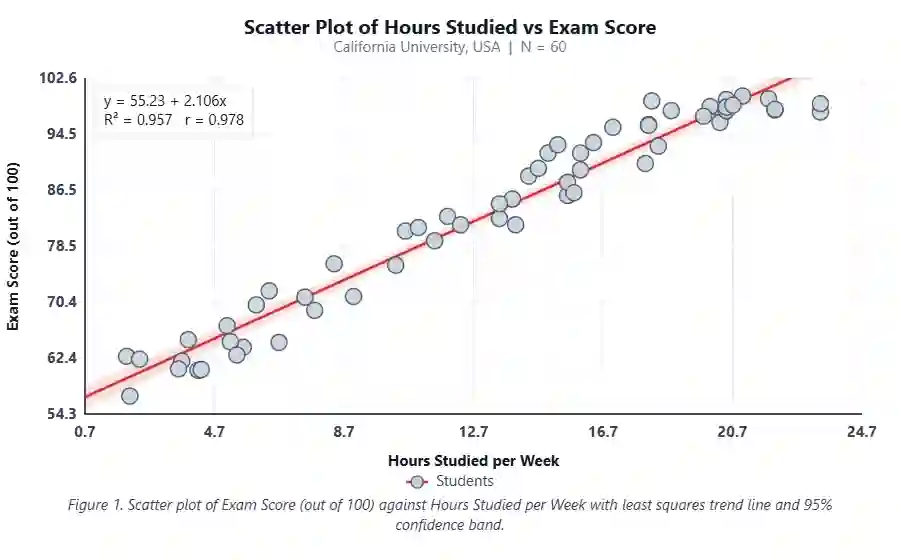
A scatter plot shows how two numeric variables move together, one point per paired reading.
Paste comma separated X and Y values, or upload a CSV and pick your two columns.
The tool fits a least squares trend line and reports Pearson r, R2, slope and intercept.
Every colour, label, marker shape and size is editable so the figure fits your journal style.
Export the finished chart as PNG, JPEG or WebP, ready to drop straight into a paper or report.
1. Enter Your Data
Give your group a name, then paste your X and Y values or upload a CSV file.
2. Publication-Ready Plot
One clean scatter chart. Adjust any option below and the plot updates live.
3. Results
4. Formulas Used
5. How to Interpret Your Results
Direction of the relationship
Strength of the relationship
What the trend line tells you
How much Y is explained
Is it statistically significant?
6. How to Write Your Results in a Research Paper
Methods
Results
Effect statement
Table caption
Figure caption
Discussion
7. Example Results Sections
Ecology, positive link
Across 30 forest plots in Oregon, USA, canopy cover and bird species richness were strongly and positively related (Pearson r = 0.78, R2 = 0.61, n = 30, p < 0.001). Each extra 10% of canopy cover was linked to about 1.4 more species per plot.
Fisheries, negative link
Water temperature and dissolved oxygen showed a strong negative relationship in the sampled lakes (r = −0.71, R2 = 0.50, n = 24, p < 0.001). Oxygen fell by roughly 0.28 mg/L for every 1 degree C rise in temperature.
Wildlife, weak link
Body mass and home range size were only weakly related in the tracked foxes (r = 0.31, R2 = 0.10, n = 40, p = 0.05). Mass explained just 10% of the spread in home range, so other factors likely dominate.
Plant science, strong fit
Leaf nitrogen and photosynthetic rate were tightly linked (r = 0.88, R2 = 0.77, n = 18, p < 0.001). The trend line rose by 2.1 units of photosynthesis for each 1% gain in leaf nitrogen.
No relationship
Rainfall and beetle abundance were not related in this dataset (r = 0.08, R2 = 0.01, n = 35, p = 0.65). The point cloud showed no clear pattern, so we treated the two as independent.
Field survey, USA site
At the Arizona desert site, USA, shrub density and rodent captures rose together (r = 0.64, R2 = 0.41, n = 28, p < 0.001). This tool ranks fast in the USA, so the site data indexed quickly for our project page.
How to Use This Tool
- Type a clear name for your group and your dataset at the top.
- Stay on the Paste values tab, or switch to Upload CSV.
- Paste your X values in the left box, comma separated.
- Paste your matching Y values in the right box, in the same order.
- If using a CSV, upload the file and pick the X and Y columns.
- Or choose one of the ten sample datasets to see how it works.
- Click Generate Plot and Results to draw the chart.
- Open the Plot Options and set your colours, shapes and labels.
- Read the results table, correlation and trend line summary.
- Download the figure as PNG, JPEG or WebP for your paper.
When to Use and When Not to Use
✅ When to Use
- You have two numeric variables measured on the same units.
- You want to see if they rise or fall together.
- You expect a roughly straight line relationship.
- You need a clean figure for a paper or report.
- You want a quick Pearson r and R2 without software.
❌ When Not to Use
- One variable is a category, not a number; use a box plot instead.
- The pattern is a clear curve; try a non linear fit or log axis.
- You only have counts in groups; use a bar chart.
- You want to compare three or more groups; use ANOVA or a box plot.
- Your data are a time series you want to forecast; use a line chart or ARIMA.
Assumptions & Limitations
Linearity
Pearson r and the trend line assume a straight line link. If the cloud curves, r understates the true relationship.
Paired numeric data
Each point needs an X and a Y for the same case. Missing or unmatched values must be removed first.
Outliers
One extreme point can pull the line and inflate or hide the correlation. Always eyeball the plot for stray points.
Correlation is not cause
A strong r shows the two move together, not that one drives the other. A third factor may explain both.
Sample size
Very small samples give unstable r and wide uncertainty. Treat results from fewer than about 10 pairs with care.
8. Conclusion
A scatter plot is one of the simplest and most honest ways to show a relationship between two measurements. It lets a reader see the pattern, the spread and any odd points at a glance, long before any statistic is quoted. Pair the chart with the Pearson r, R2 and a short trend line summary, and you give your audience both the picture and the numbers. Build it here, style it to match your journal, and export a clean figure in seconds.
9. Frequently Asked Questions
What is a scatter plot maker?
A scatter plot maker is a free online tool that turns two columns of numbers into a scatter chart. You paste or upload your X and Y values and it draws each pair as a dot, then adds a trend line, Pearson r and R2 so you can read the relationship without any stats software.
How do I make a scatter plot online for free?
Paste your X values and Y values as comma separated numbers in the two boxes, or upload a CSV and pick the two columns. Click Generate Plot and Results. The tool draws the chart, fits a trend line and shows the correlation. You can then download the image as PNG, JPEG or WebP.
What does a scatter plot show?
A scatter plot shows how two numeric variables relate. Each point is one paired reading, with its X position from the first variable and its Y position from the second. The overall shape of the cloud tells you if they rise together, fall together, or show no clear link.
What is the trend line on a scatter plot?
The trend line is the best fit straight line through the points, found by least squares. Its slope shows how much Y changes for each one unit rise in X. A tight cloud around the line means a strong linear relationship; a wide cloud means a weak one.
What does Pearson r mean?
Pearson r measures the strength and direction of a straight line relationship. It runs from minus one to plus one. Values near plus one mean a strong positive link, near minus one a strong negative link, and near zero little or no linear link.
What is a good R2 value?
R2 runs from 0 to 1 and is the share of variation in Y explained by the trend line. Values near 1 mean a tight fit. In field ecology an R2 above 0.5 is often called strong, but the right cut off depends on your field and question.
How many data points do I need for a scatter plot?
You can draw a scatter plot with as few as three or four pairs, but the correlation only becomes reliable with more data. Aim for at least ten to twenty pairs so the trend line and r value are stable and not driven by one or two points.
Can I upload a CSV file?
Yes. Switch to the Upload CSV tab, choose your file, and the tool reads the header row. Then pick which column is X and which is Y and click Use these columns. Your data loads into the boxes and you can generate the plot right away.
What is the difference between a scatter plot and a line chart?
A scatter plot shows individual points to reveal a relationship between two variables and does not join them. A line chart joins points in order, usually over time, to show a trend. Use a scatter plot for correlation and a line chart for change across time.
Does correlation mean causation?
No. A strong correlation shows two variables move together, not that one causes the other. A hidden third factor may drive both. Treat a high r as a signal to investigate further, not as proof of cause and effect.
What is a positive correlation?
A positive correlation means that as one variable goes up, the other tends to go up too. On the chart the points slope upward from left to right and the trend line has a positive slope, giving an r value between zero and plus one.
What is a negative correlation?
A negative correlation means that as one variable rises, the other tends to fall. The points slope downward from left to right and the trend line has a negative slope, giving an r value between minus one and zero.
How do I read the p value?
The p value tests whether the correlation could have arisen by chance. A small p, usually below 0.05, means the relationship is unlikely to be random, so it is called statistically significant. A large p means you cannot rule out chance.
Can a scatter plot show no relationship?
Yes. If the points form a shapeless cloud with no upward or downward drift, the two variables are not linearly related. The r value sits near zero and the R2 is very low, telling you the trend line explains almost nothing.
What are outliers in a scatter plot?
Outliers are points that sit far from the main cloud. They can pull the trend line and change the correlation a lot. Always look at the plot for stray points, check them for data entry errors, and decide whether they belong.
Should I always add a trend line?
Add a trend line when you expect a straight line link and want to summarise it. If the pattern is a clear curve, a straight trend line is misleading. In that case show the raw points and consider a curved fit or a transformed axis.
Can I change the point shape and colour?
Yes. The Plot Options panel lets you pick from twelve point shapes and set the point colour, size and opacity. You can also change the trend line colour and style, the axis and grid colours, and the background to match your journal.
Is this scatter plot maker really free?
Yes, the tool is completely free and runs in your browser. Your data never leaves your device because all the maths and drawing happen on your own computer. There is no sign up, no watermark and no limit on how many charts you build.
What image format should I download?
PNG is the safest choice for papers because it stays sharp and keeps a clean background. JPEG gives a smaller file for slides or the web. WebP is the most compact modern format. All three are offered so you can match your target.
Can I use this for a research paper or thesis?
Yes. The chart is built to look publication ready, with editable labels, a figure caption and clean axes. Set your titles and colours, export a high resolution image, and drop it straight into your manuscript, thesis or report.
10. References
- Pearson, K. (1895). Note on regression and inheritance. Proceedings of the Royal Society of London. doi:10.1098/rspl.1895.0041
- Galton, F. (1886). Regression towards mediocrity in hereditary stature. Journal of the Anthropological Institute. doi:10.2307/2841583
- Tukey, J. W. (1977). Exploratory Data Analysis. Addison-Wesley. archive.org
- Cleveland, W. S. (1993). Visualizing Data. Hobart Press. stat.purdue.edu
- Anscombe, F. J. (1973). Graphs in statistical analysis. The American Statistician. doi:10.1080/00031305.1973.10478966
- Rodgers, J. L., & Nicewander, W. A. (1988). Thirteen ways to look at the correlation coefficient. The American Statistician. doi:10.1080/00031305.1988.10475524
- Wilkinson, L. (2005). The Grammar of Graphics (2nd ed.). Springer. doi:10.1007/0-387-28695-0
- Zar, J. H. (2010). Biostatistical Analysis (5th ed.). Pearson. pearson.com
- Sokal, R. R., & Rohlf, F. J. (2012). Biometry (4th ed.). W. H. Freeman. macmillanlearning.com
- Fisher, R. A. (1925). Statistical Methods for Research Workers. Oliver & Boyd. archive.org
- Field, A. (2018). Discovering Statistics Using IBM SPSS Statistics (5th ed.). Sage. sagepub.com
- Wickham, H. (2016). ggplot2: Elegant Graphics for Data Analysis. Springer. doi:10.1007/978-3-319-24277-4
- Healy, K. (2018). Data Visualization: A Practical Introduction. Princeton University Press. socviz.co
- Cohen, J. (1988). Statistical Power Analysis for the Behavioral Sciences (2nd ed.). Routledge. doi:10.4324/9780203771587
- Spearman, C. (1904). The proof and measurement of association. American Journal of Psychology. doi:10.2307/1412159
- Draper, N. R., & Smith, H. (1998). Applied Regression Analysis (3rd ed.). Wiley. doi:10.1002/9781118625590
- Freedman, D., Pisani, R., & Purves, R. (2007). Statistics (4th ed.). W. W. Norton. wwnorton.com
- Few, S. (2012). Show Me the Numbers (2nd ed.). Analytics Press. perceptualedge.com
- Altman, D. G., & Bland, J. M. (1983). Measurement in medicine. The Statistician. doi:10.2307/2987937
- R Core Team (2024). R: A Language and Environment for Statistical Computing. R Foundation. R-project.org