

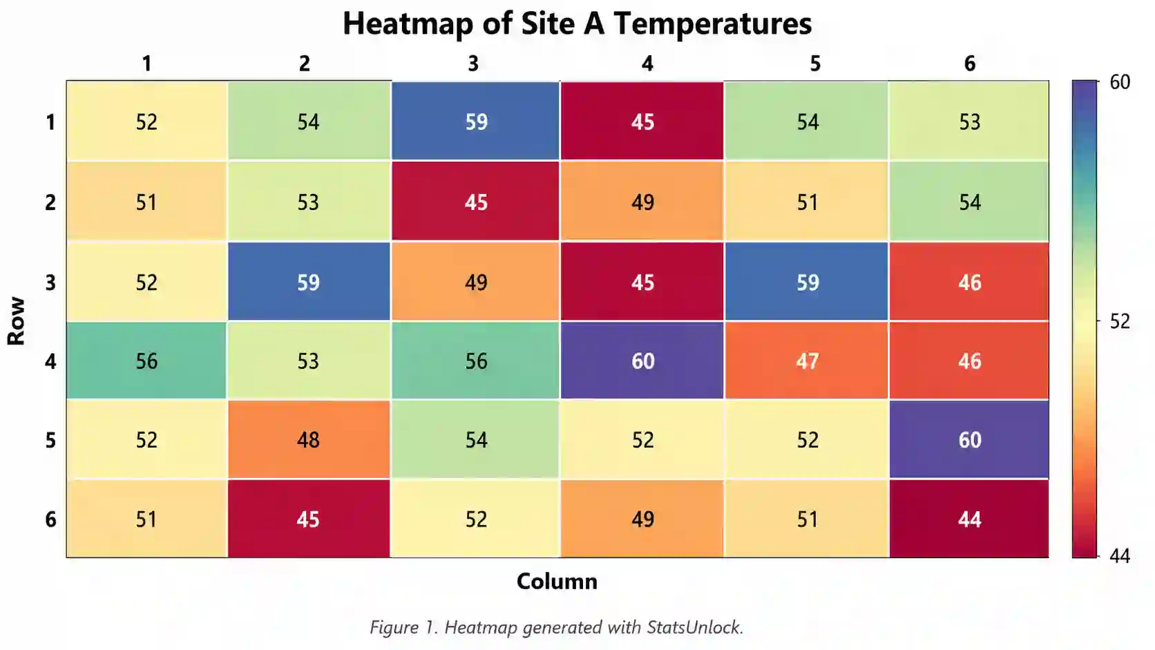

Heatmap Generator
Paste or upload your numbers, turn them into a clean, publication-ready heatmap, edit every color and label, and download a high-resolution image. No sign-up needed.
Key Takeaways
- A heatmap turns a list of numbers into a colored grid so patterns, hot spots, and outliers jump out fast.
- Just paste comma-separated values or upload a CSV, pick the number of columns, and the grid builds itself.
- Every part of the plot is editable: color palette, cell labels, borders, titles, fonts, and size.
- You get summary stats (count, min, max, mean, median, standard deviation) alongside the picture.
- Export a crisp PNG, JPEG, or WebP that is ready for reports, slides, and research papers.
1. Enter Your Data
Type a group name, paste your numbers (comma-separated), and choose how many columns the grid should have.
2. Publication-Ready Heatmap
One fully editable heatmap. Change any option below and it updates instantly.
3. Results
Summary statistics
4. Formulas Used
5. How to Interpret Your Results
6. How to Write Your Results in a Research Paper
Copy a card and swap in your own wording. The numbers below come from your current data.
7. Example Results Sections
How to Use This Tool
- Type a clear group or dataset name so the plot title and download file make sense.
- Paste your numbers into the box, separated by commas. Spaces and new lines also work.
- Or switch to the Upload CSV tab, pick your file, and choose the column you want to map.
- Not sure where to start? Pick a sample dataset and click Load sample data.
- Click Generate Heatmap and Results to build the grid and the summary stats.
- Set the number of columns to control the shape of the grid (for example 7 columns for weekdays).
- Choose a color palette that fits your story, and reverse it if you want the scale flipped.
- Turn cell values, row and column numbers, and the color legend on or off as needed.
- Adjust fonts, colors, borders, and the color scale min and max for a clean look.
- Download a PNG, JPEG, or WebP for your report, or the results table as a text file.
When to Use and When Not to Use a Heatmap
✅ When to Use
- You have many numbers and want to spot patterns or hot spots quickly.
- Your data has a natural grid, such as rows by columns, days by hours, or site by month.
- You want to compare a matrix of values, like a correlation table.
- You need a compact figure that shows a lot of data in a small space.
- You want to show clusters or gradients that a plain table hides.
❌ When Not to Use
- You have only a few values; a bar chart is clearer.
- You need to read exact numbers precisely; use a table instead.
- You want to show a trend over time for one series; use a line chart.
- Your categories have no order or grid meaning; use a grouped bar chart.
- Your audience has color-vision limits and you cannot use a colorblind-safe palette; add labels or use a table.
Assumptions & Limitations
8. Conclusion
Heatmaps are one of the fastest ways to read a large block of numbers. By mapping value to color, they let your eyes do the pattern-finding that a spreadsheet cannot. Use the editable options here to build a clean figure, keep a colorblind-safe palette when you can, and always pair the picture with the summary stats so your readers get both the shape and the exact numbers. When you are ready, export the image and drop it straight into your report, slide deck, or manuscript.
9. Frequently Asked Questions
What is a heatmap?
A heatmap is a grid of colored cells where each color shows the size of a number. Warmer or darker colors usually mean bigger values and cooler or lighter colors mean smaller values, so you can spot patterns across a lot of data at a glance.
How do I make a heatmap from a list of numbers?
Paste your numbers separated by commas, choose how many columns you want, and the tool arranges the values into a grid and colors each cell by size. You can then edit the palette, labels, and size, and download the image.
Is this heatmap generator free?
Yes. It is completely free, runs entirely in your browser, needs no sign-up, and never sends your data to a server.
Can I upload a CSV file?
Yes. Open the Upload CSV tab, pick your file, and choose the column you want to map. The tool reads the file locally and lets you select which column becomes the heatmap.
How many columns should my heatmap have?
It depends on your data. For weekly patterns use 7 columns, for months use 12, and for a general grid pick a number that makes the grid close to square. You can change the column count any time.
Which color palette is best?
Viridis and Magma are good defaults because they read well and are friendly to colorblind viewers. Use a diverging palette like Cool-Warm when your data has a meaningful midpoint, such as positive versus negative values.
What does the color legend mean?
The color legend, or colorbar, links each color to a value. The bottom of the bar is your minimum and the top is your maximum, so you can read any cell's rough value from its color.
Can I show the exact number in each cell?
Yes. Turn on Show value in each cell. You can also set the number of decimal places and let the tool pick light or dark text automatically for readability.
How do I handle outliers in a heatmap?
One very large value can flatten the rest of the colors. Set a manual color scale max just below the outlier so the smaller values keep their detail, and mention the capped scale in your caption.
Can I download a high-resolution image?
Yes. Set the export width and height, then click Download PNG, JPEG, or WebP. Larger export sizes give sharper images for print and journals.
Is a heatmap the same as a correlation matrix?
Not exactly. A correlation matrix is one common use of a heatmap, where each cell is a correlation value. A heatmap is the general picture; a correlation matrix is one thing you can put in it.
What is the difference between a heatmap and a choropleth map?
A heatmap colors a grid of cells, while a choropleth colors regions on a geographic map. Both use color for value, but a heatmap is for tables and grids, not maps.
Does the order of my numbers matter?
Yes. Values fill the grid left to right, then top to bottom. If your rows or columns have a specific meaning, paste the numbers in that exact order so the layout is correct.
Can I use a heatmap for time-series data?
Yes, and it works well for calendar-style views, like days as columns and weeks as rows. For a single trend over time, though, a line chart is usually clearer.
How do I make my heatmap colorblind-friendly?
Use Viridis or Magma, which keep their order for most color-vision types, keep cell labels on, and avoid red-green diverging scales when you can.
What summary stats does the tool give me?
It reports the count, minimum, maximum, range, mean, median, and standard deviation of your values, so you can describe the data alongside the picture.
Can I normalize my data before mapping?
The tool already rescales values to a 0 to 1 position for coloring using min-max normalization, so cells are colored fairly across the full range without you doing anything.
Will my data be saved or shared?
No. Everything runs in your browser. Your numbers never leave your device, which makes the tool safe for sensitive data.
Can I use this heatmap in a published paper?
Yes. Export a high-resolution image, keep the caption clear, state your color scale range, and the figure is ready for a manuscript or thesis.
Why do some cells look empty at the end of the grid?
If your value count does not divide evenly by the number of columns, the last row is partly filled. That is normal; the tool leaves the extra cells blank rather than inventing data.
10. References
- Wilkinson, L. & Friendly, M. (2009). The history of the cluster heat map. The American Statistician, 63(2), 179-184. https://doi.org/10.1198/tas.2009.0033
- Gehlenborg, N. & Wong, B. (2012). Heat maps. Nature Methods, 9, 213. https://doi.org/10.1038/nmeth.1902
- Eisen, M. B., et al. (1998). Cluster analysis and display of genome-wide expression patterns. PNAS, 95(25), 14863-14868. https://doi.org/10.1073/pnas.95.25.14863
- Wong, B. (2011). Color blindness. Nature Methods, 8, 441. https://doi.org/10.1038/nmeth.1618
- Crameri, F., Shephard, G. E. & Heron, P. J. (2020). The misuse of colour in science communication. Nature Communications, 11, 5444. https://doi.org/10.1038/s41467-020-19160-7
- Moreland, K. (2009). Diverging color maps for scientific visualization. ISVC 2009, 92-103. https://doi.org/10.1007/978-3-642-10520-3_9
- Borland, D. & Taylor, R. M. (2007). Rainbow color map (still) considered harmful. IEEE CG&A, 27(2), 14-17. https://doi.org/10.1109/MCG.2007.323435
- Tufte, E. R. (2001). The Visual Display of Quantitative Information (2nd ed.). Graphics Press. https://www.edwardtufte.com/tufte/books_vdqi
- Cleveland, W. S. & McGill, R. (1984). Graphical perception. JASA, 79(387), 531-554. https://doi.org/10.1080/01621459.1984.10478080
- Healy, K. (2018). Data Visualization: A Practical Introduction. Princeton University Press. https://socviz.co/
- Wickham, H. (2016). ggplot2: Elegant Graphics for Data Analysis. Springer. https://doi.org/10.1007/978-3-319-24277-4
- Hunter, J. D. (2007). Matplotlib: A 2D graphics environment. Computing in Science & Engineering, 9(3), 90-95. https://doi.org/10.1109/MCSE.2007.55
- Waskom, M. (2021). seaborn: statistical data visualization. JOSS, 6(60), 3021. https://doi.org/10.21105/joss.03021
- Smith, N. J. & van der Walt, S. (2015). A better default colormap for Matplotlib (viridis). SciPy 2015. https://bids.github.io/colormap/
- Few, S. (2012). Show Me the Numbers (2nd ed.). Analytics Press. https://www.perceptualedge.com/library.php
- Zhou, L. & Hansen, C. D. (2016). A survey of colormaps in visualization. IEEE TVCG, 22(8), 2051-2069. https://doi.org/10.1109/TVCG.2015.2489649
- Wilke, C. O. (2019). Fundamentals of Data Visualization. O'Reilly. https://clauswilke.com/dataviz/
- Brewer, C. A. (2003). ColorBrewer in print. Cartography and GIS, 30(1), 5-16. https://doi.org/10.1559/152304003100010929
- Munzner, T. (2014). Visualization Analysis and Design. CRC Press. https://doi.org/10.1201/b17511
- Kerren, A., et al. (2017). Handbook of Data Visualization. Springer. https://doi.org/10.1007/978-3-540-33037-0