


Box and Whisker Plot Maker
Create a clean, publication-ready box-and-whisker plot online — free, fully editable, and export-ready.
Enter comma-separated numbers for each group. Group names are editable.
Upload a .csv, .txt, or .xlsx / .xls file, then choose which columns to plot.
Type values into the grid. Use “Add Row” to extend a group.
⚙️ Plot Options
📊 Summary Statistics
⬇️ Export Plot
📖 How to Read This Plot
Detailed Interpretation of Results
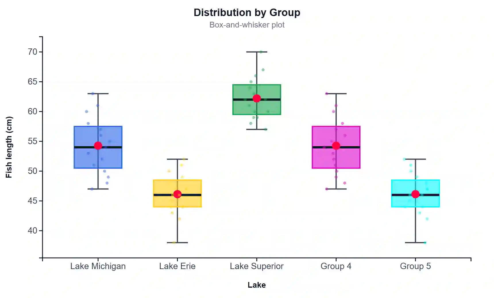
A box-and-whisker plot summarises a numeric variable through five key numbers: the minimum, the first quartile (Q1), the median (Q2), the third quartile (Q3), and the maximum. The box spans the interquartile range (IQR = Q3 − Q1), which holds the middle 50% of your data. The line inside the box is the median — the value that splits the group in half. The whiskers reach out to the most extreme points that still fall within 1.5 × IQR of the box edges, and any point beyond that is drawn separately as an outlier.
When you read the plot, start with the median line. Comparing median positions across groups tells you which group tends to be higher or lower without being pulled around by extreme values, the way a mean can be. Next, look at the height of each box. A tall box means the middle half of the data is spread out (high variability); a short box means the group is tightly clustered. If the median sits closer to the bottom of the box, the data are right-skewed (a longer upper tail); if it sits near the top, they are left-skewed.
The whiskers show the practical range of typical values, while isolated points flag observations that are unusually large or small relative to the rest of the group. A group with several outliers may contain measurement errors, genuinely rare cases, or a mixture of sub-populations worth investigating. When two boxes barely overlap, the groups are likely to differ meaningfully; when boxes overlap heavily and medians are close, any difference is probably small. For a formal decision, pair the plot with a significance test (t-test or Mann–Whitney for two groups, ANOVA or Kruskal–Wallis for three or more).
Finally, use the summary table below the chart to back up what you see. The n tells you how much data supports each box — small groups (n < 10) give unstable quartiles, so interpret narrow or lopsided boxes cautiously. Reporting the median together with the IQR is the standard, robust way to describe skewed or non-normal data.
How to Write Your Results in Research
In a results section, describe the box plot with the five-number summary and a clear group comparison, then support it with a test statistic. A typical write-up reads: “Median fish length was highest in Lake Michigan (Mdn = 55.0 cm, IQR = 8.0) and lowest in Lake Erie (Mdn = 47.0 cm, IQR = 6.5). A Kruskal–Wallis test indicated a significant difference among lakes, H(2) = 12.4, p = .002.” Always state the measure of central tendency (median), the spread (IQR), the sample size per group, and — where relevant — the outliers and the inferential test with its statistic, degrees of freedom, and p-value.
Refer to the figure in text (“Figure 1”), give it a caption that names the variable, the grouping factor, and what the box elements represent, and note the outlier rule (1.5 × IQR). Report exact p-values to three decimals (except write p < .001), and describe effect direction in plain language so a reader who skips the statistics still understands the finding. The five ready-to-paste example write-ups below fill in automatically from your data once you generate the plot.
✍️ How to Write Your Results — 5 Ready Templates
🧾 Detailed Conclusion
The box-and-whisker plot is one of the most efficient ways to compare the distribution of a numeric variable across several groups on a single, uncluttered figure. In a few centimetres of space it communicates centre, spread, symmetry, and unusual values at once — which is exactly why journal reviewers, thesis committees, and data teams trust it for exploratory and confirmatory reporting alike. By reading the median, the box height, the whisker reach, and the outliers together, you can form a defensible first judgement about whether your groups differ and in what way, before running a single formal test.
To turn a box plot into a strong result, always pair the visual with numbers and a test. State the median and IQR for every group, disclose your sample sizes, explain the outlier rule you used, and choose an inferential test that matches your design and your data’s distribution. When boxes are clearly separated, report the effect confidently; when they overlap, be honest that any difference is small or uncertain. Used this way, the plot you build here is not just a picture — it is a complete, publication-ready summary that stands up to peer review and helps your reader reach the same conclusion you did.
🔬 Technical Details
Quartiles. Quartiles use linear interpolation on sorted data (the “type-7” method used by R and NumPy default). For position h = (n − 1)·p, the quantile is x⌊h⌋ + (h − ⌊h⌋)(x⌈h⌉ − x⌊h⌋), with p = 0.25 (Q1), 0.50 (median), 0.75 (Q3).
IQR & whiskers. IQR = Q3 − Q1. Lower whisker = smallest value ≥ Q1 − 1.5·IQR; upper whisker = largest value ≤ Q3 + 1.5·IQR. Points outside the whiskers are outliers (Tukey, 1977).
Notch. Notch half-height = 1.58 · IQR / √n around the median; non-overlapping notches suggest a significant median difference (McGill, Tukey & Larsen, 1978).
Mean marker. Arithmetic mean = Σxᵢ / n, drawn as a diamond. SD is the sample standard deviation (÷ n − 1).
Rendering uses D3.js v7 as inline SVG for crisp, scalable, publication-quality output. Where: n = group size; xᵢ = individual observation; Q1/Q3 = 25th/75th percentiles.
📚 Step-by-Step Guide
- Open the Paste / Type Data tab (loaded with a USA fish-length sample).
- Rename each group in its editable name box (e.g., “Lake Michigan”).
- Type or paste comma-separated numbers for each group:
52, 48, 55, 61, 47, ... - Click + Add Group to compare more groups, or remove one with ✕.
- Prefer a file? Use the Upload File tab, pick a sheet, and select the columns.
- Set the title, axis labels, and Y range in Plot Options.
- Choose a color scheme and toggle outliers, jitter, mean marker, or notches.
- Click Generate Plot to render the figure.
- Read the Summary Statistics table and the interpretation below.
- Export as PNG, JPEG, WebP, or a TXT report for your paper.
✅ When to Use / ❌ When Not to Use
✅ Use a box plot when: comparing a numeric variable across 2+ groups; your data are skewed or have outliers; you want a compact five-number summary; you need a robust alternative to the mean ± SD bar chart.
❌ Avoid it when: each group has very few points (n < 5 — show the raw dots instead); you need to show exact distribution shape or bimodality (use a violin or histogram); you are plotting proportions or counts (use a bar chart).
Alternatives: violin plot (full density), strip/jitter plot (raw data), bar chart with error bars (means), or a raincloud plot (box + density + points).
Real examples: (1) fish length across lakes; (2) blood pressure by treatment arm; (3) exam scores by school.
❓ Frequently Asked Questions
📚 References
This box and whisker plot maker follows established practice for quartiles, interquartile range, and outlier detection in statistical graphics and data visualization.
- Tukey, J. W. (1977). Exploratory Data Analysis. Addison-Wesley. link
- McGill, R., Tukey, J. W., & Larsen, W. A. (1978). Variations of box plots. The American Statistician, 32(1), 12–16. https://doi.org/10.1080/00031305.1978.10479236
- Frigge, M., Hoaglin, D. C., & Iglewicz, B. (1989). Some implementations of the boxplot. The American Statistician, 43(1), 50–54. https://doi.org/10.1080/00031305.1989.10475612
- Hyndman, R. J., & Fan, Y. (1996). Sample quantiles in statistical packages. The American Statistician, 50(4), 361–365. https://doi.org/10.1080/00031305.1996.10473566
- Tufte, E. R. (2001). The Visual Display of Quantitative Information (2nd ed.). Graphics Press. link
- Wickham, H., & Stryjewski, L. (2011). 40 years of boxplots. Technical report, had.co.nz. https://vita.had.co.nz/papers/boxplots.pdf
- Krzywinski, M., & Altman, N. (2014). Visualizing samples with box plots. Nature Methods, 11, 119–120. https://doi.org/10.1038/nmeth.2813
- Streit, M., & Gehlenborg, N. (2014). Bar charts and box plots. Nature Methods, 11, 117. https://doi.org/10.1038/nmeth.2807
- Weissgerber, T. L., et al. (2015). Beyond bar and line graphs. PLOS Biology, 13(4), e1002128. https://doi.org/10.1371/journal.pbio.1002128
- Bostock, M., Ogievetsky, V., & Heer, J. (2011). D³: Data-Driven Documents. IEEE TVCG, 17(12), 2301–2309. https://doi.org/10.1109/TVCG.2011.185