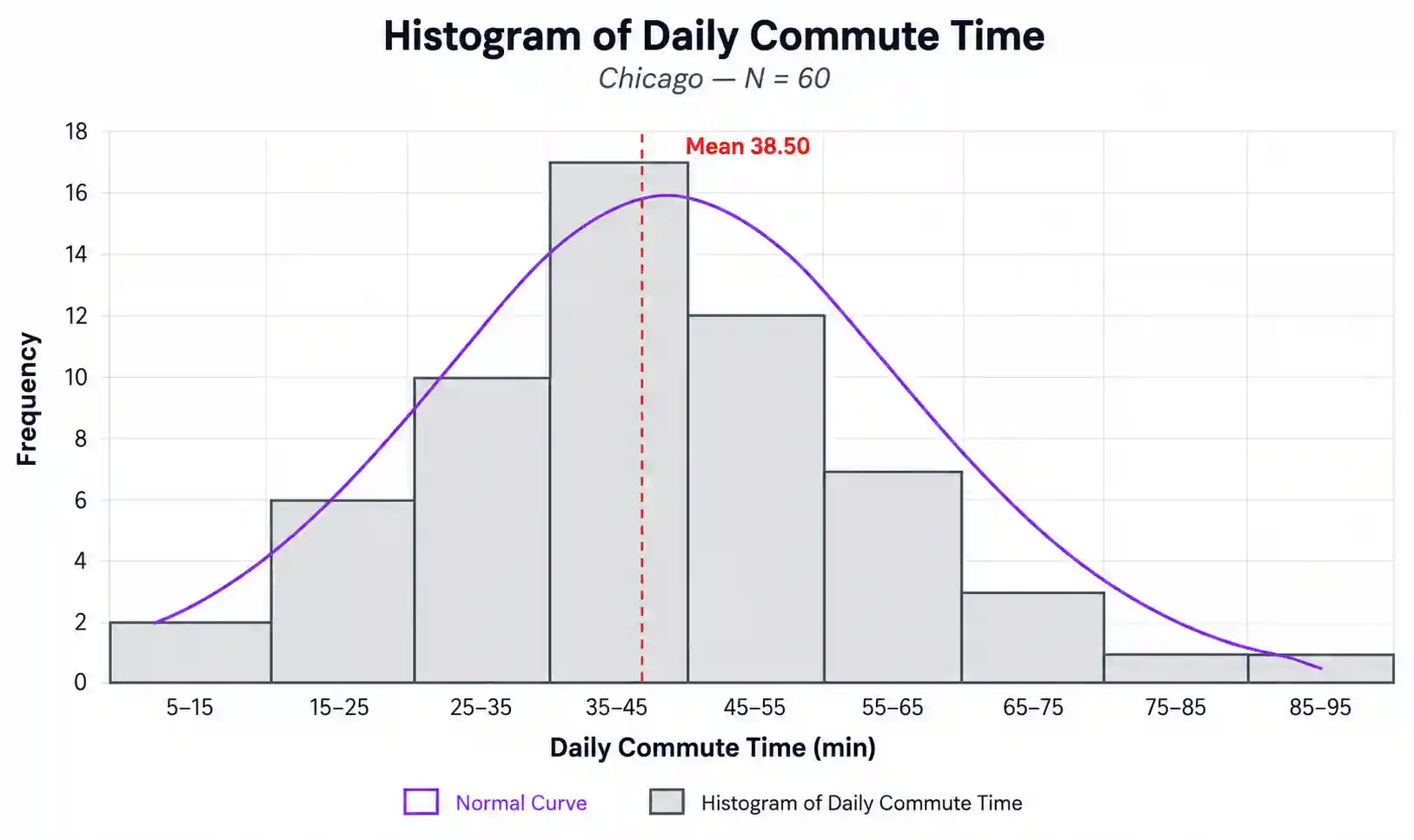
Histogram Plot
Build a publication-ready frequency distribution plot — bin-width rules, KDE & normal-curve overlay, mean/median lines, fully customizable styling.
📥 Data Input
🎛️ Plot Configuration
Bins & Overlays
Titles, Axes & Caption
Fonts
Colors
Legend & Sizing
📈 Plot
⬇️ Export Plot
📊 Summary Statistics
📖 How to Read This Plot
Chart Interpretation
Generate the plot above to see a detailed interpretation.
How to Write Your Results — 5 Templates
Each card is auto-filled from the live values. Use the 📋 Copy buttons to paste into your paper, thesis, poster, or pre-registration.
🔬 Technical Details
Bin-width rules
Sturges:           k = ⌈1 + log₂(n)⌉
Scott:             h = 3.5 · s · n^(−1/3)
Freedman–Diaconis: h = 2 · IQR · n^(−1/3)
Square-root:       k = ⌈√n⌉

Where:
  k   = number of bins
  h   = bin width
  n   = sample size
  s   = sample standard deviation
  IQR = Q3 − Q1
KDE bandwidth (Silverman's rule)
bw = 0.9 · min(s, IQR/1.34) · n^(−1/5)

f(x) = (1 / (n · bw)) · Σ K((x − xᵢ) / bw)
K(u) = (1 / √(2π)) · exp(−u²/2)   (Gaussian kernel)
Normal curve overlay
For frequency mode the Gaussian density is scaled by n·h to match histogram counts; for density mode the curve uses raw PDF; for relative-frequency mode it is scaled by h.
Libraries
Rendered with Chart.js 4.4.1. CSV/Excel parsing via SheetJS 0.18.5. All computations performed client-side.
📚 Step-by-Step Guide
- Choose how to enter data. Three tabs: paste (comma-separated), upload (CSV/Excel with column picker), or manual entry.
- Edit the variable name. It is reused in axis labels, the legend, the figure caption, and every export.
- Pick a sample dataset. Five USA-based examples are pre-built. Dataset 1 (Chicago commute) is loaded into the input by default — edit it or paste your own values, then click Generate Plot to render.
- Choose a bin-width rule. Freedman–Diaconis is the safest default. Scott for near-normal data, Sturges for small samples, Square-root for quick exploration, Custom for a fixed count.
- Toggle the overlays. Normal curve, KDE density, mean line, median line, ±1 SD band, and per-bar value labels are all independently switchable.
- Set the Y-axis units. Frequency (count), relative frequency (%), or density — the curves rescale automatically.
- Edit titles, axes, and caption. Inline fields control every label that appears on the exported image. The big
at the top of the page is also editable — click and type. - Choose fonts and colours. Eight palettes (including Colorblind-safe Okabe–Ito), individual colour pickers for bars/curves/lines/background, opacity slider, font family selector, and per-element size controls.
- Set canvas size and DPI. Default 900 × 520 px at 2× retina; switch to 3× for print, or 1× for the web.
- Export. PNG (lossless, journals), JPEG (slides), WebP (web), or TXT (statistics report).
✅ When to Use a Histogram
Use a histogram when…
- ✅ Your variable is continuous (interval or ratio).
- ✅ You have at least 20–30 observations (50+ is much better).
- ✅ You want to assess normality before a t-test, ANOVA, or regression.
- ✅ You want to detect skewness, bimodality, or outliers.
Use an alternative when…
- ❌ Your variable is categorical → use a bar chart.
- ❌ You have fewer than 15 observations → use a dot plot or stem-and-leaf.
- ❌ You want to compare 2+ groups → use grouped box plots or violin plots.
- ❌ You want a smooth density estimate → use a KDE (toggle the KDE overlay in this tool).
Decision tree
Numeric variable?
├─ Yes → continuous?
│   ├─ Yes → HISTOGRAM ✓  (this tool)
│   └─ No (discrete count) → bar chart of counts
└─ No (categorical)        → bar chart
Real-world USA examples
- Public health — daily-step distribution for 2,400 Fitbit users in California.
- Education — SAT Math score distribution across a Los Angeles high-school district.
- Real estate — single-family home prices in Atlanta showing a long right tail driven by luxury sales.
❓ Frequently Asked Questions
Q1. What is a histogram plot?
A histogram plot is a bar chart that groups a continuous numeric variable into adjacent intervals (bins) and shows the frequency of values in each bin. It reveals shape, centre, spread, skewness, modality, and outliers — the four things to know about any variable before running an inferential test.
Q2. When should I use a histogram plot?
Whenever you have one continuous numeric variable and want to inspect its distribution. Always plot a histogram before a t-test, ANOVA, or regression — most "weird" results trace back to a skewed or outlier-heavy distribution that the analyst never visualised.
Q3. How do I interpret the shape of a histogram?
Look at three things. (1) Symmetry: bell-shaped → near-normal; long right tail → positive skew; long left tail → negative skew. (2) Modality: one peak (unimodal) is typical; two peaks usually signal a mixture of two subgroups. (3) Outliers: isolated bars far from the bulk indicate extreme values worth investigating.
Q4. What sample size do I need for a histogram plot?
At least 20–30 observations is a practical minimum. 50–200 produces a clear, interpretable shape. Below 15, the histogram becomes very sensitive to bin choice — prefer a dot plot or stem-and-leaf instead.
Q5. How do I export my histogram for publication?
Use PNG for journals and reports (lossless, transparent background possible), JPEG for slide decks (smaller, lossy), WebP for the web (modern, smaller than PNG), or TXT for the underlying statistics. Set canvas to 900 × 520 px and DPI hint to 2× or 3× for print-quality output.
Q6. What is the difference between a histogram and a bar chart?
A bar chart represents categorical data and has visible gaps between the bars. A histogram represents continuous numeric data and the bars touch — because the bins are contiguous numeric intervals. Confusing the two is the most common chart-type mistake in undergraduate research.
Q7. How do I cite a histogram in my paper?
Refer to it in the text as "Figure 1" (or 2, 3, …) and place the figure with a caption that states the variable, N, mean, SD, and shape. Example: Figure 1. Histogram of daily commute time in Chicago (N = 60, M = 28.5 min, SD = 3.86, skew = 0.01).
Q8. Can I use this tool with my own data?
Yes. Paste comma-separated values, upload a CSV or Excel file (a column picker lets you choose the numeric column), or type values into the manual-entry table. All three input modes feed the same plot.
Q9. What file formats does the upload support?
.csv, .txt (tab/semicolon/comma-delimited), .xlsx, and .xls. Headers are auto-detected. For multi-sheet Excel workbooks, a sheet picker appears so you can pick the correct sheet.
Q10. How do I make my histogram colorblind-friendly?
Pick the "Colorblind-safe (Okabe–Ito)" palette in the Colors panel. Its hues are distinguishable to people with deuteranopia and protanopia — the two most common forms of colour-vision deficiency.
📚 References
The following references support this histogram plot maker, covering bin-width selection, kernel density estimation, and best practices in scientific data visualization.
- Sturges, H. A. (1926). The choice of a class interval. Journal of the American Statistical Association, 21(153), 65–66. https://doi.org/10.1080/01621459.1926.10502161
- Scott, D. W. (1979). On optimal and data-based histograms. Biometrika, 66(3), 605–610. https://doi.org/10.1093/biomet/66.3.605
- Freedman, D., & Diaconis, P. (1981). On the histogram as a density estimator: L₂ theory. Zeitschrift für Wahrscheinlichkeitstheorie und Verwandte Gebiete, 57(4), 453–476. https://doi.org/10.1007/BF01025868
- Silverman, B. W. (1986). Density estimation for statistics and data analysis. Chapman & Hall.
- Wand, M. P. (1997). Data-based choice of histogram bin width. The American Statistician, 51(1), 59–64. https://doi.org/10.1080/00031305.1997.10473591
- Tufte, E. R. (2001). The visual display of quantitative information (2nd ed.). Graphics Press.
- Wilkinson, L. (2005). The grammar of graphics (2nd ed.). Springer. https://doi.org/10.1007/0-387-28695-0
- Cleveland, W. S. (1993). Visualizing data. Hobart Press.
- Wickham, H. (2016). ggplot2: Elegant graphics for data analysis (2nd ed.). Springer. https://doi.org/10.1007/978-3-319-24277-4
- Crameri, F., Shephard, G. E., & Heron, P. J. (2020). The misuse of colour in science communication. Nature Communications, 11, 5444. https://doi.org/10.1038/s41467-020-19160-7
- Okabe, M., & Ito, K. (2008). Color universal design (CUD): How to make figures and presentations that are friendly to colorblind people. University of Tokyo.
- R Core Team. (2024). R: A language and environment for statistical computing. https://www.R-project.org/
- Hunter, J. D. (2007). Matplotlib: A 2D graphics environment. Computing in Science & Engineering, 9(3), 90–95. https://doi.org/10.1109/MCSE.2007.55
- Chart.js Contributors. (2013–present). Chart.js [Computer software]. https://www.chartjs.org
- STATS UNLOCK. (2025). Histogram plot maker. https://statsunlock.com