Stacked Bar Chart Generator
Build publication-ready stacked bar charts online with editable groups, categories, and four built-in visualizations.
📥 Data Input
Comma-separated category names (e.g., quarters, regions, months).
Each group becomes one colored layer in the stack. Each group's values map to the category labels above (in order).
Each numeric column = one group (stack layer). Row labels become category labels.
Edit cells in the table — values feed straight into the chart.
⚙️ Chart Configuration
📊 Stacked Bar Chart
📈 Summary Statistics
⬇️ Export Plot
Download your chart in publication-ready formats.
📖 How to Read Your Stacked Bar Chart — Detailed Interpretation
What This Chart Tells You
A stacked bar chart layers the contributions of multiple groups within each category, so you can read two things at once. The full height of every bar is the total for that category. The colored segments inside that bar are the contribution of each group to that total. Use this chart whenever the question is "how is the whole made up?" — composition, breakdown, or share — rather than "which one is biggest?".
In your current chart, the tallest bar represents the category with the highest combined value across all groups, and the largest colored segment within any bar shows which group dominates that category. When segments are roughly equal across bars, the composition is stable. When segment heights swap order from bar to bar, the mix is shifting — that shift is often the most important story in the data.
How to Interpret the Key Features
- Bar height (total) — read along the y-axis. A taller bar means a higher combined value across all groups for that category. Compare totals across categories to spot growth, decline, or seasonality.
- Segment height (group contribution) — read the size of each color block. A larger segment means that group contributes more in that category. Hover or read the data labels (if enabled) for exact values.
- Segment order — Chart.js stacks from the bottom up in the order groups are added. The bottom group is the baseline; the top group "floats" on the others.
- Color consistency — the same group keeps the same color across all bars, which is what makes the chart readable. If you change the palette, the new colors should still be distinguishable for colorblind readers (use the Colorblind-Safe palette in the config).
- 100% Stacked mode — switch to this when totals differ wildly between categories and you only care about share. Each bar becomes 100% tall, and segment heights show percentage contribution. This is the right choice for market-share, demographic mix, and composition-over-time questions.
Common Patterns and What They Mean
- Same color block dominates every bar — one group is the consistent driver. Useful for headline statements like "Region A accounts for the majority of revenue in every quarter."
- Segment order flips between bars — the relative ranking of groups is changing. Investigate why one group is gaining share at another's expense.
- Total rises but one segment shrinks — the category is growing overall, but one group is being out-paced. Often signals that the growth is concentrated in a subset of groups.
- Totals are similar but composition differs — categories with the same magnitude but different internal mixes. Strong evidence that the underlying drivers are different even though the headline number looks identical.
- A small segment that appears in only some bars — that group is intermittent. Common with rare categories (uncommon species, low-volume products, new market entrants).
When to Use vs Alternatives
Use a stacked bar chart when totals matter and composition matters and you have 2–6 groups. Use a grouped bar chart (side-by-side) when readers need to compare individual group values directly across categories. Use a 100% stacked bar chart when totals are uninteresting and only the mix matters. Use a line chart when categories are ordered time points and you care about trends within each group rather than category totals. Avoid stacked bars when you have more than ~6 groups — the chart becomes unreadable and the eye cannot rank middle segments.
How to Write Your Results in Research
Below are five ready-to-paste write-ups in different academic styles. Each card auto-fills from the live data in your chart — generate the plot, then click 📋 Copy.
Figure 1 presents a stacked bar chart of ___ across ___ categories, decomposed into ___ groups. Total values ranged from ___ to ___ across categories, with a mean category total of ___. ___ contributed the largest share overall (M = ___, ___ %), while ___ contributed the smallest share. Composition was visibly heterogeneous across categories, with the proportion of ___ varying between ___ % and ___ %.
APA conventions
Use "Figure 1" callouts in-text; cite the chart in the first mention; place the caption directly below the figure; report means rounded to two decimals; report percentages with no decimal unless precision matters.The stacked bar chart in Figure ___ illustrates the absolute contributions of ___ groups across ___ categories. The grand total summed to ___ units, distributed across categories with the highest combined value observed for ___ (total = ___). At the group level, ___ accounted for the largest cumulative contribution (___ units, ___ % of the grand total), followed by ___ (___ units, ___ %). The variation in composition across categories — particularly the relative gain of ___ in ___ — suggests that the underlying drivers are not uniform and warrants further investigation in Section ___.
Thesis conventions
Use full figure references with chapter–figure numbering (e.g., Figure 4.3); cite related literature in the same paragraph; cross-reference the methodology section; include exact totals and percentages.We compared ___ across ___ categories and broke each total down into ___ groups. The biggest combined value was in ___, and the smallest was in ___. Across all categories, ___ was the largest contributor, making up roughly ___ % of the total. The mix between groups changes noticeably from one category to the next, which means the story is not just about how much, but also about what is driving each total.
Plain-language conventions
Avoid jargon; use short sentences; round numbers; describe direction and magnitude in everyday language; suitable for press releases, blog posts, and executive summaries.Methods: Stacked bar visualization of ___ groups across ___ categories (n = ___ observations).
Results: Total category values ranged from ___ to ___ (mean = ___). ___ was the dominant group overall (___ %, ___ units), and ___ showed the largest within-category variation.
Conclusion: Composition differs meaningfully across categories, with implications for ___ (see full discussion).
Abstract conventions
Keep to ≤250 words for conferences; use the Methods → Results → Conclusion structure; lead with the design (visualization type) and the units; close with one actionable implication.A stacked bar chart was constructed with ___ categories on the x-axis and the sum of group values on the y-axis. Groups were ___ (n = ___ groups), stacked in the order ___. No data points were excluded. Category totals were computed as the row-wise sum across groups, and per-group contributions were retained as absolute values (alternative 100 %-stacked view also reported in Supplementary Figure ___). Chart generated using StatsUnlock Stacked Bar Chart Generator (statsunlock.com). Replication input is provided in Appendix ___.
Pre-registration conventions
State every analytic decision in advance; specify exclusion rules, the order of stacking, the choice of absolute vs percent, and the software/tool used; provide raw input data in an appendix or open repository.🎯 Detailed Conclusion
A stacked bar chart is the right choice when you need to answer two questions simultaneously: how big is each category in total, and what is each category made of. By layering group contributions inside a single bar, the chart compresses two layers of meaning — magnitude and composition — into a single visual unit that the eye reads in well under a second.
From the data you provided, the chart reveals three things worth carrying into your write-up. First, the ordering of category totals — which categories carry the most weight overall, and which are trailing. Second, the dominant group — the segment that consistently occupies the largest slice across most or all bars. Third, the compositional shifts — categories where the mix changes, often the most analytically valuable observation because shifting composition almost always points to an underlying mechanism worth investigating.
For publication, three practical decisions matter. Choose the right mode: absolute when totals are part of the story, 100% stacked when only mix matters. Pick a colorblind-safe palette — roughly 8% of men have a form of color vision deficiency and a journal reviewer is statistically likely to be among them. Limit to 2–6 groups; beyond that, segment heights become impossible to compare and a small-multiple of bar charts (one panel per group) usually communicates better.
In short: a well-built stacked bar chart turns a table of numbers into a single sentence that a reader grasps in a glance. The four supporting visualizations above — grouped bars, 100% stacked, per-group totals, and the category-total trend line — let you triangulate every claim you make, so the chart you publish is not just attractive but defensible.
🔬 Technical Details
How the Stacking Works
Each bar's height (in vertical orientation) equals the sum of group values for that category:
Where: Hc = total height for category c; vg,c = value of group g in category c; G = number of groups.
100% Stacked Mode
Where pg,c is the percentage share of group g in category c. Every bar sums to exactly 100%.
Per-Group Total
Used in the "Group Totals" supporting visualization to show overall contribution per group across all categories.
Library and Versions
- Chart.js 4.4.1 — bar/line rendering with
stacked: trueon both axes for absolute mode. - SheetJS 0.18.5 — Excel (.xlsx/.xls) and CSV parsing for the upload tab.
- Canvas-based export at native resolution via
canvas.toBlob().
Assumptions and Limitations
- All values must be non-negative. Negative values break stacking visually because segments would overlap or extend below zero.
- All groups must share the same category set — missing values are treated as 0.
- Readability decreases sharply beyond 6 groups; consider a heatmap or small-multiples instead.
- In 100% stacked mode, a category with all-zero values produces an empty bar (division by zero is handled and rendered as blank).
📚 Step-by-Step Guide — How to Use This Tool
- Type or paste your categories into the Category Labels field (comma-separated, e.g.,
Q1, Q2, Q3, Q4). - Edit the group names in the left column of each group row. These names appear in the legend.
- Enter values for each group as comma-separated numbers — one value per category, in the same order as the category labels (e.g.,
52, 48, 55, 61). - Add more groups using the "+ Add Group" button. Each new group becomes a new colored layer in the stack.
- Or upload a CSV/Excel file in the Upload tab. Pick each numeric column to be a group, then click "✓ Use Selected Columns."
- Customize the chart in the Configuration panel — title, axis labels, palette, font size, legend position.
- Switch to "100% Stacked" in Stack Mode if you only care about share/mix instead of absolute totals.
- Click "Update Plot" — your stacked bar chart and the four supporting visualizations regenerate instantly.
- Read the Summary Statistics table for per-group n, mean, SD, min, max, and total — useful for the Results section of any paper.
- Export as PNG, JPEG, WebP, or TXT using the download bar — all four formats are publication-ready.
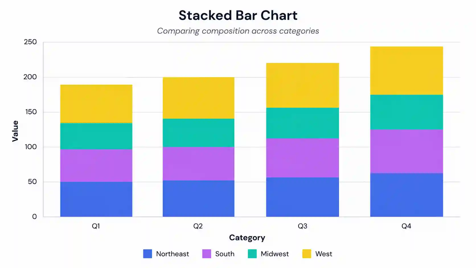
Worked Example (USA Sales — Quarterly Revenue by Region)
Categories: Q1, Q2, Q3, Q4. Group 1 "Northeast": 52, 48, 55, 61. Group 2 "South": 47, 53, 58, 64. Group 3 "Midwest": 38, 41, 44, 49. Group 4 "West": 55, 60, 67, 72. The resulting chart shows total quarterly revenue rising from Q1 to Q4, with the West region contributing the largest share in every quarter and the Midwest the smallest.
✅ When to Use a Stacked Bar Chart
Use a stacked bar chart when:
- You want to show total magnitude and composition together for each category.
- You have 2–6 groups per category — beyond 6, switch to a heatmap or small-multiples.
- Values are non-negative and share the same unit of measurement.
- Readers should compare total category sizes (vertical heights) and relative shares at a glance.
Do not use a stacked bar chart when:
- You only care about individual group values — use a grouped (side-by-side) bar chart.
- You have negative values or values on different scales — use a diverging bar or a small-multiples panel.
- You need to compare middle segments precisely across bars — only the bottom segment has a common baseline.
- You have more than ~6 groups — readers cannot reliably rank segments.
Decision tree
- Do totals matter? → If no, use grouped bars or 100% stacked.
- Does composition matter? → If no, use a simple bar chart of totals.
- Are there ≤ 6 groups? → If no, use a heatmap or small-multiples.
- Are all values ≥ 0? → If no, use a diverging bar chart.
- All four boxes ticked → use a stacked bar chart.
Three real-world use cases
- USA quarterly sales by region — total revenue per quarter plus regional breakdown.
- Camera-trap detections by habitat type — total detections per site, broken down by species group.
- Student enrollment by major — total enrollment per academic year, decomposed by major or department.
❓ Frequently Asked Questions
What is a stacked bar chart?
When should I use a stacked bar chart instead of a grouped bar chart?
How do I interpret a 100% stacked bar chart?
What sample size do I need for a stacked bar chart?
How do I export my stacked bar chart for publication?
What is the difference between a stacked bar chart and a pie chart?
How do I cite a stacked bar chart in my paper?
Can I use this tool with my own data?
What file formats does the upload support?
How do I make my chart colorblind-friendly?
📚 References
References on stacked bar chart design, data visualization best practices, and chart interpretation for academic publishing.
- Tufte, E. R. (2001). The Visual Display of Quantitative Information (2nd ed.). Graphics Press. edwardtufte.com
- Cleveland, W. S., & McGill, R. (1984). Graphical perception: Theory, experimentation, and application to the development of graphical methods. Journal of the American Statistical Association, 79(387), 531–554. https://doi.org/10.1080/01621459.1984.10478080
- Few, S. (2012). Show Me the Numbers: Designing Tables and Graphs to Enlighten (2nd ed.). Analytics Press. perceptualedge.com
- Wilkinson, L. (2005). The Grammar of Graphics (2nd ed.). Springer. https://doi.org/10.1007/0-387-28695-0
- Wickham, H. (2010). A layered grammar of graphics. Journal of Computational and Graphical Statistics, 19(1), 3–28. https://doi.org/10.1198/jcgs.2009.07098
- Healy, K. (2018). Data Visualization: A Practical Introduction. Princeton University Press. socviz.co
- Cairo, A. (2019). How Charts Lie: Getting Smarter About Visual Information. W. W. Norton & Company. thefunctionalart.com
- Crameri, F., Shephard, G. E., & Heron, P. J. (2020). The misuse of colour in science communication. Nature Communications, 11, 5444. https://doi.org/10.1038/s41467-020-19160-7
- Brewer, C. A. (1994). Color use guidelines for mapping and visualization. In A. M. MacEachren & D. R. F. Taylor (Eds.), Visualization in Modern Cartography (pp. 123–147). Elsevier. colorbrewer2.org
- Heer, J., & Bostock, M. (2010). Crowdsourcing graphical perception: Using Mechanical Turk to assess visualization design. In Proceedings of the SIGCHI Conference on Human Factors in Computing Systems (pp. 203–212). ACM. https://doi.org/10.1145/1753326.1753357
- Munzner, T. (2014). Visualization Analysis and Design. CRC Press. cs.ubc.ca/~tmm/vadbook/
- Ware, C. (2012). Information Visualization: Perception for Design (3rd ed.). Morgan Kaufmann. https://doi.org/10.1016/C2009-0-62432-6
- Chart.js Contributors. (2013–present). Chart.js [Computer software]. chartjs.org
- SheetJS LLC. (2012–present). SheetJS Community Edition [Computer software]. sheetjs.com
- Skau, D., & Kosara, R. (2016). Arcs, angles, or areas: Individual data encodings in pie and donut charts. Computer Graphics Forum, 35(3), 121–130. https://doi.org/10.1111/cgf.12888